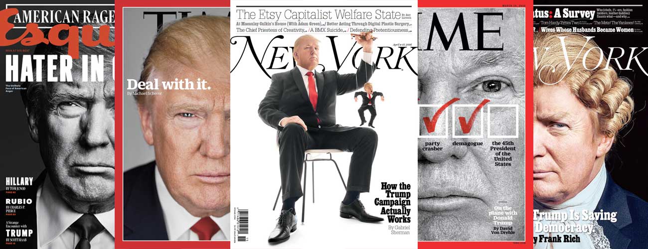
A gift of $3 billion in free media coverage helped propel Donald Trump to becoming the presumptive Republican nominee, claims one popular theory. Calculating the equivalent advertising rate for cumulative news coverage is a provocative way to depict the media’s undeniable obsession with Trump. But this understanding of “earned media” also reflects an alarmingly cynical view of journalism.
The New York Times drew attention to Trump’s media windfall in March when it cited data from an analytics firm claiming that the monetary value of Trump coverage was massively outpacing the field. “No one knows this better than mediaQuant,” the Times said of the Portland, Oregon, firm whose earned media calculations have since been referenced by countless news outlets. (How much earned media has Trump received just from the outcry over his earned media? Millions’ worth?)
MediaQuant adjusts the estimated value of coverage depending on tone, but only marginally. Paul Senatori, the firm’s chief analytics officer, says the Times article about earned media would have, itself, been scored “neutral” toward Trump—as are the vast majority of stories about most candidates. His software doesn’t give significant weight to whether coverage is favorable or unfavorable to a candidate because of how subjective that can be. “If you place too much emphasis on sentiment, you have to go down this rathole,” he says of the many biases involved in judging editorial tone.
By one slightly wry definition, news is information that someone doesn’t want published, and everything else is advertising. A news-to-advertising exchange rate defies that principle. Visibility is certainly coveted in elections, but it’s still radical to claim that the collective news coverage of a candidate amounts to a campaign donation, especially for someone like Trump, whose favorability ratings are unprecedentedly bad, largely in response to his coverage.
Heightened scrutiny of how press can swing elections is generating greater interest in media-wide coverage analytics—the faster and more expansive those findings, the better. But when companies with a marketing focus are hired to play the role of media watchdog, there’s a tendency to take their findings on faith. These firms are dazzlingly adept at gathering data, but some considerations used to determine earned media or the breakdown of positive and negative coverage reflect a marketer’s mindset, not a journalist’s. And news outlets often run with the most striking findings, rather than the most informative.
The preferred metric at mediaQuant, a three-year-old company, is actually its “media rating,” which provides a standardized score for how prominently a brand, topic, person, or organization is appearing across 20,000 news outlets and social media platforms. Journalists haven’t shown much interest in that finding, which currently measures Trump at a 98 out of 100, with Hillary Clinton climbing to a 97. “As soon as we put the dollar figure on [earned media],” Senatori explains, “the media loved it because they could then compare it to Trump’s ad spending.” After the Times reported that, by March, Trump had earned free media equivalent to $1.9 billion, it was picked up by The Washington Post, CNN, National Review, Time, The Huffington Post, and The Weekly Standard, to name a few. Before he dropped out, Ted Cruz cited mediaQuant’s earned media report numerous times, dropping the latest stats in a radio interview this week.
Asked why the Times reported earned media but not the media rating, the paper’s vice president of corporate communications, Danielle Rhoades Ha, emailed, “Dollars are a compelling, relatable unit.” Times political reporter Nicholas Confessore introduced mediaQuant’s earned media calculations as “not quite an apples-to-apples comparison to paid advertising.” No matter how you parse it, that’s a serious understatement. Santori says his company is meticulous about setting the value of a news mention based on where and when it occurred, but adjusting for how it occurred is more challenging. If coverage is deemed positive, mediaQuant could value it at 45 percent of the ad equivalent. For negative coverage, it might drop to 14 percent. It’s debatable whether a 10-minute TV interview is vaguely comparable to 20 30-second ads. But appearing on the cover of The New York Daily News next to words like “ANTI CHRIST” is laughably unlike buying an ad in that space, even if mediaQuant adjusts the value because of the negativity. “No one but a dimwit would accept that all the Trump publicity … helped his candidacy,” Politico media critic Jack Shafer wrote in the magazine’s special issue on media, devoted entirely to coverage of Trump.
Shafer criticized mediaQuant for doing little to differentiate positive, negative, and neutral coverage. But a computer algorithm would surely render a crude simplification of how to evaluate reporting and commentary.
The Pew Research Center has conducted a series of studies that try to gauge the sentiment of campaign coverage. After the 2012 presidential election, a team of seven experienced researchers coded a sample of 2,457 stories. To be deemed positive or negative, a story needed to have 50 percent more positive or negative comments. Criteria were updated to reflect the news events being covered. Pew found that its team agreed on how to categorize a story 82 percent of the time.
Amy Mitchell, director of journalism research at Pew, offered some examples of rules for text analysis. The “Criticism Only Rule” states that if an article simply describes one candidate criticizing another, that’s not enough to be automatically positive or negative for either person. The “Hypothetical Rule” states that use of a term like “could” also is not automatically positive or negative.
To analyze blogs and social media posts, Pew used the social analytics firm Crimson Hexagon, which aggregates textual assertions, and found that the tool matched human evaluations 97 percent of the time. Data journalists at places like The Washington Post’s “Monkey Cage” and The New York Times’ “Upshot” are now using Crimson Hexagon to analyze huge numbers of full news articles to assess political coverage. The longer the article, the wider the range of topics covered, and the greater the variety of article formats, the less reliable such algorithms become. That’s not to say that Crimson Hexagon is unreliable, but that the omnipotence of any software should be questioned. When Crimson Hexagon is cited by journalists, they almost never explain how it works, whereas reporting on polling data usually links to a detailed breakdown of methodology.
How does Crimson Hexagon determine if facts are favorable or unfavorable? Does it differentiate news and commentary? How does it correct for outlets that publish much more frequently than others? The Crimson Hexagon algorithm for gauging sentiment picks up on patterns from more than 500,000 previously coded documents, and can account for rhetorical effects like sarcasm, says John Donnelly III, senior vice president for global sales and marketing.*
Vox used Crimson Hexagon to measure the tone of coverage for the five remaining presidential candidates last month. The firm analyzed 177,000 stories from 10 media outlets with its “auto-sentiment” algorithm and found that Hillary Clinton received the most negative coverage. Vox writer Jeff Stein gave a reasonably thorough explanation of how the study was conducted, but some details only inspire further confusion. For instance, he gave an example of stories that were classified positive, negative, and neutral for Clinton. The positive story was a since-removed Vox piece on “The 2016 candidates’ favorite TV shows,” and the neutral story by Politico was “Cruz, Clinton in best financial shape heading into voting.” The classifications seem to be backward. The examples show that Crimson Hexagon didn’t separate commentary from news reporting. When bias is in question, journalists must clarify that distinction, not further conflate it.
Pew findings include the clarifcation, “The study of the tone in news coverage is not an examination of media bias.” Pew gives extensive context with its reports of what factors impact differences in coverage. After all, reality is not an even split of positive and negative. Yet in response to the Vox study, news aggregators presented it as proof of bias against Clinton (who, by the way, earned $1.2 billion in “free” media over the last year, according to mediaQuant).
The sentiment of coverage and its equivalent advertising value are interesting metrics for marketers. The fairness of coverage and its value to the public interest are interesting metrics for journalists. But when these considerations cross-pollinate, the results are often misleading.
*This article has been updated to include previously unavailable clarifications from Crimson Hexagon.
Danny Funt is a senior editor at The Week and a former CJR Delacorte Fellow. Follow him on Twitter at @dannyfunt