Developing a cover illustration can be a simultaneously maddening and infinitely satisfying experience. You must divine the central idea of your cover story, explain it to the artist, and wait anxiously to see what the alchemy of that process produces. Given that the evolution of each cover is itself a story, we decided to share that story when appropriate with readers via a Q&A with the artist. This issue the cover was done by the amazing Tomer Hanuka, who has been a professional illustrator for more than a decade.
CJR: What was the major challenge of this illustration?
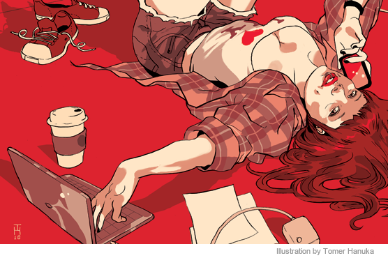
Tomer Hanuka: Sometimes I have to do forty to fifty sketches to get to the heart of the concept, but right after I read the story this image came to me, sort of the classic ‘50s pinup, very innocent in a way, but re-imagined as a modern technology vixen. It is sexy but also sort of conservative—there is something safe about the sexuality.
CJR: How so?
TH: Well, the sex is there to promote something else, rather than to promote the sexuality itself. She isn’t a hooker, you know? It’s sort of a wink, something kind of cute. Like getting excited at seeing someone’s knee when you are a Hasidic Jew. Pinups were the hardcore porn of the 50s, but now there is something naive and innocent about them.
CJR: When we got your sketches, all of us immediately assumed you were intentionally sending up the New York Times Magazine cover of the blogger Emily Gould, which is referenced in the article. But you were not familiar with that cover, right?
TH: Yeah, I was borderline offended when that was suggested. I’d never do that, just go to the source material and riff on it. The upside-down pinup is such a classic image, and when I went to see the Times cover it is obvious that that is what they had in mind, too, but they did a much more modern interpretation.
CJR: Originally, we had sent you a concept for an image of a young woman with her own image tattooed on her arm, as a way to illustrate the concept of personal brands. You gave us some sketches on that, but you also pushed this other idea—your own idea—that we ultimately embraced. How do you manage that give and take with editors and art directors in terms of whose concept wins out?
TH: That happens on every assignment. The editors and art directors don’t want you to be working in the dark, so they try to give you some guidance sometimes that guidance is spelling out the required image in detail. Which is great, but editors in particular tend to think more literal—I don’t mean that as an accusation; they are word people and deal in the specifics of language. My thought process is visual, and visual communication goes beyond language. I try always to lobby for my own ideas on any assignment, because if I can sell them on my ideas then most of the times the images turn out better.
CJR: Our stories can get pretty abstract. We are constantly amazed when an illustrator is able to absorb that abstraction and render it meaningfully as an image. Is that something that you enjoy, that challenge?
TH: That is the challenge I wake up to every day. Even if it isn’t an abstract piece, the challenge is to find the emotion, the spark of life, and let that guide my visual interpretation.
CJR: And what about color? Your work often uses such vibrant, bright colors.
TH: That’s my doomsday weapon.
CJR: What do you mean?
TH: Well, the drawing has to communicate, it has to tell the story, but the colors are what I turn to once the negotiations are over, my doomsday weapon. There is no sketch phase, no more revisions or other hands in the mix. The sketch is approved, the dust has settled, and I sit back and push the red button. Color is a very powerful thing, it can destroy the story or breathe life into it; it can establish the tone, the level of conflict, the time of day. Many times it feels like the coloring stage is when the job really starts. Up until then I was in the gym getting ready, rehearsing my lines.
CJR: So on this sketch, why did you choose these colors?
TH: I wanted something that was sort of hip and cool, a downtown sensibility. The pinup is such a throwback and something about the palette needed to push it into the present and beyond. On one hand we got the pose—a quote from a bygone century—now we need the color to create the paradox and say, in a way, here is this modern person doing something totally cheeky. Using dark reds and blacks, in a very limited way, I thought would evoke colors of a tattoo, but also a certain thriftiness, a minimalism that I think feels futuristic.
Brent Cunningham is CJR’s managing editor.