David McCandless worked for many years as a writer, but now he likes to call himself a data journalist and information designer. McCandless has never had any formal design training, which makes it all the more interesting that his Web site, Information is Beautiful, has become an influential destination for people interested in data visualizations. He recently published a book of his work, and also contributes to The Guardian’s Datablog.
McCandless marries raw data with design to create images that tell a story. And just as he—and the researcher he works with—puts a lot of thought and effort into the creation of his work, McCandless has also spent time creating mechanisms that enable him to update and correct his designs, share his source material, and encourage people to help him gather and verify data.
Ultimately, he says, the goal is to keep improving the work.
“It’s not just about correcting errors, but it’s also about enhancing and adding and building on [the images],” he says. “The better images are seen as living images, so they evolve over time.”
One of his most popular illustrations is “The Billion Dollar Gram,” which he created for his book and put online in August (for a closer look, click here and zoom in):
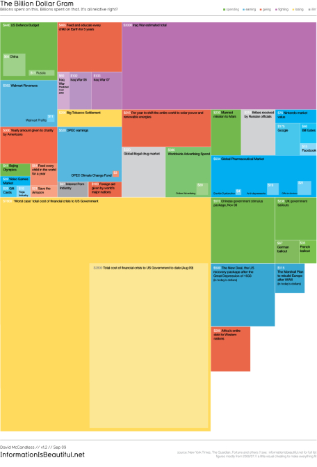
Aside from the striking visuals involved, the image is notable for the metadata McCandless includes at the bottom. Right next to his name is the kind of version number you’re used to seeing on a piece of software, “1.2.” Over to the right is a list of sources for the information, which includes several newspapers. The text also directs readers/viewers to his site for more information about the data. Curious readers can go to the site, pull up the post with the image, and follow a link to a Google Docs spreadsheet that itemizes all of the data he used and spells out where it came from.
One of the challenges of information design and data visualization is that there are two distinct areas where you can go wrong, which in turn can lead to a range of other errors. First, there’s the data itself. Is it the best available? Are the sources trustworthy? Data is the foundation, so a true visual journalist needs to apply a high level of verification to this element, or the visual display will only serve to call attention to his mistakes.
“As a general policy, we try to use online sources or citations because we’re sharing all the workings and sharing all research in Google Docs,” McCandless says. “We’ve kind of got this first-level rule that we have online links to all the resources and data sources. If we can’t do that, we get on the phone and we quote sources. It’s not ideal, but you can’t always find stuff online.”
And you can’t always get it right. McCandless recently issued a correction and apology for an image he produced about the CO2 emissions of the Icelandic volcano Eyjafjallajoekull.
“It’s the first time we’ve made a mistake on that scale and it was very upsetting, to be honest,” he says. “It’s not great getting things wrong—I hate it. But the really annoying thing is that the image went so far [around the Internet].”
Aside from the data, the design and presentation are the other major place where an image can go wrong. The data needs to be brought to life, but it also needs to be respected. Perhaps an image will be more pleasing to the eye with a nip here, a tuck there, or a slight skewing of the elements. The question is when those cheats become outright distortions.
“One of the unexpected things I’ve gotten [from all of the feedback on the site] is that audiences feel that data is sacrosanct and sacred,” McCandless says. “They won’t accept you doing journalistic tricks or adding little bit of fuzziness with the design or the headline to make it more interesting. They feel data is rigid and should never be played with.”
Take the Billion Dollar Gram as an example. On the image itself, McCandless included text near his sources to acknowledge “a little visual cheating to make everything fit.” That cheating involved small adjustments to the size of some of the dollar blocks, which means that, as one commenter noted, “The Walmart Profits and the Russian defence budget are about $11 [billion]. But one is clearly smaller than the other. What gives?”
Another commenter wrote that the image was “rubbish” because of the visual cheating. (Fifteen minutes later the same person posted another comment saying, “On reflection, ‘rubbish’ is a bit strong. Sorry.”)
Anyone who has ever picked up a copy of Harper’s and looked at their Index knows that data can be a powerful way to tell a story. As with the Billion Dollar Gram, the Index uses juxtaposition and comparison to send a message. When that message needs correcting or updating, McCandless benefits from the fact that his work is represented in a single image file.
Many argue that the proper netiquette for using an image is to download it from a Web site and then upload it to your own server, rather than simply inserting the image using the other site’s URL. (That’s what we did above.) But McCandless says he finds it easier to correct an image when people insert it on their sites without downloading it. That enables him to simply replace version 1.0 of the image with 1.1, and in the relevant metadata, and start serving up the corrected version all over the Web.
“If we issue a correction, anyone who had replicated the image and is hosting it off our server automatically changes [to the new version],” he says. “So we can continually change and edit images.”
McCandless also includes an element of crowdsourcing in his work. When he posts a new image on his site, he often includes a call to his readers for additional or corrected data, or other relevant information. (He also has a page where he asks people to help with specific projects.) The principle is that McCandless doesn’t publish once and then move on. His images are constantly evolving.
“I’m feel like I need other people’s help to sharpen up my work, and to bring in new information and to generally be involved in the creative process,” he says. “I don’t feel any article is necessarily ever finished, and I encourage people to contribute and to check my work.”
As far as images of journalism go, that’s a beautiful one.
Correction of the Week
In an embarrassing moment of Freudian word-vomit, we said in Tuesday’s lede that Kal Penn had been ARRESTED when the actor-turned-politico-turned-actor had actually been MUGGED (at least we got it right in the article’s body). Despite Kal’s close association with certain recreational drugs, we have no reason to believe that he is anything but an upstanding citizen. 1000 apologies. — The Huffington Post
Craig Silverman is currently BuzzFeed's media editor, and formerly a fellow at the Tow Center for Digital Journalism.