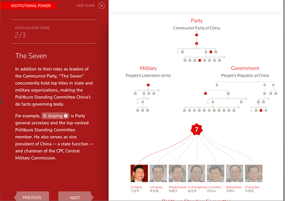
On February 28, while China’s leadership transition was underway, Connected China, a visualization application produced by Reuters, went online. Using a rich database of information about Chinese leaders and political institutions compiled by reporters, the app (optimized for the iPad but available through any browser that supports HTML5 and CSS3) illustrates the complexity of the government system and relationships between political powers in China.
The application has five major components: China 101, Social Power, Institutional Power, Career Comparison, and Feature Stories. Each of these sections helps shed light on the intricate political structure and underreported personal backgrounds of top Chinese government officials. Users can explore China’s political classes by clicking through Connected China’s bubbles, bars, and photos.
Over the course of about 18 months, a dozen bilingual reporters based in Hong Kong dug into government websites, government reports, policy papers, Mainland major publications, English news reporting, academic texts, and think-tank reports to build up the database.
According to Irene Jay Liu, the project director of Connected China and news and data editor at Reuters’s Hong Kong office, the reporters realized, over the course of their investigation, that it would be interesting and useful to focus the project on the interpersonal relationships among Chinese political leaders.
“At the very beginning, we didn’t know that we were to do a career path comparison,” said Liu. The team found, however, that they were able to collect information about individual leaders’ backgrounds, how they rose through various promotions, and the importance of their administrative levels in China.
“We knew that it was something that people would love to talk about anecdotally,” said Liu. “We finally figured that we could put some data behind it to give it more concrete visualization.”
Reuben Stern, print and graphics editor at Reynolds Journalism Institute’s Futures Lab, agrees. “The beautiful thing here is that the technology and database are making it possible to be able to present a clear understanding of complex relationships.”
The idea of building a database from daily reporting was crucial to the project.
“You write a story that captures only 10 to 20 percent of what you reported,” said Reg Chua, the chief editor of the Connected China project and data and innovation editor of Reuters. “All that work you have done is wasted. It’s in your head and it’s in your notebook but no one else can access it.”
Chua believes that it doesn’t have to be the case. “If we could capture the information in some structured way, not just keeping archives, not just digitizing your notebook, but finding a way to construct it as a database, we could use that information much more valuably for a much longer period of time.”
The project was developed hand in hand with the Boston-based design company, Fathom Information Design, led by prominent data visualization expert Ben Fry.
“Since we were doing something so new and different,” said Chua. “It made sense to go with one of the leading people in the field.”
The Reuters team provided the information and set priorities for what they wished to emphasize. The Fathom design team then pitched ideas back to the editorial team, which made the final visualization decisions.
“That’s a task that requires editorial judgment,” said Chua.
It also requires a unique team. In this case, its members skew very young; most of the eight reporters are recent journalism graduates who are adept at using data processing tools.
“They don’t have fixed notions of what journalism was, or what it should be. That was what allowed us to be creative, in terms of everything, from thinking of the data structure to what the final output would look like for the HTML5 application,” said Liu.
But Liu does not think that reporters have to be programmers or statisticians to be able to work on a project like this, or to be successful data journalists.
“All reporters need to know how to process data using widely available tools like Excel and Google Fusion Table, neither of which requires a PhD in computer science,” she said.
“People seem to be talking about data journalism as this separate entity that is new, exotic and specialized,” said Liu. “Is it that everyone has to become a data journalist? Or data is essentially part of the reality of journalism now? I would argue the latter.”
Yue Qiu and Wenxiong Zhang are students at the Columbia Graduate School of Journalism. In addition to an M.S. in journalism, Qiu is working on her MIA at Columbia University School of International and Public Affairs. She previously worked for China Daily and The New York Times Shanghai bureau. Her email is yq2154@columbia.edu. Zhang is perusing an M.A. in arts and culture reporting at Columbia Graduate School of Journalism. His email is wz2243@columbia.edu.