Data journalism and information visualization is a burgeoning field. Every week, Between the Spreadsheets will analyze, interrogate, and explore emerging work in this area. Between the Spreadsheets is brought to you by CJR and Columbia’s Tow Center for Digital Journalism.
On Sunday, Homicide Watch DC, close to the brink of closure, came back to life. The independent news source for murder coverage in the District of Columbia reached its Kickstarter goal of $40,000, allowing it to continue on as a student newsroom while founders Chris and Laura Amico head to Boston for Laura’s Nieman-Berkam fellowship.
Homicide Watch is an example of a handful of online endeavors that cover crime by combining data, social media, and traditional reporting. The Chicago Tribune is the latest publication to venture into this area with its recently launched crime news application. Tribune’s piece carves out an online space where big data, interactivity, and a carefully crafted design meet to efficiently deliver local crime information to readers.
It was the Tribune‘s metro editor who first pointed out that the high homicide rate in Chicago could be important news item for the apps team, the dedicated group of reporters and developers who build online news interactives. How to cover crime was something Tribune staffers were already thinking about, according to Joseph Germuska, a senior news app developer at the Tribune. At the same time, Chicago upped its commitment to making its data more accessible to the general public. “We were looking for a way to adapt and adjust to make sense of this data,” said Germuska.
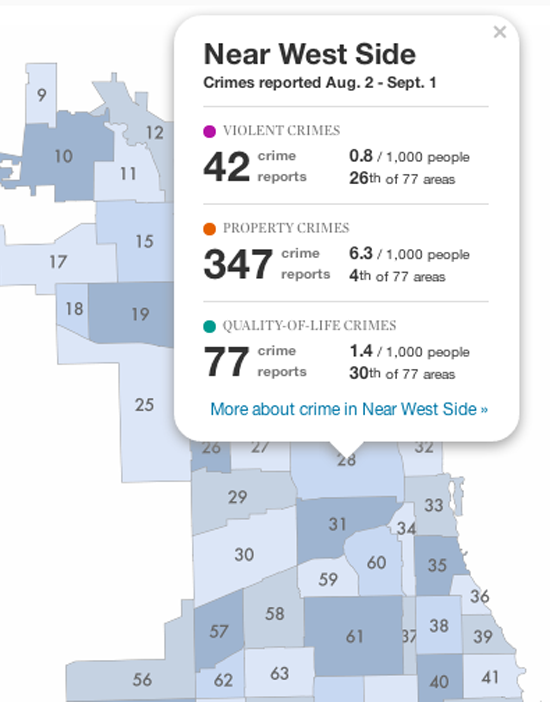
The Chicago Tribune wanted to link crime coverage to location it occurred to enable readers to see exactly where in their neighborhoods these crimes were occurring. The strongest feature of this map is the immediate sense it conveys of how many and what kinds of crime are happening in communities; something naturally of high interest to those communities’ members.
Germuska said that one of the inspirations for Chicago’s crime app was the Los Angeles Times‘s Homicide Report. Launched in 2007, the interactive map records all homicide victims reported by the Los Angeles County Coroner, then maps them across the county by geographical location and victim data. Chicago’s interactive map is broken down by community, which Germuska said made the most organizational sense to the app team.
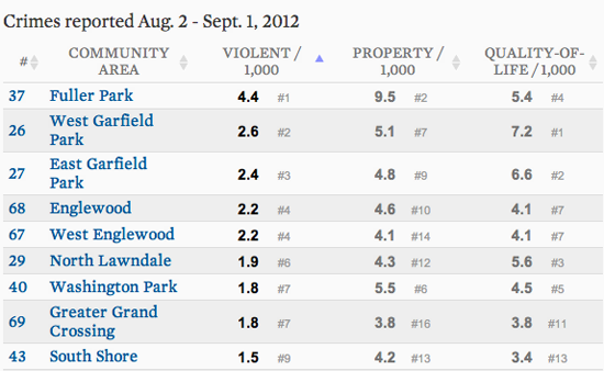
The app team then set to work planning the site and building out their design. The central question Germuska and his team wanted to address was, “How do we simplify a big table of numbers into an understandable format?” The team had numbers relating to different categories of crimes, across all 77 community areas of the city dating back to 2001. Germuska said they were also concerned with ensuring that any numbers they did display had the most impact and meaning for readers.
A table of crime reports from the most recent month runs along the left side of the map, broken down into three categories of crime: violent, property, and quality of life. The user can sort the table alphabetically or numerically by community area or by highest and lowest crime rates within the three categories:
If you click on one of the sections of the map, a more detailed table pops up, with statistics on crimes reported within that month along with context about how those numbers relate to population within the community. For even more detail, the user is able to click through to a dedicated page for each community area which pinpoints the crimes to their near-exact address. These pages have charts and figures about the crime rates that give the bigger picture about the crime rates:
Germuska said the Chicago Tribune would not have been able to embark on this project without the city’s database. Crime data is volatile; it changes as crimes are reclassified. If this project was produced with scraped data, Germuska said he doesn’t think it would be as authoritative.
The public data used to build the Tribune’s new site runs on Socrata, a company that provides platforms for open government data. Founded in 2007, its clients include the cities of New York, San Francisco, Austin, and Seattle. Chicago uses Socrata to power its data portal,which holds over 200 data sets ranging from crime statistics to food inspections and public school progress reports.
The Tribune’s map updates as new crimes are reported. The app team would like automate this process so that when the data held in the Socrata data portal refreshes, it pumps the new figures into the crime app. Currently, that process is not updating correctly, so the app team has to monitor updates.
Anna Codrea-Rado is a digital media associate at the Tow Center for Digital Journalism at the Columbia University Graduate School of Journalism. Follow her on Twitter @annacod.