In the week following the shooting of Michael Brown in Ferguson, MO, there were few notable data journalism approaches to the story, except for an impressive graphic from The Washington Post illuminating the racial differences between some cities’ populations and police forces. We honored that one in last week’s edition of Data Darts and Laurels. Since then, there have been several more examples of applying a numbers-based approach to Ferguson and the issues of law enforcement and racial disparities it illuminated.
We’ll start locally, looking at the St. Louis Post-Dispatch‘s attempt to answer the question, “Why did the Michael Brown shooting happen here?” The newspaper reported that area around where the shooting took place “accounted for 18 percent of all serious crimes reported between 2010 and August 2012,” based on a review of county crime data. The article also explores the city’s demographics and discrepancies–how 87 percent of all traffic stops in Ferguson in 2013 were of black drivers. (The city is about two-thirds black.) Used alone, the data in this story does not answer the article’s main question. Rather, the story’s success comes in how the reporters fuse the numbers with interviews with residents that shows how concentrated poverty and lack of community has caused problems in this part of the county. For combining statistics with on-the-ground storytelling, the Post-Dispatch gets a LAUREL.
With big news stories like the events in Ferguson, it’s become expected that there will be quantitative analysis of who is covering or following the issue. Pew Research Center did just that, analyzing, among other things, how the story has played out on Twitter. What’s clear from Pew’s piece is that Ferguson is a major topic of discussion there. In the eight days following the shooting, there were 10.6 million tweets about Ferguson, according to Pew. What is problematic is how Pew compares how Ferguson was tweeted to how the 2012 Trayvon Martin shooting was tweeted in the days following that incident. (There were 4.7 million tweets about that shooting in the entire month that followed it, according to Pew.) This comparison leaves us saying, “So what?” Is Pew implying that the Trayvon Martin story was less newsworthy than the Ferguson events? The disparity in tweets can come from any number of reasons. Pew acknowledges that there are more people tweeting actively now than in 2012, but there also could be many other factors at play in the large volume of #Ferguson tweets. On its own, the look at Twitter volume by news story is compelling, but for using it in a faulty comparison, Pew gets a DART.
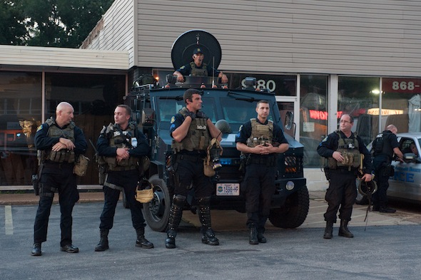
The New York Times gets a LAUREL for mapping a Department of Defense program that provides military surplus gear to local police departments around the United States. While the map doesn’t truly give its visitors the ability to visualize trends, other than there’s a lot of military equipment in law enforcement hands, it’s an awfully compelling way to show what’s in police arsenals locally and nationally. It also helps that the graphic wasn’t created in a vacuum but was accompanied by a story that explored whether militarizing police is a good thing.
Both FiveThirtyEight and The Washington Post’s blog The Fix tried to examine why it’s hard to pin down how many people police in the US kill every year. As FiveThirtyEight’s Reuben Fischer-Baum notes:
Some reporting has put forward one of the only figures available: the approximately 400 “justifiable police homicides” each year since 2008, according to the FBI’s annual Supplementary Homicide Report (SHR). … And there’s no governmental effort at all to record the number of unjustifiable homicides by police. If Brown’s homicide is found to be unjustifiable, it won’t show up in these statistics.
The Fix story starts out with a similar premise, noting that the FBI’s data has only two relevant data points: “The number of people killed by police in justifiable action, and the weapon used in the homicide.”
The two pieces soon diverge. The Fix explores the FBI’s “justifiable police homicide” data and includes a series of charts showing how such killings have changed over time and comparing these to, among other things, the number of total police in the country. But as the author himself notes, it’s hard to draw conclusions from the data, because the statistics are “volatile.” Maybe given meaningful conclusions were such a stretch, The Fix should have either axed the piece before publication or simply focused on the flaws of the original data. The blog gets a DART for trying to force meaning out of inadequate data.
FiveThirtyEight’s approach to police-caused homicides is much better. Fischer-Baum explains why the FBI’s numbers aren’t enough to analyze police-involved deaths. Among the reasons: not all law enforcement agencies report numbers, statistics aren’t reported until a case is considered closed, killings in federal jurisdictions are excluded and “unjustifiable homicide by police” isn’t even a classification. This piece shows that some of the most compelling data journalism is explaining why sometimes the data just doesn’t exist. For the thoughtful critique of the FBI’s data keeping, Fischer-Baum gets a LAUREL.
Tanveer Ali is a Chicago-based journalist who is DNAinfo.com Chicago’s data reporter and social media producer. He has reported for the Chicago News Cooperative, WBEZ, and GOOD Magazine, among others. A former staff writer at the Detroit News, he received a master’s in journalism from the Medill School of Journalism.