Data journalism and information visualization is a burgeoning field. Every week, Between the Spreadsheets will analyze, interrogate, and explore emerging work in this area. Between the Spreadsheets is brought to you by CJR and Columbia’s Tow Center for Digital Journalism.
New York schools broke a record this week. Over 200 of them are at risk of closure because they failed their annual progress reports. News outlets large and small covered the story. The Queens Courier, for example, took the local angle, pointing out that its borough’s schools were the highest-performing. Courier gets an A for effort, but its data presentation barely earns a D.
Courier is but one example of how local media are missing a trick in terms of their data journalism. Granted, producing the types of graphics and interactive news features the bigger media organizations are doing is costly, time consuming, and requires a degree of technical skill. But annual city school progress reports provide the perfect opportunity to create a simple yet detailed visualization of that data. At the very least, a simple table with all Queens schools, ranked by grade, would have been a welcome addition to the story. Instead, Courier wrote a straight article that laid out the facts: 217 New York City schools’ reports showed “dismal grades,” though “Queens emerged as the highest performing borough.”
The New York Daily News didn’t fare much better. Readers can either follow the link to NYC’s Department of Education’s report or check a PDF embedded at the bottom of the article. Both resources are long, difficult to search, and, quite frankly, dull. And these days, the availability of free and easy-to-use data visualization tools makes it almost inexcusable for these outlets not to at least attempt to create a visual illustration when a story cries out for one.
Courier could have done something very simple to improve this piece. In the first instance, because the story was so well covered elsewhere, there’s a strong case for them to not to have devoted reporting resources to covering it themselves. A simple link to a story explaining the background would have sufficed. In the time that would’ve freed up, reporters could have taken the data and put it into a simple Google Fusion Table. Google Fusion Tables are free software made by Google that allow users to create simple visualizations such as maps, charts and tables. Newsrooms including the WNYC, the Guardian, and Mother Jones use the tool.
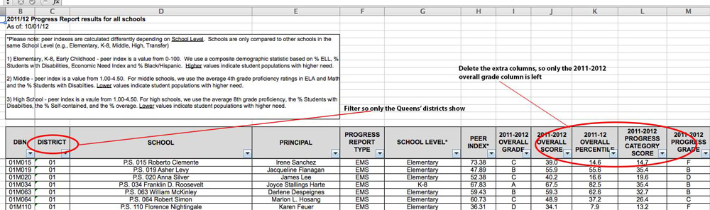
The data is from the report is available here. It’s easily downloadable as an Excel spreadsheet. Sort and filter it to show only Queens schools. Remove the unnecessary columns so the spreadsheet simply contains the school name, principal, district number, and the overall grade awarded in the progress report:
Copy and paste the information from the Excel file into a Google spreadsheet. Then create a Google Fusion table using the data from the Google spreadsheet:
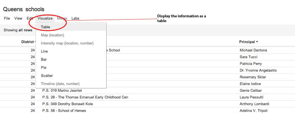
And create a nicely formatted, interactive display of the information:
This is a basic first step, one that can be added to fairly easily. From this foundation, a search function can be added, for example, making it that much easier for concerned parents to find their child’s school in the table. With a little more technical knowledge, the data can be combined with geographical information to create a map, giving readers even more visual information.
Even more advanced would be to delve even further into the analytics. Merge in more data and try to figure out patterns. The NYC Data Mine—an open, free source—holds demographic data about school districts. If reporters had more time, they could look at demographic data about the districts and draw colorations between that information and the performances of the schools in those districts.
Local news outlets might not have the capacity or budget for extensive data journalism projects, but making simple tables to display content of such high value to their readers is still possible — and it should be a high priority.
Anna Codrea-Rado is a digital media associate at the Tow Center for Digital Journalism at the Columbia University Graduate School of Journalism. Follow her on Twitter @annacod.