Data journalism and information visualization is a burgeoning field. Every week, Between the Spreadsheets will analyze, interrogate, and explore emerging work in this area. Between the Spreadsheets is brought to you by CJR and Columbia’s Tow Center for Digital Journalism.
When it comes to numbers, sometimes less is more. Peter Ørntoft’s data project for the Danish Design School — which recently won an Information is Beautiful award — doesn’t have much data on display, but its visual impact is bountiful. By selecting a choice few figures to illustrate his findings, he creates much more punch than by dumping all the information available and leaving it up to the reader to make head or tail of it.
A keen design eye goes a long way when visualizing data. Ørntoft’s piece was intended to be displayed in print form, but data journalism need not be relegated solely to the darkest corners of the Internet. In fact, infographics intended for print publication can inspire all kinds of data journalism projects. As this piece shows, approaching the visualization of data from a print design angle makes for an aesthetically appealing result. Data journalism doesn’t have to be a thing of beauty, but if it is, the point it makes tends to stick better.
The project uses data on what Danish people think about various social issues. Its strength is its integration of graphical elements with photography; it draws from an established visual literacy associated with photographs. The rule of thirds — a compositional principle that says images divided into three clear sections are easier to interpret — is apparent. There are three vertical sections, two grey spaces framing each side of the central element of the woman in the headscarf. There is also color-blocking; against a neutral background there are accents of primary colors which stand out and draw the eye to them, helping the viewer see that the action of this piece is happening in its center.
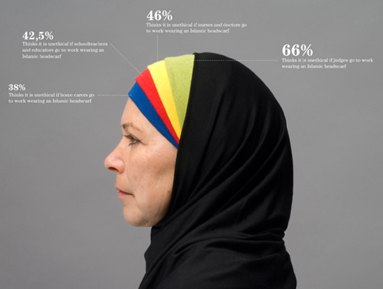
This piece is a prime candidate for the theory that behind every great visualization is a simple chart. The headscarf piece isn’t just a well-composed photograph — it’s also a bar graph. Ørntoft seamlessly meshed it into his design by letting the strong visuals lead the piece while also ensuring those visuals were rooted in the context of the numbers they represent. By structuring the composition in a geometric and graphical style, the reader is reminded that at its core, this is a data story.
The piece that won the Information is beautiful award is a one photograph of a series. This format of a collection of images gives a nod to a well-established photography trope: the photo essay. In this case, its use creates a narrative. Ørntoft paints a bigger picture by showing the reader a selection of specific examples. Displaying the information like this also creates some breathing room; space to digest what is on display. On the whole, white space is used generously in this piece. The numbers stand out against a neutral background, giving them more punch and increasing the chance that the reader will actually absorb their meaning.
The numbers behind this piece came from an opinion poll carried out by a Danish consulting firm. This wasn’t an exercise in data journalism, but rather in art infographics, so while the design is superior, source verification isn’t a given. That said, independent or commissioned data collection is a practice it would behoove media outlets to implement. Data can be political not only when it deals with partisan subjects, but also in its acquisition.
Those who collect data—be it social advocacy groups or government bodies—have agendas they bring into their work. Were a media outlet to conduct its own opinion polls, for example, it would end up producing a graphic with solid statistics. Pair that with a design that has the visual impact of Ørntoft’s series, and that’s an award-winning combination.
Anna Codrea-Rado is a digital media associate at the Tow Center for Digital Journalism at the Columbia University Graduate School of Journalism. Follow her on Twitter @annacod.