The papers are filled with charts illustrating Monday’s big rebound in the stock market. But what we really need these days are some easy-to-grasp indicators of whether it’s been a good day or a bad day in the bond markets.
As we’ve said before, it’s not like we really want to learn the ins-and-outs of the fixed-income business. But events keep conspiring to force these lessons on us. It was the bond market that went bonkers first, back in the spring of 2007, long before the much-smaller stock market. And now, again, it’s debt that’s the driving force in the global financial story.
But the tools that readers have to understand the bond market just don’t seem to be up to the job.
Just look at the NYT’s Economix blog, which pulls in a few heavy hitters to answer questions about the Greek debt crisis and what it means for the rest of us. There’s some nice patient explaining here. But check out those charts, on the bottom right of the page. Yeah, down there.
They’re calmly labeled Credit Crisis Indicators and, to the untrained eye, they don’t reveal anything that looks like a crisis. You can click right through them—Treasuries, Libor, Ted Spread, Commercial Paper and High-Yield Bonds.
Oh, let’s just take a look.
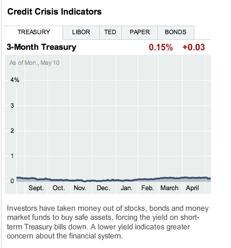
Does that send a shiver up your spine? Me neither.
Maybe Libor.
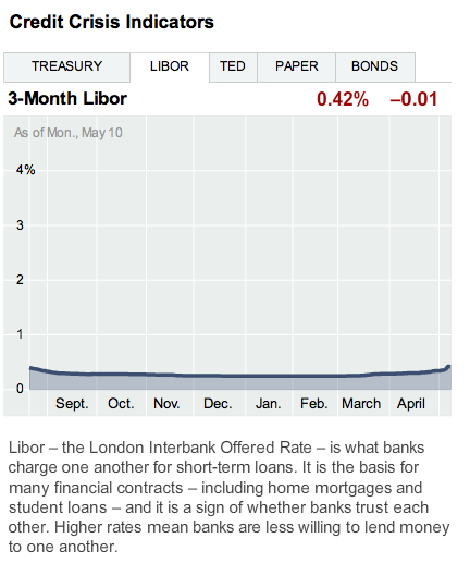
Hmm. I’m still not quite getting it.
Ted Spread, are you there?
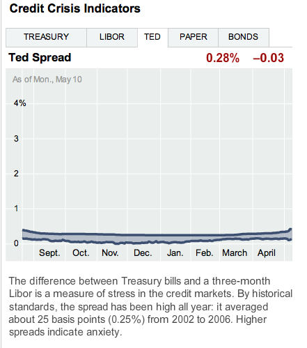
Somehow, they’re just not doing it for me.
We’ve been trained by the Dow and the S&P. It’s red and green, winners and losers, arrows that go up and down, the popular symbols of all things economic. They’re not perfect, and there’s a lot that they don’t tell, but these images do get people engaged in financial questions.
It’s not just stock charts that zig and zag that way. A bit higher on that Economix page is a nice set of Economic Indicators that also dance around. Existing home prices. Industrial production. Consumer borrowing. They’re bouncing all over the place.
We need that kind of action to know that something is going on. And it’s not impossible to show some movement with bond charts. The Times has done it before, on interest rate spreads in Europe.
This beauty from Seeking Alpha takes us to the land where Ted spreads mix with the Vix (as in Volatility Index).
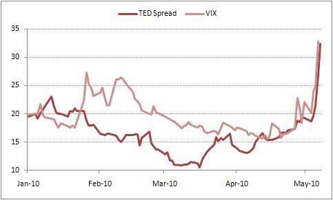
OK. That’s probably taking things a bit too far. But it shows that you can convey a lot more if you just zoom it in a bit, and play with that vertical axis.
This isn’t to say it’s a good thing that we live in a world in which us ordinary folk need to know what the Ted spread is.
But these charts can no longer be tucked away near the bottom of the page, hanging out all flat and lazy. They need to step up to the primetime role they’re playing. Come on, give us a Libor chart worth looking at!
Holly Yeager is CJR’s Peterson Fellow, covering fiscal and economic policy. She is based in Washington and reachable at holly.yeager@gmail.com.