Their content itself is vastly–vastly–different. But, online, it’s becoming increasingly difficult to tell the difference between cable TV outlets…and their print–paper, mag, blog–counterparts. Conventional wisdom about Intuitive and Yet Compelling Web Site Design has, it seems, coalesced to the point at which, save for the site’s individual branding (CW: site logo should be located on the top of the page), and its individual color choices (CW: sites can choose among a wide array of Soothing Blue shades for their sans serif)…a Web site is a Web site is a Web site.
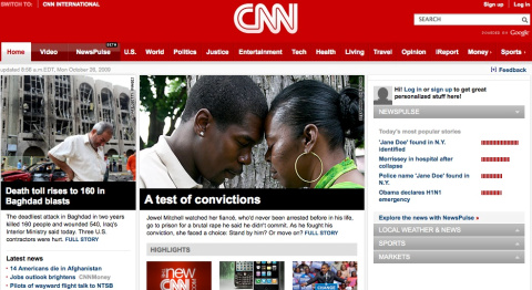
Today, the worlds of television and print find another place to live together in online harmony: CNN has launched a redesign of CNN.com. And the new site follows the CW to a tee: breaking news stories on the left, ‘highlighted’ stories in the middle, customized content on the right sidebar, etc.
The site, ReadWriteWeb notes, is emphasizing video integration–video courtesy of academically-inclined idea-monger TED, through a just-announced partnership…and video gathered by CNN. One sign, anyway, that the site has its roots in cable TV news.
Megan Garber is an assistant editor at the Nieman Journalism Lab at Harvard University. She was formerly a CJR staff writer.