Atlantic correspondent Richard Florida put up a post yesterday, drawing on data collected and initially mapped by ProPublica, that purports to track the geographic distribution of bailout funds. As Matt Yglesias notes on his blog, this attempt to connect dollars to places produces some not-very-enlightening results, because in the underlying data, the headquarters of companies that received funds are treated as the physical destination of government money.
I’m looking at this map and I’m learning that New York and North Carolina are both places where large banks have their headquarters, and also that a chunk of TARP money was sent to car companies. But this is really stuff we knew before… Whether you like or loathe the government’s approach to those institutions, it doesn’t make a ton of sense to characterize funds going to these firms as ‘going to New York.’ The firms have a national and global presence.
Yglesias has appropriately updated his original post to make it clear that Florida bears the brunt of the blame here. ProPublica’s idea to “map” the bailout probably wasn’t the best, but the main purpose of their feature was to present data about the flow of bailout funds. Florida has seized on the peripheral map concept and, with help from two colleagues, expanded upon it to create images that show “the geography of bailout funding per person” and also “the geography of the bailout as a percent of state economic output.” Normally, taking this next step—breaking the data down on a per-capita basis, or as a share of gross state product—would make sense. But in this case, it simply provides a patina of sophistication atop a flawed concept.
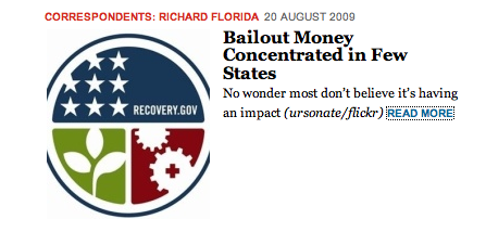
But there’s another problem here, which is that there’s another, entirely separate big government expenditure program for which geographical breakdowns are appropriate—the stimulus. There’s a natural tendency on the part of the public to view the stimulus and TARP as one hazily-defined program, and journalists should be pushing back against that inclination. Florida’s post has the opposite effect. In fact, according to a correction appended to the post, his item was originally headlined “The Stimulus Maps.” (ProPublica apparently pointed out the error.) And, as recently as this afternoon, The Atlantic’s home page featured a link to his post that, misleadingly, included a thumbnail of the official “Recovery” logo, which the government uses to promote stimulus efforts:

Fortunately, judging by the comments to Florida’s post, most of The Atlantic’s readers seem not to be confused. As “Aaron” wrote shortly before 3:30 today: “It would appear that most of the comments realize that this map is unsurprising, misleading, and -frankly- irrelevant.”

