Journalist and designer David McCandless gave an inspiring TED talk last month, just posted online last week. In it, he shows off some of his favorite visualizations of data and explains why visualization is increasingly vital, the more information we as media consumers are exposed to. He says,
“It feels like we’re all suffering from information overload, or data glut. And the good news is there might be an easy solution to that, and that’s using our eyes more. So visualizing information, so that we can see the patterns and connections that matter, and then designing that information so it makes more sense, or it tells a story, or allows us to focus only on the information that’s important…. Visualizing information like this is a form of knowledge compression. It’s a way of squeezing an enormous amount of information and understanding into a small space.”
Numbers, for instance. News readers are bombarded with numbers all the time—millions, billions, trillions. Can we absorb what they actually mean? Some numbers simply don’t make any sense without our being able to visualize and contextualize them.
For one particularly illustrative project, “The Billion Dollar-o-Gram,” McCandless input large numbers from news articles about money and budgets and wrangled them into color-coded boxes. In the figure below, purple boxes represent money designated for “fighting,” red is “giving money away,” and green is “profiteering.”
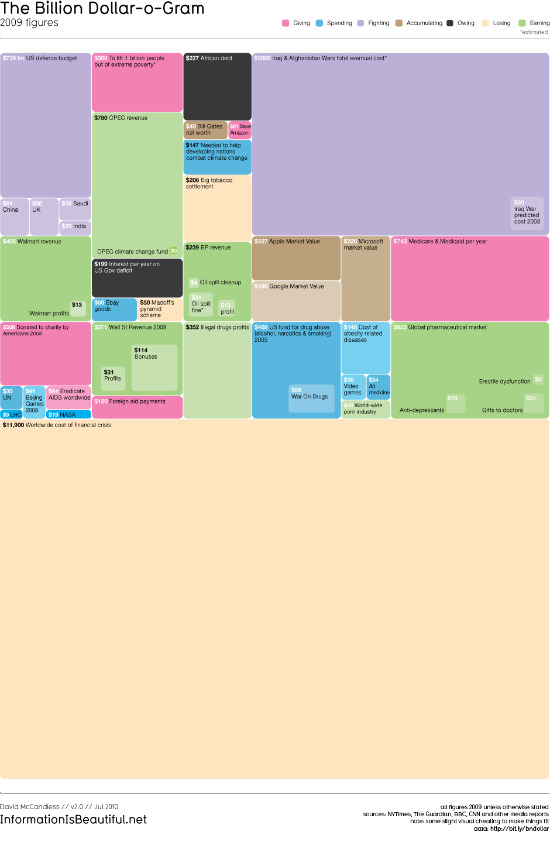
Patterns and story ideas begin to emerge when data is put side to side like this. Some things jump out right away. See the biggest purple box, on the upper right hand side? The tiny square within the rectangle is what the Iraq War was predicted to cost back in 2003 ($60 billion). The huge rectangle surrounding it is what the Afghanistan and Iraq wars will actually cost in total ($3,000 billion, or $3 trillion. [He lists his sources here.])
Oh, and the tan wasteland below all those tiles—that’s the global cost of the financial crisis. Puts things into perspective, doesn’t it?
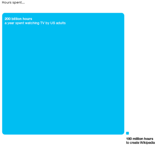
Even the visualization of two numbers side to side can be extremely helpful when the numbers are quite large. For instance, McCandless was struck by Clay Shirky’s theory of cognitive surplus, “the idea of spare brainpower of the world’s collective mind just sitting there waiting, wanting, to be harnessed,” and one statistic just begged to be illustrated:
McCandless does some sharp media criticism, finding patterns just by tracking the frequency with which some topics are covered in the news. For his “Mountains Out of Molehills” visualization, below, he charts “the world’s fears, a timeline of global media panic,” from SARS (orange) to bird flu (yellow) to swine flu (bright pink, all the way to the right).
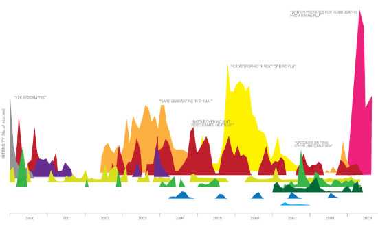
Other fears include violence in video games, the “millennium bug,” and killer wasps. If this is a graph of our greatest-hyped fears, it’s interesting to see, as he points out in his talk, the gap towards the left. The gap begins in September 2001, “when we had something very real to be scared about.”
When confronted with a glut of information, especially in the news, we tend to look for filters that can help us answer the questions, “Should I believe this?” and “Why should I care?” Many of McCandless’ visualizations seek to answer those questions in tiny ways. For instance, after seeing an enormous amount of news coverage about risky side-effects of the new HPV vaccine, McCandless was able to debunk it with a simple series of circles showing just how infrequent such medical complications are. Similarly, these graphs measuring the accuracy of pre-election polling in UK general elections might change your mind about how much weight to give poll numbers you see in the future.
The visualizations I like best are ones that show that you don’t have to use a traditional straight-X-Y-axis graph to create a picture that makes sense. McCandless created this elegant diagram, “Time travel in popular film and tv,” color-coded by method of time travel (alien technology, force of nature, time machine, deep freeze…). Each jump in time is plotted against a wavy yellow line representing time, 800 A.D. to 4000 A.D. You’ll have to click here to be able to read it, but here’s a glimpse:
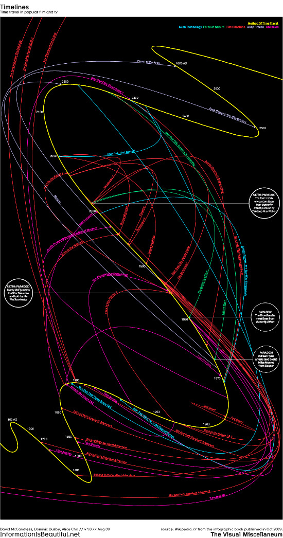
(Together with The Guardian website, he also crowdsourced the data to create another similar graph of the time travelling adventures of the television character Dr. Who.)
As McCandless’ talk emphasizes, there is just an unprecedented amount of data on the Internet, waiting to be scooped up and scanned for patterns and stories. He’s certainly found some interesting visual stories to tell. For instance, he mined 10,000 Facebook status updates to map the most popular days and months for couples to break up (Mondays, April). He Googled statistics about plane crashes to show how passengers can try to increase their luck (sit in the back, don’t fly in August). Data is “a fertile, creative medium” for journalists, which we can “irrigate with networks and connectivity,” he says. “Data is the new soil.”
Most exciting for me, someone who barely knows how to create a new blog post, is the part towards the middle of the talk when McCandless talks about all he’s been able to accomplish despite his relative lack of experience. He’s never been to design school, was a writer for most of his career, and only recently taught himself programming through trial and error. He says it was easier than he expected, that years of exposure to visual media “had instilled a kind of dormant design literacy” in him that he could instinctively draw on. He assures us that he’s not alone on that, either.
Feeling inspired? I spoke a few weeks ago with Chris Wilson and David Plotz from Slate about how easy it is to learn a few basics of computer programming and data-mining. Before you design a solid data visualization, you have to have the data. Wilson recommended starting with simple tools like screen-scraper, which automates the otherwise tedious copying and pasting of data from online sites. The Q&A is in two parts, here and here.
In the meantime, go on over to McCandless’ site, Information is Beautiful, and explore some more of his projects. Be prepared to lose a few hours out of your day, though. (I did.)
(h/t Nieman Lab’s Twitter and Flowing Data.)
Lauren Kirchner is a freelance writer covering digital security for CJR. Find her on Twitter at @lkirchner