Earlier this week I did a quick rundown of some eye-catching interactive graphics that newsrooms at papers like The New York Times and The Wall Street Journal rolled out for Election Day. It would be unfair, though, to only focus on heavy-hitting sites that have dedicated interactive staff for such time-consuming projects. Across the country, smaller-circulation newspapers had to make the same decisions about how to visualize the data coming in on Election Night, but they had to make those decisions with far fewer resources. I believe the Times newsroom has at least two dozen people working full time on interactive projects; many smaller papers might be lucky to have a handful of people who know Flash.
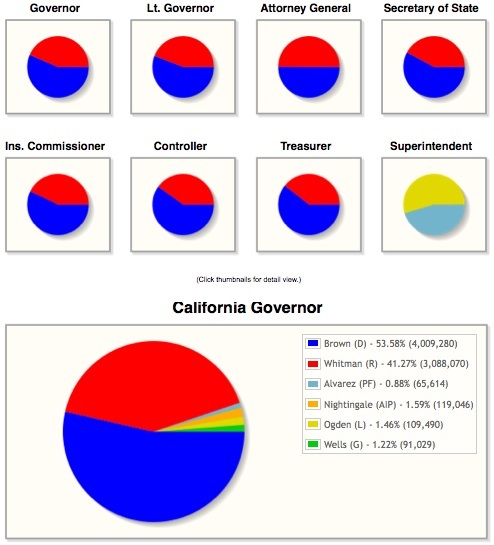
Even if newsrooms have graphic artists working on election-result maps for the papers’ print versions, many do not necessarily allocate the same level of staff time to online displays. For instance, the San Jose Mercury News published several detailed maps in Wednesday’s print edition, but those maps did not appear online. Instead, MercuryNews.com displayed some simple pie charts, like these, showing the results of eight statewide races.
Karl Kahler, national/graphics editor at the News, explained that in his newsroom, the graphic design decisions are still made relatively separately for the print and online sides, although he is the first to say that integration would be a good idea. On Tuesday evening, his graphics team was mostly concerned with completing the maps for the next day’s print issue. They had to scramble to fill in all of the information as the poll numbers were announced.
In an interview on Wednesday, Kahler recalled a conversation he had with a New York Times online editor a few years ago: “I asked him, ‘How the heck do you put out so many data-rich projects on election night?’ He said, ‘Well, you get your data people to automate the process, import the data, and set it up ahead of time so it’s more or less automatic…. You’ve got to talk to your tech people.’” To which Kahler laughed, “We don’t have those people anymore!”
Layoffs and staff turnover are obstacles to time-consuming interactive projects, obviously. James Meek is the only programmer working at The News Journal in Wilmington, Delaware, though there are about thirty people in the Journal newsroom. He and his editors decided a few years ago that Google Maps would be their go-to platform for their interactive projects, because it’s free and relatively easy to use. Here’s the simple map he developed to let readers look up the candidates in local elections:
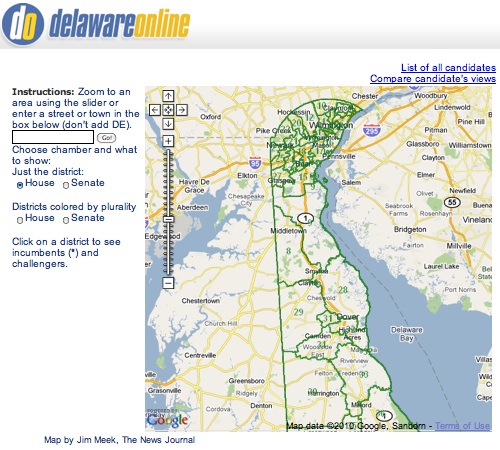
As friendly as the Google Maps interface is, making alterations to certain programs with Javascript is not something one can necessarily learn in a day, Meek said. He taught himself about GIS mapping technology about five years ago when working on a hobby website of his own, and then started incorporating some of that knowledge into his daily work at the Journal. “This is not something that a totally novice amateur would start without some detailed training,” said Meek. “They could, but they’d have to want to, and people in the newsroom like the reporter sitting next to me is really busy doing interviews and writing, which she does extremely well, but she doesn’t have time to learn.”
Because of similar staff and time constraints, surely, some other news sites didn’t bother with any visual illustrations for their election coverage; they simply cut and pasted the election returns into text posts or spreadsheets, or just jazzed them up with colors and things. Some sites pasted a static graphic made for print into their online coverage. Still others built simple tools to help voters search for specific local results. Here’s one such simple tool, from the website of The Advocate in Stamford, Conn., a Hearst newspaper:
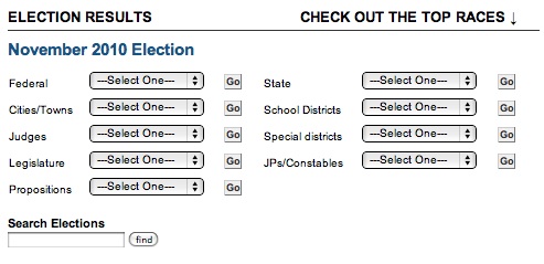
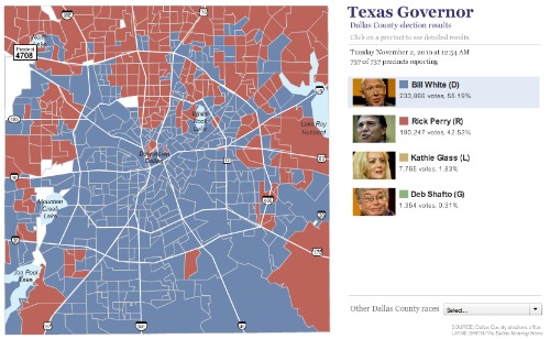
Search gizmos like that are easy for web programmers to put online, and they are helpful for readers who want to zero in on specific races quickly without having to scroll through extraneous information. What they don’t provide, though, is the big picture. They don’t tell a visual story, they don’t show geographic trends. For that, the best choice is a clickable Flash map that includes voting information, ideally divided by county. This one showing Dallas county results for the Texas gubernatorial race, on The Dallas Morning News website, is a good example:
The St. Petersburg Times editors decided to take advantage of the AP’s interactive national map for their TampaBay.com site, as many other news sites did. But they also put web editor and designer Darla Cameron to work making a map of Florida results by county to accompany it. The AP map gets the job done for the national races, and then the custom map made by the Times gives readers a reason to come to the website for more specific, local information. That map, below, went up on Election Night as the results came in; another precinct-by-precinct map went up late on Wednesday that tempted readers to “See how your neighbors voted.”
Cameron described the Times as “a big politics paper,” noting that the capitol bureau teamed up with the Miami Herald and PolitiFact Florida to deliver a complete political package. “[O]ur readers expect statewide politics coverage. The maps are just one local element to that whole package,” she explained.
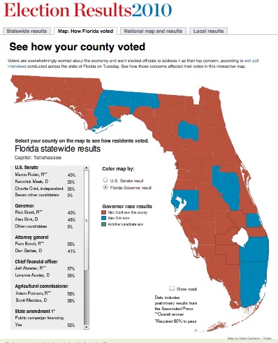
As big as the newsroom is, in terms of reporters and editors, the Times does not have that many programmer/developers, Cameron said. She was the only person coordinating the online election presence for graphics on Tuesday night. Luckily, she has a lot of experience working with GIS and mapping programs, and has already developed a lot of maps for the site in years past.
The key, Cameron said, is to plan ahead (as Kahler’s friend at the Times said, “set it up ahead of time.”) In her case, she has been talking to the county election officers for a few months about how and when the data would come out on Election Night. She got “zeroed-out versions” of the datasets from them, so she could set up a program to populate the map with the information quickly when it came in. That way, as the results were posted, she could feed the data into her map with the click of a mouse.
The Providence Journal’s Rhode Island election results map on ProJo.com was set up ahead of time, too, but designer Timothy Barmann took it one step further, and automated the entire process. For a few months leading up to November 2, Barmann, the only programmer on the news staff at the Journal, worked on and off experimenting with the open-source mapping program QGIS, custom-writing the Javascript to assign colors for the different candidates and making slight adjustments where necessary.
“As the election results were coming in, we had arranged ahead of time to have a feed that was coming in from the [Rhode Island] Board of Elections every five minutes, and so I had a process that would go out, grab that feed, and put it on our server,” Barmann said. “And then our page is automatically refreshed every five minutes anyway, so it would re-draw the map and fill in the colors based on the newest data.” It was the first election that Barmann and his colleagues had ever tried anything like that, but it worked.
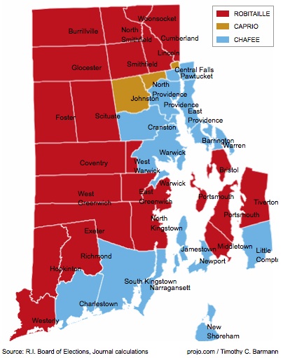
It’s worth noting that Barmann, like most reporter-programmers, is mainly self-taught. He worked at the Journal as a photographer and then a reporter for twenty years before taking on the new challenge of programming and design work for ProJo.com. He used online resources like the IRE website and its NICAR mailing list to glean the basics, and then worked through projects by trial and error. Barmann is the only person in the newsroom working on projects like these right now, so he stays busy.*
Barmann said that maps in particular are vital to election coverage. He pointed out that Lincoln Chafee, the independent candidate who won the governorship, actually won far fewer towns than his Republican opponent, John Robitaille. Chafee (represented by blue) won the more populous cities and the coastal towns, which tend to be wealthier, while Robitaille won the lower-income and more rural areas.
“Just by glancing at this map, you can see that, whereas, if you had a table or some charts it would be much harder to come to that conclusion,” said Barmann. “In this particular case, it’s just a wonderful way to tell a story.”
Darla Cameron of the St. Petersburg Times echoed that sentiment yesterday. “Yes, I think if you can look at something like this geographically, you might as well,” she said, and then laughed. “Although, that might not be the most astute thing to say. I’m pretty tired right now.”
*[Update: This sentence previously made reference to some reassignments of the newspaper’s graphic arts staff; however, these are irrelevant to Barmann’s work on this project. The reference has been removed, and the sentence has been altered to be more clear.
Lauren Kirchner is a freelance writer covering digital security for CJR. Find her on Twitter at @lkirchner