AOL’s Patch Media launched its 100th hyperlocal news site last week in Morristown, New Jersey, and is apparently planning on quintupling in size by the end of the year. This week, older Patch sites that were launched under the original design will also all transition into a cleaner, more colorful format.
In previous posts, I’ve tried to distinguish between a news Web site’s financial sustainability and its journalistic merit. Now I’d also like to draw a distinction between the visual appeal of a site’s design and its journalistic ethics. No one likes a cluttered Web site. But sometimes a site can be too clean, lumping its content together in an effort to streamline—but blurring some journalistic lines in the process. Patch’s new design is a good example.
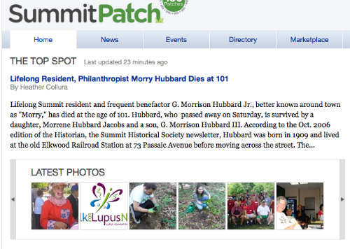
Here’s the old version, as seen on the Summit, N.J. site on Tuesday. There is only one main story featured on top, with a slideshow of random photos below. (Note: this cropped image only shows the upper left corner of the page.)
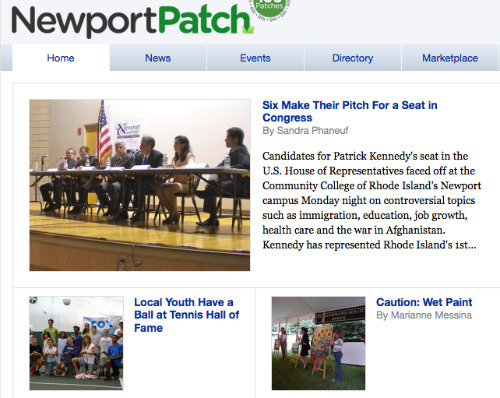
Below is what the new sites will look like: the 2.0 design, as seen on the Newport, R.I. site. There are now three main stories, which makes more sense and looks a lot better. Each story on the home page is accompanied by a photo, so the site looks more vibrant and less list-y.
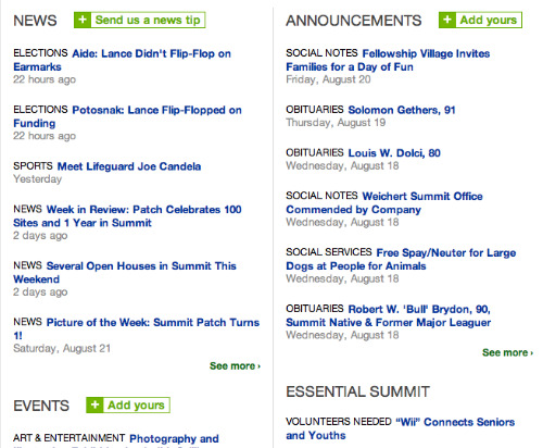
The problem with the new design, though, is what’s below the featured stories, in the lists of stories toward the middle of the page. Under the old design, the News and Announcement items were in separate columns. Practical, if a bit clunky-looking:
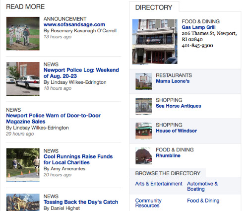
As of Wednesday, though, all Patch sites are rumored to have their News and Announcements combined into one section. Announcements will have bylines, just like the other articles written by Patch editors and paid writers. As you can see, the Announcements populate the site alongside the news articles. Readers would not necessarily know by looking at this list that the announcements have gone up to the site unedited and unapproved. (Although the contributor below happened to title her announcement with the name of the blog she is promoting, which is a clue, I guess.)
As I found by trying the site out, it’s very easy to create a login, sign in, and post an announcement:
“Tell us about a wedding, school award, volunteer opportunity, or anything else you’d like to announce to the community. Complement your announcement with photos and videos, then send it out to your friends and family.”
When you post, the page offers a link to their “terms of use” and reminds you that announcements are not meant to be used for advertisements. But there’s no stopping you from posting anything you want, as the system is not moderated. Local editors are not notified when new content goes up on their sites, but they have the authority to take things down if necessary. But Patch editors are busy people, and there’s no guarantee that they’ll be able to catch everything in a timely manner.
Anyone familiar with a typical news site’s comments section will understand why this is potentially problematic. Readers can post anything from a racist screed to a nude picture, and it will be up on the site until an editor catches and deletes it. Or, more subtly, above an editor’s non-partisan voter guide to an upcoming local election, someone could post an announcement that says “Vote for Candidate A” or “Candidate B is Scum.”
Does a small-town news website have to be written top to bottom by some brat with a journalism school degree? Absolutely not. Feedback and self-publication features are hugely important for getting readers involved and engaged with their local news sites. Patch is right to solicit and publish announcements, photos, and videos—as long as they aren’t blatant self-promotions. And with only one full-time person on staff per local site, Patch editors need all the help they can get in generating content (as thin and brief as reader-generated content will tend to be).
The downside is that this material goes up online automatically, without editing or moderation. That’s problematic already, but the redesign makes it worse, by making it harder for the reader to know what content has been vetted and what has not. If the content is not going to be moderated and pre-approved, it should at least be put in a separate box and formatted slightly differently. That way, readers know what they’re getting, and the writers’ original reporting won’t get diluted and lost in the glut. Original content is what keeps people coming back, right?
News editors and Web developers have a lot of factors to take into consideration when designing an appealing news site. I’ll add one more thing for them to worry about: a site redesign that makes your Web site more “clean” can have the unintended side effect of making your content quite journalistically murky.
Lauren Kirchner is a freelance writer covering digital security for CJR. Find her on Twitter at @lkirchner