In anticipation of the midterm elections, Yahoo created an interactive project called Ask America, part of which is the “Issues Wheel,” a method of measuring popular opinion on key political issues. “LEARN. LISTEN. BE HEARD,” declares the home page. As fun and tactile as the Wheel is, the clickable question-answer format inevitably presents the same problems one sees with any online “poll.” As CJR’s Joel Meares wrote in September,
There is also the inherent risk that Ask America’s myriad polls—which are based on a “whoever clicks here” sample—will be used by pundits and politicians to suggest trends that only exist on the shakiest of survey grounds.
Indeed. And what better way to present these skewed-sample numbers to readers than with a flashy infographic? Below is the latest in a series of Ask America infographics. It divides “The top issues by region,” illustrating the various questions that people in each geographic reason clicked and answered the most, and breaking down the results.
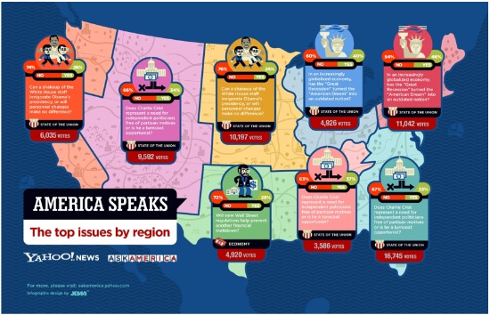
The designer of the series, JESS3, did a beautiful job illustrating this information; the graphic is colorful, cute, and readable. Unfortunately, the information itself is practically useless. I have to agree with the commenters who piled on a recent Mashable post about the graphic; the questions used here are incomprehensible puzzles. Look at the orange question on the West Coast section. It reads:
Can a shakeup of the White House staff invigorate Obama’s presidency, or will personnel changes make no difference?
74% NO
26% YES
Huh? The question to the right of that one reads:
Does Charlie Crist represent a need for independent politicians free of partisan motives or is he a turncoat opportunist?
66% NO
34% YES
Interesting.
I realize this might be obvious, but it bears noting that having 5,000 people in a region that encompasses five entire U.S. states answer a vague question about the “American Dream” does not necessarily mean that that is The Top Issue that said region cares passionately about.
When visiting the Issues Wheel site, readers are presented with question-cards somewhat randomly, and they answer as many as they feel up to answering before getting bored and clicking away from the site. It is not as though readers can see all of the questions, and then choose which ones are the most meaningful or important to respond to, as I think the infographic’s presentation of the responses implies.
Also, I tend to doubt the methodology of any survey that reveals Charlie Crist to be the most pressing “Issue” in approximately half the country.
I don’t mean to beat an infographical dead horse, here. Ask America never claims to be a scientific poll, so you can’t blame it for trying to be something it’s not. But interactive projects and graphics like this one take a lot of time and effort, and as such deserve to be taken seriously as valuable sources of information and data-analysis. They deserve to be praised when they are done well, and criticized when they turn out to be pretty but meaningless.
Lauren Kirchner is a freelance writer covering digital security for CJR. Find her on Twitter at @lkirchner