

The journalist who writes code is one of the least understood roles in the news business. Even the job titles are mysterious, and vary from newsroom to newsroom: data journalist, visual journalist, graphics editor, news app developer. When an interactive, visual story, or news app is published, the work is often chalked up to “wizardry,” ignoring the endless spreadsheets, databases, scripts, and debugging that led to the beautiful graphic.
Behind the curtain is a set of hard-earned skills, including reporting, design, data analysis, and programming in multiple languages and frameworks. In an attempt to share some of process behind such work, and ultimately encourage more collaboration between reporters and visualizers, I’ll be speaking with some of the people practicing this increasingly in-demand form of visual journalism.
In the first interview of this series, I spoke with David Yanofsky, a reporter at Quartz. Since joining Quartz in 2012, David has covered a wide variety of topics in his work including pilots taking illegal cockpit selfies on commercial flights, documenting every satellite in orbit around Earth, and tracking private helicopters flying into the Davos conference with a DIY antenna. David is also responsible for Quartz’s popular Chartbuilder tool, which was the basis for Atlas, a “platform” for discovering and sharing charts.
In April, I spoke with David about his recent visualization of the effects of the six-year drought in California, the inspiration for his story ideas, and the lessons he learned studying graphic design that apply to his creative, prolific data-driven visual journalism. Below are edited excerpts of our conversation.
For your recent California drought project, did you get the idea based on your direct observations of the drought?
Yes, definitely. I went to a wedding in Palm Springs, where the mountains are usually brown, even when there’s plenty of water around—you’re in the middle of the desert. And they were green. It was surprising. I remarked on it to people who were from there and they were like, “I can’t remember the last time they were green, maybe 15 years ago last time we saw something like this.” So I said, I wonder if you can see this in satellite imagery?
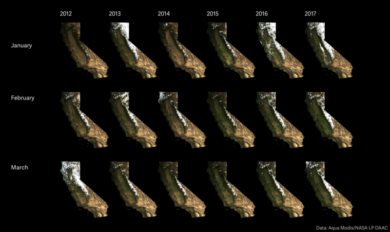
Yanofsky used satellite imagery to look back at the effects of the recent California drought. (Quartz)
I looked into that and there was the Oroville dam erosion stuff happening. I started looking into what became a failed attempt to visualize the mass of water headed into that reservoir. I got into USGS stream gauge data, California groundwater data, and the reservoir levels. That piece never materialized because the data was not granular enough. But I was able to smash it all together in the drought piece later on.
Also, I have a general bias to being up here now [in the San Francisco Bay Area]. I push West Coast stories if only to troll my East Coast colleagues for writing too much about things happening in New York.
What’s your favorite kind of challenge in a story?
I like finding sources of information that are seemingly under-utilized by people in journalism. With stream gauges, if there was a flood in some neighborhood, you might have a local reporter who went to the USGS, and found out the creek is three times its normal level. Or, you might find that information in a press release from local emergency management.
The intersection of physical science and journalism is appealing, where you talk to hydrologists, and meteorologists, and they are like, oh yeah we use that data all the time.
Another source that I really, really like is similar: international trade databases. I always come back to them because they are one of these things that no one reports through. One is from the US Census Bureau, one is from the International Trade Center, which is a UN/WTO joint agency. The data on trading commodities is so specific. The US data is like, “How many soccer balls arrived from China into the port of Houston in May.” It’s crazy specific, and often really useful.
I can see the Quartz headline for that already…
I wrote a story on June 5th—“The US has sent nearly $2 million worth of bull sperm to Iran this year.” And then followed up two days later: “Why the rest of the world is hankering for America’s bull semen.”
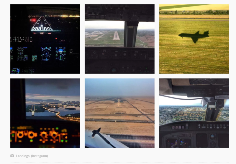
Some of the Instagram photos collected by Yanofsky that were taken in violation of FAA rules by commercial pilots. (Quartz)
What did you study in college? How does it apply to your work today?
I studied graphic design in college. [Graphic design applies] as a way of thinking about user experience, thinking about design, and systems thinking.
There’s this acronym that Richard Saul Wurman came up with. [Wurman, who founded TED talks, is a graphic designer and architect.] “LATCHN”– It stands for Location, Alphabet, Time, Category, Hierarchy and, Networks.
It has always helped me think about stories, and what’s important to show readers. The drought story was a story about location, time, and category. I made a flow chart two weeks ago about the United Airlines fiasco—what all the decisions were that could have been made differently, at each point in the process that could have produced a different outcome, so that was hierarchy, networks and time.
Whether they know it or not, simply by investigating a dataset, most people are running down this list trying to find the patterns.
My Toolkit
– Trigonometry
– Python
– Jupyter notebooks
– pandas library
– GDAL
– Landsat-util
– QGIS
– makefiles
Anything else you’d like to add about your skill set?
I came into the industry with very, very little technical programming technique. But over the course of my career, I’ve turned these five commands I knew in Adobe Flash into the skills I have now. I’m doing more complicated things now….things that I never imagined doing when I started.
I write story-specific software that is not general purpose. It often is done with the intention of creating a visual output.
Way back, the first types of [data journalism] stories that were coming out were 800-word articles: [journalists] looked at a spreadsheet, and derived a couple of numbers. And those numbers were numbers in a bunch of paragraphs. I am trying to differentiate myself from that type of work. Yes, I do write those stories, but I am much more interested in creating the chart than I am creating the paragraph with three numbers in it.