The New York Times has a policy forbidding advertising that closely appropriates the paper’s design elements. From the paper’s advertising acceptability guidelines:
The New York Times maintains clear separation between news and editorial matter and its advertisements. Accordingly, ads that include elements usually associated with The New York Times editorial matter will not be accepted (for example, but not limited to: Times-style headlines, bylines, news-style column arrangements or typography).
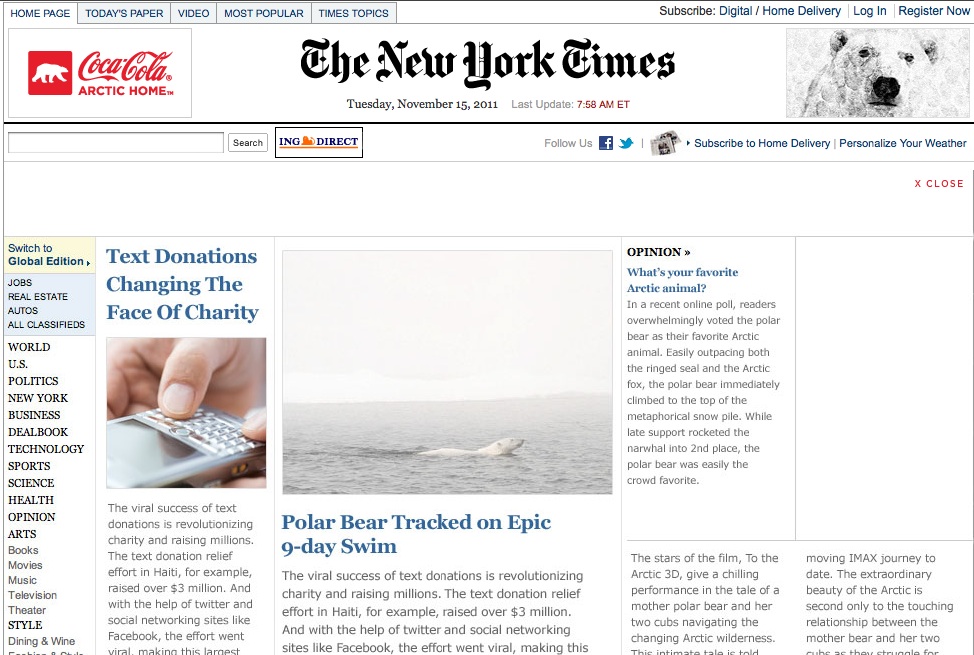
Today the Times seems to be running an online ad in very clear violation of the letter and spirit of that rule. Click over to the homepage, and watch while, briefly, the actual front page of Times website is given over to a environment-themed Coca-Cola ad that looks very much like the Times webpage.
The ad:
The news:
![]()
Typography elements? Check. Left-side section browser bar? Check. Column width and layout? Check. Careful separation of news and “opinion” content (“What’s your favorite arctic animal”)? Check.
In 2009, when the Los Angeles Times distributed its newspaper inside of a false-front wrap-ad for the Alice and Wonderland movie, which was designed to look like the normal printed front page, The New York Times noted the move “tested accepted limits”:
Ads that completely cover a publication’s front page, or are made to look like part of it—or both—are not unusual for trade magazines and some tabloid newspapers, but broadsheets have generally shunned them. But [Los Angeles Times spokesman John] Conroy noted that however unorthodox the ad may be for print, it mirrors a common practice online of having an ad cover part or all of a Web site’s home page for a few seconds.
“It’s taking a concept that we normally apply to new media and reimagining it to a concept in a newspaper,” he said.
So if the Wonderland ad was a reimagining of a web ad style for print, is this Coke ad the reimagining of a false-front print wrap for the web? And if so, is it a reimagining too far?
Not according to Eileen Murphy, a spokeswoman for the Times, who said the ad met the paper’s standards.
“We made a determination that our readers would know it’s an advertisement,” Murphy said, pointing out that the ad’s text is only visible for seconds before it becomes obscured.
While the Times guidelines make no allowance for duration or the paper’s assumptions about whether readers may or may not be deceived, Murphy said the ad also met the standards actually enumerated in their own written policy, which simply forbid advertisers to use “elements usually associated with … editorial matter.”
“It doesn’t look at all like The New York Times,” Times spokesman Eileen Murphy contended.
The “opinion” header font looks very, very Times-like, and so do the mock headlines, though the latter are a different hue than the Times‘s blue headlines.
“It’s a different typeface,” Murphy said, pointing out the sans-serif body type. “It’s a different color—the characters are grey, not black.”
Murphy admitted the decision to run the ad was the subject of discussion.
So, not a black or white issue. But certainly a grey one.
Clint Hendler is the managing editor of Mother Jones, and a former deputy editor of CJR.