To print or a read a PDF of this report, visit the Tow Center’s Gitbook page.
Tip Sheet
Audience metrics have become ubiquitous in news organizations, but there has been little empirical research on how the data is produced or how it affects newsroom culture and journalists’ daily work. The Tow Center sought to understand how the use of metrics changes reporters’ behavior and what this means for journalism. Thus, researcher Caitlin Petre conducted ethnographic analysis of the role of metrics in journalism, focusing on three case studies: Chartbeat, a dominant metrics vendor; Gawker Media, a newsroom intently focused on metrics; and The New York Times, a legacy news outlet where metrics are currently more peripheral. Petre offers the following key points based on her findings.
- Metrics exert a powerful influence over journalists’ emotions and morale. Metrics inspire a range of strong feelings in journalists, such as excitement, anxiety, self-doubt, triumph, competition, and demoralization. When devising internal policies for the use of metrics, newsroom managers should consider the potential effects of traffic data not only on editorial content, but also on editorial workers.
- Traffic-based rankings can drown out other forms of evaluation. It is not uncommon for journalists to become fixated on metrics that rank them or their stories, even if these are not the sole criteria by which they are evaluated. Once rankings have a prominent place on a newsroom wall or website, it can be difficult to limit their influence.
- News organizations can benefit from big-picture, strategic thinking about analytics. Most journalists are too busy with their daily assignments to think extensively or abstractly about the role of metrics in their organization, or which metrics best complement their journalistic goals. As a result, they tend to consult, interpret, and use metrics in an ad hoc way. But this data is simply too powerful to implement on the fly. Newsrooms should create opportunities—whether internally or by partnering with outside researchers—for reflective, deliberate thinking removed from daily production pressures about how best to use analytics.
- When a news organization is choosing an analytics service, it should consider the business model and the values of the vendor. We have a tendency to see numbers—and, by extension, analytics dashboards—as authoritative and dispassionate reflections of the empirical world. When selecting an analytics service, however, it’s important to remember that analytics companies have their own business imperatives. Newsroom managers should consider which analytics company’s values, branding strategy, and strategic objectives best align with their own goals.
- Not everything can—or should—be counted. Efforts to improve audience analytics and to measure the impact of news are important and worthwhile. But newsroom, analytics companies, funders, and media researchers might consider how some of journalism’s most compelling and indispensable traits, such as its social mission, are not easily measured. At a time when data analytics are increasingly valorized, we must take care not to equate what is quantifiable with what is valuable.
Executive Summary
In a 2010 New Yorker profile, founder and CEO of Gawker Media Nick Denton argued, “probably the biggest change in Internet media isn’t the immediacy of it, or the low costs, but the measurability.” 1
What does all this data mean for the production of news? In the earlier days of web analytics, editorial metrics had both enthusiastic proponents and impassioned detractors. Nowadays the prevailing view is that metrics aren’t, by definition, good or bad for journalism. Rather, the thinking goes, it all depends what is measured: Some metrics, like page views, incentivize the production of celebrity slide shows and other vapid content, while others, like time on a page, reward high-quality journalism. Still, there are some who doubt that even so-called “engagement metrics” can peacefully coexist with (let alone bolster) journalistic values.
This report’s premise is that it will be impossible to settle these debates until we understand how people and organizations are producing, interpreting, and using metrics. I conducted an ethnographic study of the role of metrics in contemporary news by examining three case studies: Chartbeat, Gawker Media, and The New York Times. Through a combination of observation and interviews with product managers, data scientists, reporters, bloggers, editors, and others, my intention was to unearth the assumptions and values that underlie audience measures, the effect of metrics on journalists’ daily work, and the ways in which metrics interact with organizational culture. Among the central discoveries:
- Analytics dashboards have important emotional dimensions that are too often overlooked. Metrics, and the larger “big data” phenomenon of which they are a part, are commonly described as a force of rationalization: that is, they allow people to make decisions based on dispassionate, objective information rather than unreliable intuition or judgment. While this portrayal is not incorrect, it is incomplete. The power and appeal of metrics are significantly grounded in the data’s ability to elicit particular feelings, such as excitement, disappointment, validation, and reassurance. Chartbeat knows that this emotional valence is a powerful part of the dashboard’s appeal, and the company includes features to engender emotions in users. For instance, the dashboard is designed to communicate deference to journalistic judgment, cushion the blow of low traffic, and provide opportunities for celebration in newsrooms.
- The impact of an analytics tool depends on the organization using it. It is often assumed that the very presence of an analytics tool will change how a newsroom operates in particular ways. However, the report finds that organizational context is highly influential in shaping if and how metrics influence the production of news. For instance, Gawker Media and The New York Times are both Chartbeat clients, but the tool manifests in vastly different ways in each setting. At Gawker, metrics were highly visible and influential. At The Times, they were neither, and seemed—to the extent they were used at all—primarily to corroborate decisions editors had already made. This suggests that it is impossible to know how analytics are affecting journalism without examining how they are used in particular newsrooms.
- For writers, a metrics-driven culture can be simultaneously a source of stress and reassurance. It is also surprisingly compatible with a perception of editorial freedom. While writers at Gawker Media found traffic pressures stressful, many were far more psychologically affected by online vitriol in comments and on social media. In a climate of online hostility or even harassment, writers sometimes turned to metrics as a reassuring reminder of their professional competence. Interestingly, writers and editors generally did not perceive the company’s traffic-based evaluation systems as an impediment to their editorial autonomy. This suggests that journalists at online-only media companies like Gawker Media may have different notions of editorial freedom and constraint than their legacy media counterparts.
The report calls for more research on analytics in a number of areas. More information is needed about readers’ responses to metrics. Are they aware that their behavior on news sites is being tracked to the extent that it is? If so, how (if at all) does this affect their behavior? The report also advocates for more studies using systematic content analysis to determine if and how metrics are influencing news content. Finally, I suggest further ethnographic research on the growing movement to create so-called “impact metrics.”
The report also makes three recommendations to news organizations. First, news organizations should prioritize strategic thinking on analytics-related issues (i.e., the appropriate role of metrics in the organization and the ways in which data interacts with the organization’s journalistic goals). Engagement with these big-picture questions should be insulated from daily traffic and reporting pressures but otherwise can take various forms; for instance, newsrooms that are unable to spare the resources for an in-house analytics strategist may benefit from partnerships with outside researchers. Second, when choosing an analytics service, newsroom managers should look beyond the tools and consider which company’s strategic objectives, business imperatives, and values best complement those of their newsroom. Finally, though efforts to develop better metrics are necessary and worthwhile, newsrooms and analytics companies should be attentive to the limitations of metrics. As organizational priorities and evaluation systems are increasingly built on metrics, there is danger in conflating what is quantitatively measurable with what is valuable.
Introduction
On August 23, 2013, the satirical news site The Onion published an op-ed purporting to be written by CNN digital editor Meredith Artley, titled “Let Me Explain Why Miley Cyrus’ VMA Performance Was Our Top Story This Morning.” The answer, the piece explained matter-of-factly, was “pretty simple.”
It was an attempt to get you to click on CNN.com so that we could drive up our web traffic, which in turn would allow us to increase our advertising revenue. There was nothing, and I mean nothing, about that story that related to the important news of the day, the chronicling of significant human events, or the idea that journalism itself can be a force for positive change in the world …But boy oh boy did it get us some web traffic.2
The piece went on to mention specific metrics like page views and bounce rates as factors that motivated CNN to give the Cyrus story prominent home page placement.
Of course, Artley did not actually write the story, but it hit a nerve in media circles nonetheless—especially since a story on Cyrus’s infamous performance at the MTV Video Music Awards had occupied the top spot on CNN.com and, as the real Meredith Artley later confirmed, did bring in the highest traffic of any story on the site that day.3
Media companies have always made efforts to collect data on their audiences’ demographics and behavior. But the tracking capabilities of the Internet, as well as the ability to store and parse massive amounts of data, mean that audience metrics have grown far more sophisticated in recent years. In addition to the aforementioned page views and bounce rates, analytics tools track variables like visitors’ return rates, referral sites, scroll depths, and time spent on a page. Much of this data is delivered to news organizations in real time.i
The widespread availability of audience data has prompted fierce debates in the journalism field. The Onion op-ed succinctly encapsulates one common position in this conflict, which is that metrics—or, more specifically, the desperate quest for revenue they represent—are causing journalists to abdicate their highest duties: to inform their audiences about the most important public issues of the day and to hold the powerful accountable. The more attention journalists pay to audience clicks, views, and shares, the more Miley Cyrus slide shows will beat out stories on important, difficult subjects like Syria or climate change. Proponents of an opposing view argue that the increased prominence of metrics in newsrooms is a powerful force of democratization in the media, offering a welcome end to the days when editors dictated which world events were important enough to be newsworthy. Differing views on metrics have manifested in a range of organizational policies for distributing and using the data: Many news sites make metrics widely available to editorial staff; some, such as Gawker Media and The Oregonian, have even paid writers partly based on traffic. Still, a (smaller) number of news sites, including The New York Times and Vox Media’s The Verge, actively limit reporters’ access to metrics.4
It’s not surprising that metrics have become a hot-button issue in journalism. Their presence invites a number of ever-present tensions in commercial news media to come crashing into the foreground. Among them: What is the fundamental mission of journalism, and how can news organizations know when they achieve that mission? How can media companies reconcile their profit imperative with their civic one? To the extent that the distinction between journalist and audience is still meaningful, what kind of relationship should journalists have with their readers?
In the midst of these normative questions, collective anxiety, and tech-evangelist hype, there must be more empirical research into the role that audience metrics actually play in the field of journalism.ii
This report aims to help fill these gaps. I undertook an ethnographic study of three companies—Chartbeat, the prominent web analytics startup, and two of the media organizations that use its tools, Gawker Mediaiii and The New York Times. I conducted interviews with staff members at these companies and observed meetings and interactions when possible.iv
Ethnographic research is, almost by definition, slow; it takes time to get to know how a workplace operates and establish an open and trusting rapport with subjects. The digital media field, which continues to change at a dizzying speed, poses particular challenges for this kind of slower-paced research. As I discuss in the conclusion, the three companies I studied have changed in terms of personnel and, in the case of Gawker and The Times, organizational structure since I concluded my research; they undoubtedly will continue to do so. Even so, this research is intended as more than a snapshot of these companies’ orientation toward metrics at a particular point in time. The ever-changing nature of the digital media field presents a challenge, but also a valuable exercise: It forces researchers to zoom out from particular details (the newest metric, the latest newsroom shake-up) and identify the bigger analytic themes that characterize the creation, interpretation, and use of news metrics. That is, above all, what this report aims to accomplish.
In conducting this research, I was interested in three big questions. First, how are metrics produced? At a time in which “let the data speak” is a common refrain in popular media, and judgments made on the basis of “number crunching” are widely considered more objective and reliable than those made using other methods, it is easy to forget that numbers are socially produced—that is, they are made by particular groups in particular contexts. There is substantial value in studying what sociologists Wendy Espeland and Mitchell Stevens call “the work of quantification.”5
In the case of metrics, researchers know quite a lot about the interests and principles of the journalists using analytics tools, but not much about the programmers, data scientists, designers, product leads, marketers, and salespeople who make and sell these tools. How do they decide which aspects of audience behavior should be measured and how to measure them? What ideas—about both those whose behavior they are measuring (news consumers) and those who will be using their tool (journalists)—are embedded in these decisions? How do analytics firms communicate the value of metrics to news organizations?
My second big question: how are metrics interpreted? Despite their opposing stances, arguments that metrics are good or bad for journalism have one thing in common: They tend to assume that the meaning of metrics is clear and straightforward. But a number on its own does not mean anything without a conceptual framework with which to interpret it. Who makes sense of metrics, and how do they do it?
Finally, I wanted to know how metrics are used in news work. Does data inform the way newsrooms assign, write, and promote stories? In which ways, if any, is data a factor in personnel decisions such as raises, promotions, and layoffs? Does data play more of a role in daily work or long-term strategy? And how do answers to these questions differ across organizational contexts?
As the report ventures answers to these questions, it sidesteps a more familiar (though, I would argue, less fruitful) one: do metrics represent a healing salve for the troubled field of journalism, or a poison that will irrevocably contaminate it? There is little point in debating whether or not metrics have a place in newsrooms. They are here, and they don’t seem to be going anywhere anytime soon. At the same time, we must not unthinkingly adopt a technologically determinist view, in which the very existence of metrics will inevitably cause certain norms, practices, and structures to emerge. What metrics are doing to—and in—newsrooms is an empirical question, not a foregone conclusion, and it is the one this report aims to address.
Case Studies and Methods
By looking closely at one analytics company and two media organizations that use its tool, this research is able to follow both how an analytics dashboard moves from the company that produces it to those that use it, and also how very different types of editorial groups integrate the same tool into their work.
Chartbeat is an important and ideal analytics company to study for several reasons. It has tremendous reach—its clients include 80 percent of the most-trafficked publishers in the United States, as well as media outlets in 35 other countries—yet is small enough that it is possible for an ethnographer to get a feel for the company as a whole. It was also one of the first analytics companies to make a dashboard specifically designed for use by journalists, rather than by advertising sales departments. During my time at Chartbeat, the company was building, marketing, and launching a brand new version of Chartbeat Publishing, its flagship editorial product; I was able to witness much of this process take place. From August 2013-January 2014, I spent time as a “fly on the wall” in Chartbeat’s offices, observing internal meetings, user experience research, client trainings, and the rhythms of daily office life. I also conducted 22 interviews and in-depth conversations with 16 employeesv
Gawker Media is a highly popular and visible network of blogs that covers topics ranging from gaming to sports to women’s issues. Gawker is widely known as a metrics-driven organization. In the early days of the company, owner Nick Denton developed a reputation for paying writers partly based on the page views their posts generated. The company also devised the Big Board (subsequently built by Chartbeat), a constantly updating screen displaying the top stories by traffic across all Gawker Media sites. During the time of my fieldwork, Gawker gave bonuses based on its sites’ unique visitor counts and had started publicly ranking individual writers by traffic. Gawker is a longtime client of Chartbeat and the two companies have a close relationship; while most of Chartbeat’s clients require that their data be kept confidential, Gawker allows Chartbeat to make its data public for training and other purposes. I conducted 30 interviews with writers and editors from six of Gawker’s eight core titles, as well as with a small number of editorial and business development executives. From February-July 2014, I also spent a total of five days observing the online group chats (conducted on the collaboration software Campfire) of two of the company’s core sites and attended occasional staff meetings. In addition, I analyzed the company’s internal memos (some of which staffers provided to me, others of which were leaked online).
If Gawker is known for being metrics-driven in all decision-making, The New York Times, at least at first glance, seems to have the opposite relationship to metrics. For years, representatives of The Times newsroom were publicly dismissive, even scornful, of the idea of using metrics to inform editorial processes. In the face of the paper’s ongoing financial troubles6 The Times’s culture around metrics may be changing. Though The Times is a longtime Chartbeat client, it only recently upgraded from the most basic iteration of the dashboard to the more sophisticated tool Gawker and most other large newsrooms employ. The Times’s complex and fraught relationship to analytics makes the organization an excellent case study through which to examine the interactions between metrics and legacy media practices and values. Between 2011 and 2015, I conducted 23 semi-structured interviews with 20 reporters, columnists, editors, bloggers, and analysts at The Times.
A Note on Access
Ethnographic observation and in-depth interviews provide valuable insight into how companies operate. However, it can be difficult to obtain access to corporate environments, and compromises are sometimes necessary to make such research possible. I was given access to Chartbeat on two conditions: first, that I would not share clients’ names or data; second, that I would allow the company to review all direct quotes and transcribed anecdotes from my time at the office. Of the 29 quotes and field-note excerpts I offered for review, Chartbeat left 24 unaltered, removed two altogether, and removed a single line or phrase from three. None of these edits substantially changed the presentation of my findings, and the company did not have advance access to any of my analysis or interpretation of the data. Gawker did not put any such limits on my access: everything I observed or heard in an interview was fair game for publication, except in the rare instances when interview subjects requested that something be off the record. At The Times, I arranged interviews with individual staffers but was not able to conduct observation in the newsroom. I guaranteed anonymity to individuals at all three research sites, so real names and identifying details have been omitted.
Chartbeat and the Making of Web Analytics
“It’s not the identity of the number [that matters]. It’s the feeling that the number produces …That’s the thing that’s important.”
-– Chartbeat employee
Data about audiences has long been a source of distrust—or, at least, indifference—for journalists. Journalism scholars who conducted fieldwork in newsrooms during the pre-Internet era found that print journalists took little interest in audience surveys, circulation data, or even more direct forms of feedback like letters from readers. Rather than write with a statistically informed picture of their audience in mind, instead they often relied on archetypes of a typical audience member—usually a family member—when considering the relevance of a particular story to readership. They also greatly valued the opinions of their colleagues and bosses, trusting them far more than the general public to determine whether a story qualified as good journalism.7
With the advent and spread of the Internet, two things changed. First, the data got much more sophisticated—meaning, it became far more detailed and specific and was available much more quickly. Second, changing structural conditions meant that newsrooms could no longer afford to ignore metrics. As content became more abundant and previously reliable sources of advertising revenue dried up, news organizations faced intensifying financial pressures. One way to win the fierce competition for dwindling ad dollars was to enlarge a publication’s audience, and metrics developed a reputation as a crucial tool for doing just that.
Still, the idea of using metrics to inform editorial decision-making was (and sometimes still is) met with derision, anxiety, and outright hostility by many journalists. In March 2014, the late Times media columnist David Carr warned, “Risks Abound as Reporters Play in Traffic.”8 The American Journalism Review asked, “Is Chasing Viral Traffic Hurting Journalism?”9 Even outlets that have a reputation for being extremely metrics-driven have voiced concerns. A BuzzFeed headline read, “Infinite Feedback Will Make Us Crazy”10; a Daily Beast piece on the “anti-clickbait movement” was entitled “Saving Us from Ourselves.”11
In this climate, a company determined to get metrics into a wide array of newsrooms had its work cut out for it. But by many measures, Chartbeat has succeeded at doing just that. As CEO Tony Haile often points out, the company works with 80 percent of the highest-trafficked publishers in the United States, as well as newsrooms in 35 other countries. This makes Chartbeat an intriguing research site for examining the production of analytics. How does Chartbeat decide what to count and how to present data? And just as important, how does Chartbeat market and sell its product to newsrooms?
The answers I uncovered during my research add complexity to the way we typically think about what metrics are and the function they serve within news organizations. In both popular and academic discourse, there is a widespread tendency to think of metrics as instruments of rationalization—as tools that systematically and scientifically measure the performance of news content and convey that information to journalists so that they can draw more traffic to their sites. Chartbeat often portrays its mission this way: the company’s website boasts that its dashboard allows clients to “see what interests visitors and adapt your site instantly,” “equip your team with decision-driving data,” and “know what content sparks and holds readers’ attention.” The client testimonials on Chartbeat’s site also employ dry, technical language. Here is Gawker’s: “By providing key information in real time, we have a more precise understanding of the traffic we must support as we add features to our next-generation live blog platform.” The prevailing message is that the dashboard exists to communicate rational, dispassionate data, upon which journalists can then act.
And indeed, Chartbeat’s analytics tool is designed to communicate data. The dashboard’s original distinguishing feature was its real-time information about visitors’ behavior (the name Chartbeat is a play on heartbeat, evoking this immediacy). The current publishing dashboard (Fig. 1) is packed with data about readers’ behavior. In a quick glance, one can see how many visitors are on the site (and on each particular page) at a given moment; the average amount of time they have been there; which Internet sites referred them; how often they visit; where in the world they are located; what percentage of them is looking at the site on mobile phones; and much more.
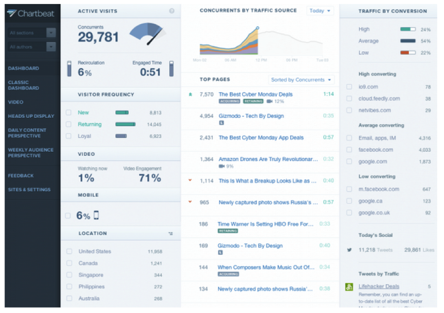
Fig. 1: A screenshot of Chartbeat’s dashboard for publishers.
But a closer look at the dashboard, coupled with hours of observation and interviews with the people who dreamt up, built, and marketed it, reveals that providing rigorous data is only a part—and at times not even the most important part—of what the dashboard is designed to do. For Chartbeat to succeed, its product must appeal to the journalists whom are its intended audience. To accomplish that, the dashboard must do much more than merely communicate data. It must demonstrate deference for traditional journalistic values and judgment; it must be compelling; it must soften the blow of bad news; and finally, it must facilitate optimism and the celebration of good news. None of these things fall under our conventional understanding of what an analytics tool is and does, yet Chartbeat expends considerable energy and effort on them. Some of these aims can be accomplished within the actual dashboard; others, like demonstrating respect for traditional journalistic judgment, are accomplished both within the dashboard itself and in Chartbeat staff’s interactions with clients.
Communicating Deference to Journalistic Judgment
One of the most popular and widespread suppositions about big data is that the existence of new sources of data and new ways to process them will obviate the need for expert intuition and judgment, which has, the narrative goes, repeatedly proven itself to be unreliable. In a typical example, Economist editor Kenneth Cukier and Oxford professor Viktor Mayer-Schönberger wrote, “the biggest impact of big data will be that data-driven decisions are poised to augment or overrule human judgment.”12
In journalism’s more traditional corners, there is a fear that metrics will do more overruling than augmenting. One of the challenges for Chartbeat staff, then, is to present itself and the company’s products in a way that will assuage these worries and earn journalists’ trust. The company does this in two ways. First, staff members rhetorically defer to editors’ judgment—both in verbal interactions with clients and within marketing materials. In a client meeting I observed, a Chartbeat employee suggested the client look at data about its most valuable traffic source and added, “you already know it intrinsically, but the data confirms it.” (Of course, Chartbeat also has to avoid going too far with this type of message, lest the dashboard be considered unnecessary.)
The second way in which Chartbeat works to communicate deference and build trust is with the metrics themselves. The new Chartbeat Publishing dashboard prominently features two metrics in the top left-hand corner: engaged time, which is an average measure of how long people spend engaged with a site’s content, and recirculation, which is the percentage of people who visit at least one additional page on a site after the one at which they arrive. Just below these figures is a section on visitor frequency, which divides readers into three categories—new, returning, and loyal—based on how often they visit a site. In explaining the impetus for these particular metrics, Chartbeat employees and marketing materials position them against page views and other metrics that have a reputation for incentivizing the production of clickbait. By contrast, the company argues, Chartbeat’s metrics are designed to reward “high-quality content,” meaning the kinds of rigorous, thoughtful reporting and writing that are central to journalists’ professional identity. In a meeting I observed in which the Chartbeat team prepared for the product launch, the alignment between Chartbeat Publishing’s metrics and traditional journalistic values was a central selling point. As one employee put it, “this is the core of what we’re trying to do—reframe an audience from chasing meaningless metrics and starting out fresh every morning, to building a loyal and returning audience that [the client] can monetize in a variety of ways.”
Just as noteworthy as which features Chartbeat Publishing includes are the ones it leaves out. The dashboard doesn’t make recommendations about what kind of content to produce or where to place content on a page. This omission is not due to technological limitations or because such a feature would be ineffective at growing clients’ traffic; rather, it is a conscious attempt to avoid alienating journalists. When asked about Chartbeat’s strategy, a member of the development team explained:
We had a competitor who made a tool that made suggestions to editors …And it was like, “put this here, promote this story.” And editors were like, “I’m not using this damn thing …You’re telling me to put stuff in the lead spot I would never put there.” So we said, “listen, we’re not taking away your job; we’re enhancing your ability to make those decisions.”
Indeed, an anecdote about a Chartbeat competitor that exemplified this dynamic was invoked so frequently in internal meetings and interviews that I began to consider it part of the company folklore. At the Guardian Changing Media Summit in 2013, the digital editor of the British tabloid The Sun served on a panel with the founder and CEO of Visual Revenue, a predictive analytics company that provides algorithmic recommendations to news organizations about story placement and assignment. In speaking about his experiences using the product, Derek Brown, The Sun editor, said:
It’s a really valuable tool, but the one thing I’ve always said to Dennis [founder and CEO of Visual Revenue] …is that you kind of have to ignore it sometimes. Great example, last week: New Pope [was elected, and] Visual Revenue is telling us, screaming at us, “nobody is interested in this story! They’re far more interested in the Katy Perry story. Put that above the Pope. Put the Pope way down at the bottom of your home page. Nobody really wants to read it on your website.” And of course, at that point—and there’s lots of examples of that every day of the week—the human being has to intervene and say, “okay, they may be more interested in Katy Perry in a bikini today. However, the Pope is a far more important story.”13
That an editor at The Sun, a tabloid newspaper, so frequently found Visual Revenue’s recommendations inappropriate is indicative of the fraught relationship that news organizations of all stripes can have with analytics companies. At Chartbeat, “Katy Perry versus the Pope” (as the story was sometimes referred to during meetings) was a powerful symbol. This was in part because, as one staff member put it, “we don’t feel that’s how data should be used.” But it also served as a cautionary tale of the kind of overstepping that could damage an analytics company’s credibility with news organizations. The story became a vivid reminder of the delicate balance Chartbeat had to strike with clients. The company needs to show that data has something to contribute to decision-making without stepping on editorial toes.
The Candy and Vegetables of Metrics
With metrics like recirculation, visitor frequency, and engaged time, Chartbeat demonstrates its allegiance to journalistic values and gains journalists’ trust. However, none of these is the metric that many users find most compelling, nor for which the company is most famous. That would be “concurrent visitors,” and more specifically, the speedometer-like dial that shows how many people are on a site on a second-by-second basis. The dial and accompanying number’s constant movement give it a mesmerizing quality, leading users to call it “sanity-ruining,”14 “addictive,” and “the crack cocaine of web data.”15
CP: From my conversations with editors about this tool, they always say it’s addictive. Do you think it [is because the Chartbeat dashboard] sort of speaks to an editorial mindset? Do you think that the engaged-time thing is the reason why editors have taken to it?
I wish I could say yes, but no …I think the reason they find it addictive is—one is just performance. It’s such a fucking tough industry that you lose sleep, man. Like being a journalist is the hardest job in the world. It’s so stressful that you are constantly worrying about whether you’re getting enough traffic or not. So your eyes are glued to Chartbeat because your life depends on it. So I don’t have any real illusions about what got us in the door. That’s why they’re addicted. Now, we’re trying to be much, much more than that, obviously. And we all need to be a bit more honest about our actual value in some of these organizations right now, because there’s nothing more than that to some people.
Indeed, Chartbeat employees themselves were not immune to the dial’s seductive properties. As one staffer who sometimes writes for the company’s blog explained:
The whole real-time thing, like to me that’s the whole thing that makes it work as a product. You know, I write blog posts and I watch it. Those are the moments when you realize why it’s a successful product, because I watch it, and nobody reads my stuff, right? …If you look at it, you’re like, “there are three people reading this.” …And then somebody else comes in and you’re like, “oh, shit, there’s a fourth! Who’s that guy?!” And that’s the magic.
As the next section will demonstrate, my findings at Gawker confirmed that many writers and editors largely ignore those Chartbeat metrics designed to reward high-quality content in favor of the concurrents dial, which is the closest thing Chartbeat has to more typical metrics like page views and uniques. There is a disjuncture, then, between the metrics on which Chartbeat builds its reputation as an analytics company that supports serious journalism and the metrics that are actually most popular and alluring to many users. Ironically, Chartbeat finds itself in a situation similar to many of its publisher-clients, who are torn between producing “vegetable” content (nourishing but relatively unpopular) and “candy” content (empty but fun and, yes, addictive). In this vein, Chartbeat has vegetable metrics, such as engaged time and visitor frequency, which contribute to its prestige and to clients’ sense that Chartbeat “gets it.” But the dashboard also has candy metrics, like the concurrents dial, which give the dashboard its addictive properties.
Sheltering Clients from Bad News and Providing Opportunities to Celebrate Good News
As Chartbeat and other analytics tools become more common and influential in newsrooms, journalists’ sense of dignity, pride, and self-worth are increasingly tied up in their traffic numbers. Metrics have earned a reputation as ego-busters, as journalists discover that their readership is considerably smaller and less engaged than they imagined. In meetings and calls I observed, clients called Chartbeat data points on their dashboard “sad” and “super pride-crushing.” Clients’ feelings about their data can become inseparable from their feelings about Chartbeat. An employee who works with smaller, lower-trafficked publishers said the experience of looking at the dashboard can be “harsh,” adding that some elect to stop using Chartbeat before finishing their free trial.
A few Chartbeat employees saw themselves as providers of tough love. One said he tells clients that “facing the low numbers is the first step towards boosting them.” However, in conversations with clients, Chartbeat generally tended to shy away from the role of a purveyor of uncomfortable truths, in large part because the company didn’t want clients to develop negative associations with the product. In meetings and trainings, employees often took a positive tone, even when discussing disappointing or unimpressive numbers. During one training, an employee displayed a graph showing that very few visitors went to a second page on the client’s site after the one on which they’d landed. The employee said that, despite appearances, this wasn’t actually bad, because the client’s landing page had so much to do and look at. “People stay on your landing page,” he encouraged. There were several other instances in which employees were quick to reassure clients that a particular metric wasn’t as bad as it seemed or to redirect clients’ attention from an underwhelming metric to a stronger one.
In addition to trying to take the edge off disappointing metrics, Chartbeat also actively facilitates opportunities for optimism—both in interactions with clients and in the dashboard itself. When describing the considerations that went into the new dashboard, one employee said:
You know, celebrate was one thing. That needs a place in [the product].
CP: When something goes well—
Yeah, yeah! Should we, in our product, be helping them celebrate more, or telling them when to?
Nowhere is the importance of celebration clearer than in the case of the “broken dial.” Chartbeat is priced so that each client has a cap of concurrent visitors that it has paid for; if the number of visitors on its site exceeds that number, the dial “breaks”—that is, the client will see that the dial and the number of concurrents have hit the cap, but the dashboard will not show by how much the cap has been exceeded. The broken dial sometimes results in an upsell, as clients who repeatedly hit their cap can pay to raise it. But even when the broken dial doesn’t directly lead to greater revenue, it has a valuable emotional impact on clients. When the cap is exceeded, one employee explained, “the dial looks incorrect …The product is broken, but in a fun way. If you didn’t have that sort of excitement, it wouldn’t work.”
One client, during a product testing session, articulated just how powerful such excitement can be and how central it is to Chartbeat’s appeal. She said that her news organization had briefly considered discontinuing its account with Chartbeat in favor of a rival analytics service, but within a few days had “crawled [their] way back” to Chartbeat. The Chartbeat employee conducting the session asked, “what is it, do you think, that was the most compelling aspect of Chartbeat?” The client answered:
First of all, if you’re into traffic as most sites are, seeing that big number [recites number of concurrents on her site—750], that’s a really good number. And we’re capped at 2,000 concurrent users, so if we always think—if we’re at 1,999, we always imagine we’re at 2,450 or 5,150, but we probably [just] can’t see it ’cause we’re capped. So we always have that kind of illusion, like that optimism going on.vi
For this client, the broken dial did exactly the opposite of what we typically think of as the role of metrics: Rather than providing unvarnished information about her audience, it allowed her and her team to imagine an audience size that was more than twice the size of their cap, regardless of whether or not the imagined number had any basis in reality. In this instance, Chartbeat’s role as a facilitator of optimism and celebration has taken precedence over its self-described mission to provide readers with an accurate picture of their traffic. Importantly, this is not an oversight on the company’s part but a strategic choice that renders the product more appealing. As an employee put it:
When [a client] does hit a home run, and you see the Chartbeat dial go up, and you see the red line go up, then that euphoria—Chartbeat gets to be part of that experience. So as long as we’re in the room, like high-fiving you, then we get a lot of positive association with that moment.
These findings all contribute to a larger point: While we tend to think of analytics dashboards as a rationalizing force in newsrooms, a tool that applies rigorous, objective quantitative methods in place of the unreliable, unscientific guesswork of the past, it turns out that Chartbeat’s dashboard is designed to play a social and emotional role in newsrooms just as much as a rational one. Everything—from the types of data the dashboard provides, to the features it doesn’t include, to the way in which data is presented, to the interactions between staff and clients—is profoundly influenced by Chartbeat’s need to earn journalists’ trust, prevent them from becoming demoralized, and provide them with an appealing product. Indeed, the company’s very survival depends on its ability to be something editors actually want to use. This is not to say that Chartbeat’s methods for measuring audience behavior are in some way flawed or not objective, or that the company intentionally or cynically manipulates its clients. To the contrary, Chartbeat’s methods are widely considered to be quite rigorous, and most of the staff members with whom I spoke seemed wholly genuine in their belief that Chartbeat’s metrics support and reward high-quality journalism. Rather, the goal here is to illustrate that Chartbeat’s metrics—indeed, all metrics!—are the outcome of human choices and that these choices are in turn influenced by a range of organizational, economic, and social factors.
Analytics at Gawker Media
“I’m actually concerned by the extent to which my emotional well-being is dictated by the number of hits on my posts. I talk to my therapist about it!”
-– Gawker Media writer
There is arguably no contemporary media organization more strongly associated with a metrics-driven editorial culture than Gawker. Throughout its 13-year history, Gawker has put a strong emphasis on numbers, though the company has prioritized different metrics at different times (most notably in 2010, when it switched from a focus on page views to one on unique visitors). Gawker’s focus on metrics was intended to not only boost profits, but also to serve as a positioning device that—along with its sharp, mocking voice and willingness to pay for scoops—set it against the media establishment. At Gawker, metrics have been:
- Prominent: The company famously pioneered the Big Board, a constantly updating screen that hangs over the reception desk on the editorial floor at its Nolita offices. The board, populated by Chartbeat data, displays the top posts by concurrent visitors across all of the sites in the Gawker network. Shortly before I began my research at Gawker, the Big Board was supplemented by a leaderboard that ranks the top writers (staff and non-staff) on Kinja, Gawker’s publishing platform, by the number of unique visitors they have brought to the site in the previous 30 days. Red and green arrows, showing whether individual writers are ascending or descending in the ranks, reinforced the message.
- Public: Gawker is known for its transparency, and many of the company’s metrics are publicly available online, including the Kinja leaderboard16 and graphs17
- Powerful: The company has experimented with a range of traffic-based pay-for-performance schemes over the years. The one in place at the time of my research operated like this: Each site had a monthly growth target of unique visitors, calculated based on its recent traffic. Thus, the sites had different targets depending on their past audience size, but they were all expected to have the same rate of growth. When a site exceeded its target, it received a proportional bonus that the site lead (Gawker’s term for editor-in-chief) could dispense among her writers as she saw fit.vii While monthly bonuses were based on collective traffic, individual traffic numbers were also influential. The company calculates something called an eCPM for all editorial staffers, which is the measure of how many dollars an employee earns in salary for every 1,000 unique visitors her posts bring into the site. Writers were expected to maintain an eCPM no higher than $20, and those whose eCPMs exceeded this for a prolonged period were in danger of being fired. Raises were also closely tied to individual traffic numbers; writers had to demonstrate sustained growth in personal traffic that was roughly proportionate to the raise they were requesting.viii
This metrics-driven approach has paid off: the company’s estimated value is around $250 million; in 2014, it pulled in $45 million in revenue and $6.7 million in profit.18
This moment in Gawker Media’s history lent itself to two major questions: First, if Gawker was indeed an extreme example of the kind of metrics-driven approach that media organizations are increasingly adopting, what was it like for writers and editors to work in this environment? What effect do prominent, public, powerful metrics have on their work and morale, and what might this tell us about the future of digital media as it becomes increasingly measurable and measured? The second question had to do with Gawker’s attempt to pivot away from an exclusively traffic-focused model toward a more interactive and collaborative style of journalism. Much has been written about the struggles of legacy media organizations attempting to adapt to the digital age. But we know less about how digitally native media companies cope with changes in their missions, business models, or field of competitors. What does change look like at a digital media company like Gawker?
The Experience of Working at Gawker
Talking to Gawker writers and editors about metrics, it was immediately clear that traffic data was a central feature of the organizational culture.ix
Data about uniques inspired strong feelings at Gawker. Staffers admitted to feeling “depressed,” “upset,” “worried,” and “desperate” when their traffic or their site’s traffic was low. The flip side, of course, was that getting exceptionally high traffic felt validating, even exhilarating. But the thrill of a hit story was inevitably fleeting: because monthly traffic targets were based on a site’s past performance, high historical traffic meant even higher expectations for future traffic. Even when you were doing well, you could always be doing—and, indeed, were expected to do—even better. One site lead described this unceasing pressure:
It can be quite taxing. I find that the start of every month in my life for the last two years has been stressful, because I start with maybe some of that terror that I had when I was [first] thinking about what it would be like to be a newspaper reporter …“What am I gonna write about?” Well now it’s, come March 1st, “well, hope we do as well in March as we did in February.”
A writer described a similar feeling, which he linked to Chartbeat specifically:
Chartbeat is rough because it’s relentless. There’s never gonna be a time when you can close your MacBook and be like, Chartbeat’s all set, our traffic’s good, we’re ready to go. You can always do something else, or post something else to Facebook to see if it sticks, or try tweeting a story again to see if maybe it’ll get pickup now instead of this morning.
The never-ending cycle of highs and lows, facilitated by real-time analytics tools like Chartbeat and expressed materially in bonuses and raises (or the lack thereof), meant that working in editorial at Gawker could be an emotional roller coaster. In the words of a site lead:
When traffic is just average or low, or if we have a really spikey period and it goes down to what it was pre-spike, I get upset. I feel like I’m not good at my job …I notice it all the time.
The ups and downs could also be highly addictive. Some staffers made explicit analogies to drugs when discussing metrics. The writer who called Chartbeat “relentless” also admitted to having been a “Chartbeat addict” at previous digital media jobs. He said he was trying to limit his exposure to the dashboard, with limited success: “At Gawker Media it’s like I’m a cocaine addict on vacation in Colombia.” Others compared the perpetual hunt for traffic to playing a game or gambling.
It is perhaps not surprising, then, that when I would ask staffers what personal qualities were needed to thrive at Gawker, nearly all of them mentioned competitiveness. As an editor succinctly put it, “if you aren’t hard-working or hyper-competitive, I can’t imagine how you would work here.” Several employees cited their backgrounds in extracurricular sports and video gaming as experiences that had prepared them for Gawker’s company culture. While Gawker’s reputation for being metrics-driven undoubtedly causes it to attract already competitive employees, the looming presence of the Big Board and the Kinja leaderboard in the office intensified this trait and, as one writer put it, “massaged [it] into productivity.”
But the leaderboards ranking stories and staffers don’t just harness employees’ competitive tendencies; they shape the very nature of competition in the media field, namely by turning it further inward. In Deciding What’s News, his 1980 ethnography of Time, Newsweek, CBS, and NBC, sociologist Herbert Gans documented the extreme lengths to which these rival magazines and news networks would go trying to outpace each other in scoops and audience growth.19
Of course, newsrooms have always had competitive internal dynamics. But metrics can highlight and intensify them. For instance, a staffer at Jezebel, Gawker’s site devoted to feminism and women’s issues, fervently wanted to surpass the traffic of Deadspin, the sports site, but evinced only an abstract curiosity about the traffic of other women’s sites, like XOJane. This is largely attributable to the fact that Gawker Media employees did not generally know the traffic figures of other companies’ sites beyond the broadest strokes or estimates. A staffer at Kotaku, Gawker’s gaming site, explained:
I don’t even know what other gaming sites are doing. I also don’t care, because I know that this sports site [Deadspin] and this politics and celebrity gossip site [Gawker] and this tech site [Gizmodo] that are part of my company …I know how well they’re doing. I see how much they’re growing every month. And if sites about all these other topics can grow to the extent that they’re growing, then why can’t my site?
It is striking that an employee at a site with a relatively niche audience would hold it to the same standard of growth as sites about more mainstream topics like consumer technology or celebrity gossip. But the intention of the Big Board and the Kinja leaderboard was precisely to render seemingly dissimilar sites and writers comparable according to the same metric and thereby place them in competition. This dynamic occasionally caused bad blood between coworkers and resentment from the smaller sites. During the time I spent in the online group chat of one of the company’s smaller sites, writers expressed annoyance that a writer for a larger site had published a post about a video their site had covered first, rather than simply “splicing” their post (and thus ensuring that their site got the additional traffic).
Given the prominence, publicness, and power of metrics at Gawker, what kinds of actions did editors and writers take to boost their numbers? My research revealed three main effects of Gawker’s metrics-driven culture. First, writers and editors had a tendency to go with what works, or had proven to work in the past. A writer ticked off the types of posts that reliably “do well” on her site: “People love unhinged letters …Unhinged sorority girl! Unhinged bride! [Or], ‘look at what this douchebag wrote me,’ …And people like cute things that kids did. People like heartwarming videos with inter-species friendships.” In the event that a post outside the realm of surefire traffic-getters became a surprise hit, a site would try to follow up on it or replicate it. One site lead, after being shocked by the traffic garnered by a short post about the upcoming series finale of a popular TV show, told the writer to do a follow-up post immediately after the final episode aired: “[I said], ’I need you to cover this first thing in the morning. I don’t care what you write, but you need to cover it.’ ”
Second, writers posted very frequently. While most staffers could rattle off a list of topics that could be counted on to get good traffic, many also stressed that traffic could be highly unpredictable. Nearly everyone I spoke to could cite examples of posts whose traffic far exceeded—or, in a few cases, gravely disappointed—expectations. This element of randomness or surprise meant that the only way to guarantee higher traffic—both individual and site-wide—was to post as much as possible. Many sites had adopted this strategy. As a writer put it, “it’s more or less like playing the lottery. You pick your numbers and you’re diligent about it and the more lottery tickets you buy, the more likely you are to hit it big.”
As this writer acknowledged, though, there were costs associated with frequent posting: “[Traffic] compels me to produce more. However, producing more, blogging more, keeping the post count up, necessarily means that I don’t take time to work on the longer, slower, reported-out features.” This was a recurring theme. Site leads said they were happy when writers did manage to produce longer features or essays, even when these were unlikely to attract major traffic. Yet they acknowledged that this could cause problems. In the words of one site lead: “Sometimes there are things that are really long beautiful pieces that are very thought out and only do 10,000 uniques over 24 hours, and that kinda sucks. But I wouldn’t change it. It’s just the pressure now to be like, OK, what are we gonna do now to make up for that?”
The extensiveness of metrics-driven employee monitoring could easily give the impression that Gawker was an oppressive work environment. Some commentators and reporters have characterized Nick Denton as running a “digital sweatshop”; listening to writers and editors speak about their efforts to keep pace with growth expectations, it was not hard to see why. Yet some staffers had turned down offers from legacy media organizations where there was far less of an emphasis on traffic; others had left Gawker for such organizations only to subsequently return to the company. This pattern has become so common that Capital New York gave it a name: the Gawker boomerang.20 When staffers were asked why they return, or why they chose to build their careers at Gawker in the first place, the answer was nearly always the same: writers and editors cherish the freedom and autonomy they feel they have at Gawker. When John Cook departed from Pierre Omidyar’s embattled First Look Media, he tweeted, “there’s more autonomy at gawker than any other editorial shop, First Look or otherwise—that’s the operational principle.”21
[At Gawker] you’re really visible and you’re allowed to be yourself. And I think that’s one of the great things about writing for any of the Gawker sites, is that they encourage you to have an opinion and to have a voice. Whereas at [one of these magazines], they’d be like, “be yourself, but be yourself through us.”
A site lead who had returned to Gawker after working in magazines echoed this point: “Nick lets us do whatever we want. We can write whatever we want. We can take the site wherever we need to go.”
Obviously, the Gawker staff is a self-selecting group: those who apply, get hired, and stay at the company (or return to it), are unlikely to find metrics overly oppressive or debilitating. Even so, Gawker’s multiple systems of metrics-driven monitoring could make employees’ paeans to their editorial autonomy seem hollow or even deluded. After all, site leads were free to take their sites “wherever they need to go” only as long as they kept their traffic numbers up. But to see employees’ perceptions of editorial autonomy as a form of false consciousness oversimplifies the issues at stake. Statements like Cook’s raise a broader question: what is the meaning of editorial freedom in a digital media landscape saturated with metrics? Many online-only media companies, including Gawker, have dispensed with, or at least scaled back, the stylistic and ethical norms of twentieth-century journalistic professionalism, such as objectivity, nonpartisanship, and the prohibition on paying for scoops. They also tend to have a flatter organizational structure than legacy media organizations, such that writers face far less editorial oversight. Yet such freedoms coexist with levels of metrics-driven surveillance that would be unthinkable at more traditional news organizations like The Times. This suggests that the contemporary digital media landscape encompasses multiple conceptions of editorial freedom—and those who populate it have conflicting notions of what constitutes the most onerous constraints for working journalists.
Changing a Metrics-driven Culture Can be as Difficult as Changing a Legacy One
The centrality of metrics to Gawker’s organizational culture meant that behaviors that were hard to quantify were also hard to incentivize. This came across most clearly in discussions of Kinja, Gawker’s publishing platform. Kinja, which allows users not only to comment on posts on Gawker sites but also to publish independent posts of their own, was born out of Denton’s vision of collaborative journalism—the idea, in short, that the best stories emerge not from the dogged efforts of a lone reporter but from the collective work of a writer and her devoted audience, which provides tips, serves as valuable sources, engages in spirited debate, or moves the story forward in other ways.
For Denton’s vision to be realized, Gawker staffers had to be highly interactive with their audience in the comments section of each post. But this presented a major problem for Gawker’s management. Over the years, employees had been conditioned to use numbers as an important gauge of their job performance, yet interactions on Kinja were not easily quantified. There were attempts to do so: During my time at Gawker, then-editorial director Joel Johnson emailed each site’s editorial staff about a new policy that writers were expected to participate in the comments section of at least 80 percent of their posts (and called out, by name, those who had failed to meet the target). However, there was no systematic way to measure or quantify the quality of these interactions, and some writers told me it was easy to hit the 80 percent target by responding to comments with, “great point!” or a similarly superficial contribution. To spend more time engaging with commenters, they said, would decrease their post count, which could, in turn, depress their number of unique visitors and their site’s chance of getting a bonus.
To address these tensions, Gawker executives introduced a “Kinja bonus,” modeled after the uniques bonus, in an effort to boost writers’ engagement with the comments. But there was no transparent, mathematical way of allocating the Kinja bonus, which led writers and site leads to question its legitimacy and fairness. As one site lead explained:
Every site gets 1 percent or 2 percent or maybe 0 percent of their monthly budget if there’s been good Kinja participation, which, how is that judged? Well, they don’t actually have a way to count this yet. So this metrics-driven company is in this position where they value this thing because, in theory, it will lead to greater health for the platform and the company, but they have no numerical proof for it. x
Even if Gawker managed to make the expectations and incentives around Kinja interaction more straightforward and transparent, my interviews indicated that staffers would continue to resist the shift from a focus on mass traffic to a focus on interaction. Many writers and site leads had fraught, if not downright hostile, relationships with commenters. Said one editor when asked about commenters: “I hate them. So much. I fucking hate them. I’ve always hated them. They’re the worst.” Writers and editors alike complained about finding themselves on the receiving end of a daily onslaught of negative or critical comments—and for female employees or employees of color, these could veer into harassment and threats. Some writers coped by avoiding comments altogether. This group was particularly dismayed by the new focus on Kinja interaction; they felt as though they were being told that enduring daily harassment was now a part of their job.xi
Interestingly, some employees turned to metrics as a way to counter the psychological toll of negative comments. As the editor lead who has “always hated” commenters put it:
We broke 9,000 [concurrent visitors] earlier today, so that was awesome. I take screen cap[ture]s of that. That is a reminder that I can do this …It doesn’t matter if I have someone screaming at me [on Twitter] at 7:30 in the morning. I’m good at my job …And if [my site] was really downhill, more and more people wouldn’t be reading it!
For writers facing the hostility of online commenters, traffic numbers can operate as a source not of stress but of solace and validation.xii
SEO type stuff, but more like headline tricks, tweet tricks, [all of which were a] precursor to the awfulness that is Upworthy. Like all those tricks work and they’ll get you traffic, but more mature sites, Gawker media sites, realize that there has to be a balance between playing to the numbers but also paying attention to quality, and having some really simple rules in place as to what you will and will not do for traffic.
In his much-discussed post “On Smarm,” Gawker.com editor Tom Scocca argued that Upworthy and BuzzFeed, both top Gawker competitors for social traffic, epitomize smarminess online, defined by Scocca as “a kind of performance, an assumption of the forms of seriousness, of virtue, of constructiveness, without the substance.”22 Denton, in his 2013 year-end memo, acknowledged that Gawker was “not completely averse to crowd-pleasing,” but called BuzzFeed and Upworthy “the most shameless” in their ploys to get traffic, adding “the crowd will eventually choose the juicy truth over a heartwarming hoax.”23
Analytics at The New York Times
“It’s very easy for everybody to read their own agenda into the numbers.”
-– New York Times editor
If Gawker is an organization whose culture is steeped in metrics, The New York Times is the opposite: an organization whose 164-year history, prestigious reputation, and majority single-family ownership have long buffered its newsroom from the kinds of commercial considerations that metrics represent. In past years, representatives of The Times have publicly taken a dismissive posture toward metrics. “We believe readers come to us for our judgment, not the judgment of the crowd,” said former executive editor Bill Keller in 2010. “We’re not ’American Idol.’ ”24
The confluence of The Times’s longstanding culture and its current economic reality has led to a fraught relationship with metrics. In The Times newsroom, the use of metrics was:
- Restricted: Though The Times subscribes to several analytics tools, such as Chartbeat and Google Analytics, only staffers in certain roles and departments were authorized to view them. Similarly, while the most-emailed list is publicly viewable on The Times website, only a small number of staffers received a regular email showing how many times each story on the list had been emailed. Access to analytics was largely aligned with staff hierarchy—as a general rule, editors could see metrics and reporters could not. However, there were exceptions: some relatively junior online staffers (e.g., web producers) had access to analytics, and access was more widely distributed in online-only departments, such as interactive news.
- Discretionary: It was largely left up to those staffers who had access to metrics to decide how (if at all) they wanted to consult and use them. There were no newsroom-wide expectations around metrics, nor were there formalized systems for asking questions of data or drawing conclusions from it.
- Rare: With the exception of online-only items such as blogs and interactive features, audience metrics did not play a major role in editorial decision-making at The Times. For instance, while page one placements were a part of reporters’ yearly evaluations, online metrics (including home page placements) were not.
To be sure, The Times is unique—or at least, atypical—in many respects. But the organization’s extraordinary prestige and strong sense of journalistic professionalism, coupled with its ongoing financial challenges, mean that highly relevant questions about editorial metrics appear in especially sharp relief at The Times. These range from the simple (What do metrics mean? Who should be in charge of interpreting them?) to the complex (How can journalists take metrics into account without sacrificing their professional integrity and sense of civic responsibility? What is the right balance to strike?).
The Thinking Behind Restricted Access to Metrics
At a time when even legacy newspapers like The Washington Post have screens showing traffic numbers in the newsroom, The Times newsroom is notable for the conspicuous absence of such displays. While editors had access to analytics tools, including Chartbeat, reporters did not. Some reporters I spoke with were indifferent about how metrics rated their work, but many expressed a desire to see traffic data:
I don’t easily know how many people click on my stories. I would be curious to know that but I don’t have a way of easily knowing.
I would love to know [by] what paragraph my readers start to give up on me, because you know they’re not reading ’til the end, but we write it like they are, right? …And traffic could unlock those answers.
Why did The Times restrict reporters’ access to metrics? Two answers emerged in the course of my research. First, there was a concern that seeing metrics could lead reporters astray from their independent news judgment. Instead of covering topics that are important or newsworthy, they would start to focus on more frivolous subjects that are guaranteed to be popular. Said one reporter:
It would be a bad idea for us to be choosing stories based on how many people were reading them …I mean, if you go down that road, then you end up writing a lot about, you know, Angelina Jolie or whatever.
While interviewees often invoked this fear, it was usually voiced abstractly, as a hypothetical, worst-case scenario. The Times’s history, single-family majority ownership, and longstanding organizational culture made the adoption of purely metrics-driven decision-making seem highly unlikely to many staffers. “There’s no danger of that at The Times,” said one reporter, articulating a sentiment I commonly heard in interviews, “because the entire philosophy of the place and …woven deep, deep, deep into the fabric of the place is opposed to that.”
The second—and in my view, more important—reason The Times restricted reporters’ access to metrics was because of concerns that they would misinterpret the data. We tend to assume that the meaning of metrics is relatively straightforward: Story A got more page views than Story B; Story B got the most Facebook shares of the week, and so on. But several Times staffers commented that they found metrics quite difficult to make sense of, let alone act upon. This is not because most journalists are “bad at math,” as the late Times media columnist David Carr put it,25
If one story gets 425,000 hits and another one gets 372,000, is that meaningful, that difference? Where does it become important and where doesn’t it?
An editor echoed this theme of interpretive ambiguity:
When you’re looking at a raw number, it’s hard to know how that fits into what you would expect …It’s almost like, you rarely have an apples to apples comparison…. There’s so many other things kind of confounding it.
The fact that audience metrics could be interpreted in multiple ways, depending on who was doing the interpreting, was a source of concern for editors. Some worried reporters would use metrics to challenge their decisions. For instance, when asked why The Times newsroom restricted access to analytics, one editor described his annoyance at what he saw as reporters’ misreading of the most-emailed list (which, by virtue of its place on The Times home page, is one of the only metrics to which reporters had regular access):
People in here will say, “oh my gosh, look, my story’s number one on the most-emailed list, you should put it on the home page!” Well, no, we’re not making judgments based on that. We’re making judgments based on …what are the most interesting, or the most important stories for our readers.
To this editor, the fact that reporters drew incorrect conclusions from the most-emailed list meant that they should not have access to more data. A Chartbeat employee had encountered a similar line of thinking among clients. While creating an earlier version of the company’s dashboard, she had worked with a number of legacy news organizations that didn’t provide universal access to metrics; they gave it instead only to high-level editors for whom there was:
no fear about them misusing data, abusing data. And “abusing” means that they don’t know how to read it, therefore don’t understand it, therefore are …gonna make the wrong, like incorrect assumptions, or use it to their advantage.
There was also a concern among editors that metrics could demoralize reporters by disabusing them of common (though incorrect) print-era assumptions about their audience. A member of the internal team that spent six months studying the newsroom to produce The Times’s Innovation Report said the group had come across this fear:
Reporters …in the print universe, they’ve had circulation numbers. And you push them on this and they know it’s not true, but they all believe that the circulation number is sort of how many people read their story …They kind of really do have this inflated sense of readership. So there’s a real worry that delivering them hard data on digital readers will be demotivating.
In sum, metrics are a source of anxiety at The Times, not only because of their power to influence content, but also because of their potential impact on the organization’s internal dynamics. Metrics provided an alternative yardstick—aside from editors’ evaluations—by which reporters could judge the worthiness of their stories and their job performances more broadly. The data therefore threatened to undermine not only news judgment, but also the traditional hierarchical structure of The Times newsroom, in which editors were the final arbiters of the nebulous quality that is “newsworthiness.” If editors alone had access to metrics, they alone could control the way in which the data was interpreted and mobilized.
It is a common conception that data analytics will displace established “experts” who base decisions on their own experience, intuition, and judgment. Economist and Yale Law professor Ian Ayres concisely articulates this view: “We are in a historic moment of horse-versus-locomotive competition, where intuitive and experiential expertise is losing out time and time again to number crunching.”26
It is not hard to see how a version of this narrative might apply to journalism. Editors could (and, at many organizations, do) find themselves increasingly displaced by metrics that demonstrate what content is winning large audiences and, in some cases, make suggestions about placement and story assignment. An online editor at The Times succinctly voiced this anxiety:
Really the only thing an editor has—like their full job is based on their judgment, ’cause that’s really what they do, is they just sit and use their judgment to edit stories and decide how important they are and where they should go on the site. And so, replacing that with metrics is some sort of massive threat to their livelihood and value in the job.
Thus, Times editors restricted access to metrics in order to minimize the perceived danger presented by the data. At the same time, it was clear to editors that metrics could be quite useful as a management tool, and many reported employing it in this way.
The Invocation and Disclosure of Selective Metrics as a Management Tool
The fact that reporters did not have regular access to analytics is not to say they were never exposed to this data. Obviously, reporters could always see the limited metrics that are made public on The Times site, such as most-emailed and most-viewed. While editors sometimes expressed annoyance or bewilderment at reporters’ interest in the most-emailed list, they also regularly congratulated reporters whose stories made the list. As one reporter explained:
It’s absolutely routine now that when any desk head sends out their “what a great job we’re doing” [email], it will go, “it was a great week, [so-and-so’s] story shot to number one most-emailed in three-and-a-half hours.”
Again, this suggests that it was not the most-emailed list per se that editors objected to—rather, it was the fact that reporters sometimes interpreted the list in ways that editors did not approve of or agree with.
In addition to invoking the most-emailed list, editors often shared carefully curated proprietary metrics with reporters, often to accomplish particular management goals. One such goal was to increase reporters’ enthusiasm for writing content that would appear only on The Times website, not in the print publication. Researchers studying The Times, such as Nikki Usher and the internal team that produced the Innovation Report on the organization’s digital challenges, have found that The Times continues to locate most of its prestige in the print edition. My own findings strongly corroborated this. As an editor explained:
We have this tradition at The Times that when somebody gets a story on page one for the first time, we order a modern-day version of what used to be like the page one plaque during the days of lead type and, you know, it’s like this aluminum sheet with the page one etchings on it, which is sort of our honorary acknowledgement that they got a story on page one …Nobody wants to get a plaque that shows their story on the home page of The Times.
As noted above, this favoring of the print edition over the online one had material implications for reporters. An online-oriented editor recounted employee evaluations from her time as a reporter:
In my annual review, even though I was an exclusively digital person who was supposed to be pioneering things, there was no mention made of anything [other] than the number of stories I had on page one. That is still the metric that is used for reporters. Over and above everything else.
Given the higher status of the print edition relative to the online one, it was unsurprising that some reporters were not particularly eager to write online-only content, such as blog posts. This could be problematic for editors, who needed to fill The Times’s sprawling website with content, much of which would never run in the print paper. Metrics came in handy as a way to increase reporters’ enthusiasm for writing online-only content, and editors often used them to do just that. In the words of an editor (the same one who was annoyed when reporters advocated for home page placement based on their story’s appearance on the most-emailed list):
One of the things that we’ve tried to do with [audience data] is to use it for other purposes. At The Times being on A1 is a hugely important thing and a huge accomplishment. We’re trying to impress upon people the value of being on the home page, too. And so if you can say, “hey, thought you’d wanna know—your story was being read by 8,000 people at nine o’ clock this morning …” or something like that, then the point of that is just to try to emphasize to people the value of being on the home page.xiv
An anecdote recounted to me further emphasized this theme: An editor had called one of The Times in-house analysts and asked him to pull some historical traffic data for the Bats blog, the paper’s erstwhile baseball blog. When asked why he needed these particular numbers, the editor explained that he was assigning three reporters to cover the World Series game that night. Two were going to write stories for the print paper, and one was going to write for Bats. The reporter delegated to the blog was unhappy about his assignment, so the editor wanted to share some metrics with him to show that his audience when writing for Bats would in fact be bigger than if he were writing for the paper. Thus, unlike the baseball scouts in Moneyball, who found themselves made irrelevant by Billy Beane’s data-driven approach to selecting players, Times editors rendered metrics subordinate to their judgment more often than the other way around. As one editor put it: “If I need to prove a point, I go there.”
At the time of this writing, The Times is taking steps to broaden access to editorial metrics and diminish the organization’s focus on the front page and print edition. Even as circumstances at The Times continue to change, the organization’s longtime status quo with regard to metrics illustrates that data can be mobilized to serve managerial ends in ways that look very different from the Gawker model.
The Black Market for Data
Not all reporters were content to depend on editors for exposure to metrics. Some described participating in a kind of black market for analytics, in which they found ways to sidestep the newsroom’s policies and access data on their stories. Social connections to newsroom staffers who had regular access to analytics could be useful in this regard. As a reporter explained:
I don’t have a [Chartbeat] account, but I do like to look over the shoulder of the [web producer] that sits in front of me who does, and he and I have great conversations about what the traffic means and what the traffic patterns are and where our traffic’s coming from, you know, all that sort of [thing]. ’Cause he’s a web producer, so he has access to it and sees it.
Some reporters also made use of freely available tools, such as bit.ly and Topsy, to monitor the social media response to their stories. In addition, I spoke to a small number of reporters who had retained access to analytics from when they inhabited other roles within the organization. According to one such reporter:
The only reason I have access to the metrics is because I still have tools that I used when I worked in [a tech department], and so I can go in and see kind of what’s going on …But most reporters wouldn’t know their story got 20 page views or 20 million.
Indeed, when making the case to executive editor Dean Baquet for wider access to metrics in the newsroom, the Innovation Report team argued that many reporters were finding their own ways to access metrics; without comprehensive data and training to help them make sense of it, they said, there was a greater chance of troubling misinterpretations.
The Subculture of Online-only Sections
Perhaps unsurprisingly, given their lack of prestige relative to the print edition, online-only sections and roles had quite a different orientation to metrics. While editors and reporters alike bristled at the notion of assigning traditional news stories based solely on traffic predictions, traffic was a major consideration when deciding which interactive features and blogs to create, cut, or expand. A reporter recalled the rationale for the construction of an elaborate interactive feature:
After studying the idea for a while, they calculated maybe it would be worth doing, ’cause even though it would take a certain number of person-hours to build, it will get enough traffic to justify it. And so that’s the type of decision that [the interactive] group would make, because …the deep, sophisticated things they’re only gonna build if they think they’re gonna get a lot of traffic.
For the print staff, the higher one’s status in the organization, the greater one’s access to metrics. This correlation did not apply to online-only teams and roles. Though web producers are usually junior relative to the rest of the editorial staff, for example, they had unfettered access to traffic data. So did staffers who built interactive features. An editor explained:
The people working on the projects have the most direct access to data …and [the interactive team editors] get those numbers from them. And actually even across Google Analytics and other things, it’s usually the folks closest to the project that are looking at that data and kind of bubbling up the things from it.
At first glance, the circumscribed role of analytics at The Times seems to indicate that the organization does not find audience data important or relevant to its work. But these findings demonstrate that The Times’s restrictive policies around metrics do not primarily stem from a dismissive attitude toward analytics. Rather, the phenomena described here—the newsroom’s system of tiered access to metrics, editors’ selective disclosure of data, and reporters’ efforts to obtain metrics via alternative methods—are acknowledgments of the seductive power of metrics, and illustrations of the newsroom’s ambivalent and apprehensive relationship to that power.
Conclusion
A Moment of Convergence on Metrics?
On May 15, 2014, BuzzFeed published a leaked version of what has become known as The New York Times’s Innovation Report. The document spanned nearly 100 pages and was the product of six months of reporting and research by a team of Times staffers tasked with assessing the paper’s transition to the digital age and crafting recommendations for moving forward. The report painted a picture of an organization struggling mightily to reconcile its storied print past (and present) with its digital future. Many of its findings overlapped with those of this research, such as the online edition’s persistent prestige deficit relative to that of the print edition, and the organization’s difficulties melding the online and print editions into a cohesive entity.
Metrics are an important patch of terrain where these struggles are playing out. The report urged greater use of analytics in editorial decision-making, though did not devote much space to the issue. This is because, in advance of the report’s internal release, the research team had already successfully made the case for more metrics-driven decision-making in an extensive presentation to executive editor Dean Baquet. Since then, the organization has made significant investments in growing The Times’s audience. During the fall of 2014, Alexandra MacCallum was appointed assistant managing editor for outreach. MacCallum formed a 23-person audience development team (consisting mostly of existing staffers, along with some new hires), which, significantly, set up shop in the newsroom.27
In addition, executive editor Dean Baquet is working to diminish the newsroom’s focus on the front page. In February of 2015, Baquet sent a memo to newsroom staff explaining that instead of jockeying for page one placement, desks would instead compete to make “Dean’s list,” a group of enterprise stories selected by masthead editors that would receive “the very best play on all our digital platforms.”28
Meanwhile, Gawker Media underwent a series of major changes at the end of 2014. On December 2, Denton announced the ouster of Joel Johnson as editorial director, writing that if Gawker hoped to beat well-funded competitors BuzzFeed and Vox in 2015, “our talent selection and development, and our editorial plays, must be as shrewd and accomplished as the baseball management popularized by Moneyball.” This reference seemed to suggest Gawker would move in an even more metrics-driven direction. But in a subsequent post, Denton cited Gawker’s traffic-chasing as one of the reasons he felt the quality of the company’s content had suffered in 2014: “Editorial traffic was lifted but often by viral stories that we would rather mock. We—the freest journalists on the planet—were slaves to the Facebook algorithm.” Just over a month later, Denton published another blog post, this one announcing that the traffic chart displaying unique visitors to Gawker sites over time that had long adorned the wall of Gawker’s editorial floor would be taken down. Instead, the screen would show a blog of the best stories across the Gawker network, as chosen by newly appointed executive editor Tommy Craggs and his Politburo, a small group of senior editorial staffers. The Politburo would also determine sites’ bonuses based on its evaluation of their content. “A layer of subjective editorial judgment will return,” Denton wrote. “Newspaper traditionalists will no doubt see this as vindication.”
Denton’s post should be taken with a grain (if not a hunk) of salt; in the past he has indicated a desire to diminish the company’s focus on traffic without meaningfully changing company incentive structures or HR policies.xv
These recent developments suggest that Gawker and The Times, once polar opposites in their orientations toward metrics, are moving closer to one another. This is not all that surprising, given that both organizations are trying to work through basically the same dilemma with regard to metrics. Journalists—even nontraditional, analytics-savvy ones—are hesitant to fully equate an article’s audience size with its quality and importance. Yet given that journalism is, by definition, a public-facing profession, indifference to audience interests and behaviors likewise seems inappropriate. It is also, practically speaking, impossible: at a time when home page visits are falling and readers increasingly get their news via social media, no commercial media organization is exempt from playing the traffic game.
What are we to make of this tension? It is not one that can be resolved simply by the creation of better metrics.xvi
The intention of this report is to play a role in this process, by stepping away from dire (or bullish) predictions about the impact of metrics on journalism to consider how this data is actually produced, interpreted, and used by individuals and organizations. Below are some of the central findings, followed by suggested directions for future research in this line of inquiry.
Key Findings
- Analytics dashboards communicate powerful social and emotional messages. Conversations about metrics, as well as analytics companies’ own marketing materials, tend to focus on the ways in which metrics are a rationalizing force in newsrooms, allowing journalists to access the unvarnished truth about their audience’s behavior and make decisions accordingly. But this view overlooks the ways in which analytics dashboards are designed to do more than simply communicate data. For instance, Chartbeat’s dashboard is designed to convey deference to journalistic judgment and provide opportunities for positivity and celebration. Chartbeat employees also downplay disappointing metrics in their conversations with clients. These actions help to engender positive feelings in clients about Chartbeat’s product.
- Chartbeat faces a similar dilemma to one of its news organization clients: its most popular metrics are not always the ones it’s most proud of. Chartbeat has invested considerable time and effort into building metrics that attempt to quantify audience loyalty and engagement—both because the company believes that engagement metrics will incentivize higher-quality content and because these metrics serve an important prestige function. Still, staffers acknowledged that for many clients, the dashboard’s most popular feature is its real-time, speedometer-style dial of concurrent users. Thus, the dashboard’s success is partly due to its combination of prestige metrics—which allow Chartbeat to claim allegiance to journalistic values and position itself against rival analytics companies—and highly addictive metrics from which journalists struggle to tear their eyes away.
- Organizational culture heavily shapes the use of metrics. Efforts to examine the ways in which metrics are changing journalism should keep in mind that the reverse can also be true. While Gawker’s norms and practices are very much influenced by the company’s historical emphasis on metrics, The Times’s longstanding organizational culture and structure significantly shapes the role of metrics in the newsroom. For instance, instead of finding their authority diminished by metrics, Times editors controlled the circulation and interpretation of metrics in the newsroom such that they used data to serve preexisting editorial and managerial ends.
- Journalism’s multiple goals can make metrics difficult to interpret. Most news organizations—even Gawker Media—are not solely aiming to amass as much traffic as possible. This can lead to confusion about how to read analytics data. There is a general sense that, for instance, a story on drone strikes should not be held to the same traffic expectations as one on Game of Thrones. The two stories are qualitatively different—but metrics, by definition, rank pieces of content according to uniform standards. When interpreting metrics, some journalists therefore found it difficult to determine what constituted a fair comparison or an appropriate standard for a given article.
- Metrics can be a source of intense stress for writers and editors, but also one of validation and solace. The relentlessness of metrics, the competitiveness of rankings, and the somewhat unpredictable nature of web traffic caused considerable anxiety among writers and editors at Gawker. However, many staffers reported far more stress about commenters and online trolls than they did about metrics. Indeed, at times, high traffic numbers served as reassurance for staffers that negative comments, vitriolic as they were, represented only a tiny minority of a vast audience. In this way, some staffers used metrics to psychologically buffer against an onslaught of negative feedback.
- Traffic pressures can coexist with a strong perception of editorial autonomy. This was the case at Gawker, where writers and editors felt free to do “what they wanted,” even as they also knew they would be evaluated based on metrics.
- Metrics fuel internal competition. Because analytics tools rank individual stories and authors, they can have the effect of turning competition further inward. Rather than focusing on surpassing blogs owned by rival media companies (whose traffic numbers they usually did not have access to), editorial staffers at Gawker often expressed a desire to beat the traffic of their sister sites.
- A metrics-driven culture can be just as sticky as a legacy one. Gawker’s longtime emphasis on metrics—and especially metrics-based pay incentives—made it difficult for the company to shift its focus to interaction, which was not as easily quantified. This raises questions about the widespread tendency to conceptualize editorial judgment and metrics as two entirely distinct—and often incompatible—entities. At a place like Gawker, where a post’s quality and the size of its audience were often considered to be at least somewhat correlative, staffers’ editorial judgment was inextricably linked to their notions (based on past metrics) about what would hit a nerve with audiences. The management’s directive to shift partially away from that model was thus interpreted as a threat, not only to traffic but also to editorial staffers’ judgment and professional autonomy.
Questions for Future Research
- What do news consumers make of metrics? Existing studies about news metrics, including this one, usually focus on how analytics data affects professional journalists. It would be valuable to have more knowledge about news consumers’ relationship to metrics. Are audiences aware that their behavior on news sites is being tracked to the extent that it is? If so, does this awareness shape reading habits? There is an unfortunate tendency in journalistic and academic circles to conflate readers’ behavior (e.g., a story about Kim Kardashian got more clicks than any other story) with their true desire (e.g., this means readers want more stories about Kim Kardashian than any other topic, even if they might say otherwise).xvii
- Are metrics actually shaping content, and if so, how? There is widespread speculation that exposure to metrics leads news organizations to prioritize fluffy stories that will be sure-fire traffic hits over meaty, challenging ones that are unlikely to draw a large audience. Yet, a couple notable exceptions notwithstanding,xviii
- What is the impact of impact metrics? Future research would do well to examine efforts to create metrics that measure a news story’s impact, judged on factors such as whether a story prompted congressional hearings, lawsuits, or policy changes.xix
Recommendations for Newsrooms
- Prioritize big-picture, strategic thinking about metrics. Most of the journalists with whom I spoke were too busy with their daily assignments to think extensively or abstractly about the role of metrics in their organization, or which metrics best complemented their journalistic goals. Newsrooms should create opportunities for reflective, deliberate thinking about analytics that is removed from daily production pressures. The Times has recently taken an important step in this direction with the creation of a full-time “strategy team,” whose mission, in the words of Arthur Gregg Sulzberger, is “to focus on working with the masthead to identify, develop and prioritize digital initiatives, implementing some of the recommendations in the Innovation Report, and collaborating with colleagues throughout the building to ensure we’re keeping pace with the fast-changing needs and habits of our readers.”29
- When choosing an analytics service, look beyond the tools. We have a tendency to see numbers as authoritative and dispassionate reflections of the empirical world. For that reason, while it is intuitively obvious that analytics companies have their own business imperatives, it can be easy to forget this when looking at a dashboard packed with numerical data. This is not to say that companies like Chartbeat do not provide an accurate and useful service. Rather, it is to suggest that when newsroom managers are selecting from an array of analytics services, they should consider not only the tools available, but also which company’s values and strategic objectives best align with their own.
- Identify the limitations of metrics. What, if anything, simply can’t be counted? As one follows debates on metrics and news over time, a pattern starts to become visible. One metric rises to prominence and widespread use only to face a backlash; critics argue that it incentivizes bad journalistic behavior and content of poor quality. Unless they are against the use of metrics altogether (which it seems that fewer and fewer are), these critics often advocate for the use of an alternative metric, which is said to reward good journalistic traits and more serious, civically minded content. The first metric is displaced (in reputation, if not in actual usage)xxTo say that the cycle has become familiar is not to imply that no progress has been made, or that all metrics are equally useful—far from it. Efforts to improve audience analytics and to measure the impact of news are important and worthwhile. But newsrooms, analytics companies, funders, and media researchers should consider which of journalism’s most compelling and indispensable traits may stubbornly resist the process of commensuration that metrics impose on news. This leads to an even more difficult question: Does a highly commercial media system such as ours allow us to assign adequate value to that which is uncountable? This is the issue that the spread of news metrics will eventually force us to seriously contemplate.
Glossary
This is a list of terms related to audience metrics. The decision to include and exclude specific terms was necessarily subjective. For this glossary we have included those used in this metrics report, common vernacular, designations used by significant analytics companies, and oft-employed terminology relating to large social platforms—the meanings of which may not be obvious to all readers.
Term/Definition
Active visits – this refers to Chartbeat’s presentation of three main metrics, prominently displayed at the top of its dashboard, which provide data about users who are presently engaging on a site. These metrics are concurrents, engaged time, and recirculation.
Ad drop-off – the percentage of visitors who leave a video during the ad pre-roll.
App performance metrics – metrics used to analyze the technical performance of an app, such as user timing (a term Google employs to mean how long it takes for a user to perform a given user action).
Attention minutes – a metric Upworthy defines as the amount of time a user is engaged with a video, estimated by tracking video player signals about whether a video is playing, user’s mouse movements, and which browser tab is currently open to infer whether a user is actually watching the video.
Authentication/authenticated user – authentication, by way of user registration and a log-in process, for example, helps to filter out robots and spiders to give a more accurate count of unique visitors, thereby helping to identify and value users.
Average engagement – the average length of time that all users spend engaged on a particular page. See Engaged time.
Behavior Flow – a Google Analytics report that visualizes the path a user takes from one page to the next. A publisher defines “nodes” on a site map, which could be a single page, a collection of pages, or an event (such as a video play or download), and can then view the volume of traffic among nodes.
Big Board – Chartbeat tool for newsrooms that displays a constantly refreshing list of a top-performing articles.
Bounce – a visit/session that consists of a single view of one page by a user who then immediately leaves the site. The Web Analytics Association (WAA) also calls this a “single page view visit,” not to be confused with a “single page visit,” which can consist of multiple views of the same page.
Bounce rate – the percentage of users who view one page and then leave the site.
Break the Internet – a hyperbolic expression (stronger than “go viral”) for an unusually sharp rise in page views, shares, and other engagement around a particular piece of content.
Click – a colloquial term referring to a page view.
Click-through rate – the number of times a link is clicked, divided by the number of times it is viewed.
Click-through/clickthrough – the number of times a link is clicked.
Clickbait/click bait – a term with numerous definitions, including a headline that overpromises relative to what it delivers, sensationalist or otherwise low-quality content, or a teasing headline (so-called “curiosity-gap headline”) intended to grab viewers’ attention and generate more page views.
Clicks per minute – the number of times per minute visitors click on any link to a particular article. Chartbeat assigns a color code (green, yellow, red) to articles based on their clicks-per-minute performance compared to historical data for articles in the same page position with similar timing (time of day, day of the week).
Close rate – YouTube uses this to express the percentage of annotations immediately closed by the user. On YouTube, an annotation is a clickable text overlay on a video. Annotations commonly ask viewers to like, favorite, or share a video, or to link to related content.
Collective traffic – an inexact term generally referring to the number of visitors and the number of pages visited for a specific website. See also Site traffic.
Concurrents – the number of unique visitors currently viewing a site. Chartbeat provides second-to-second counts of its clients’ concurrents.
Concurrents dial – a meter-like visualization that displays how many people are on a site on a second-by-second basis, with a maximum cap as defined by the publisher. When the number of concurrents exceeds this cap, the publisher sees a “broken dial.”
Conversation rate – this is a term concerning social media, describing the proportion of an audience moved to discuss certain content. On Facebook, for example, it refers specifically to the ratio of “talking about this” to “reach” —with “talking about this” as derived from a number of potential participatory signals, which include comments, likes, shares, RSVPs, and other actions. See also Reach and Talking about this.
Conversion – the completion of some action by a user as intended by the site designer, such as clicking on a link or buying a subscription. A visit that results in a conversion is sometimes called a “converter.”
Cookie – also called an HTTP cookie, web cookie, or browser cookie. This is a piece of data placed in the user’s browser memory when he/she visits a site. There are various uses of cookies; for metrics purposes, cookies can track a visitor’s actions through a particular session (session cookies), or track behavior over multiple sessions as long as the user’s browser is not reset.
Cross-posting – posting the same content to multiple platforms.
Daily Content Perspective – Chartbeat’s daily (midnight to midnight) summary of site metrics, which features the highest performing articles, top sections, top authors, and a summary of overall traffic.
Dark social – a term coined by Alexis Madrigal of The Atlantic referring to social sharing for which analytics software cannot ascertain a referrer. See also Unknown referrer traffic.
Dashboard/analytics dashboard – a display of metrics provided by analytics products. Dashboards generally include visualizations of up-to-the-minute data and options to view the data by different segments.
Device segmentation – a categorization of visitors by device (desktop, mobile, or tablet).
Digital fold – the point on a digital page beyond which a user must scroll to see more content. This term has become less meaningful as the growth of screen sizes, new devices, and software configurations have vastly increased the potential range of browser dimensions.
Direct traffic – a label used by Google Analytics and Chartbeat to refer to sessions from people who typed in a URL, clicked on a bookmark, or copied and pasted a URL into a browser. The more technical name for direct traffic is “unknown referrer traffic,” because the browser request does not include a referrer variable. See also Unknown referrer traffic.
Engaged time – Chartbeat’s term for the amount of time users spend reading, watching, commenting, or otherwise engaging with content. Chartbeat measures engaged time by tracking keyboard and mouse events, inferring whether a tab is active or not.
Engaged users – Facebook uses this term for the number of unique people (in reality, unique Facebook profiles) who have clicked on a given post.
Engagement score – a ranking metric based on a combination of popularity and average engagement with a video, benchmarked against the publisher’s entire video library.
Entry page/landing page – rather ambiguous terms that Google Analytics and other media analytics companies use interchangeably to mean the first page a user visits when he/she comes to a site. Landing page can also refer to a page that the publisher specifically intends to be the user’s point of entry into a session.
Event – any logged or recorded action that has a date and time assigned to it by either the browser or server. Examples include a click, a mouseover, a video play, a key press, and many others. Events can be counted in different ways: by the total number of occurrences of an event, the number of visits that include at least one occurrence of an event, or the number of visitors who execute the event at least once.
Exit page – the last page visited before a user leaves the site.
First launch/new user – this refers to the session when an app is opened for the first time on a device.
Impact metrics – a high-level term regarding attempts to measure the impact that journalistic works have on the world. These have emerged partially as a response to the perceived inability of browser-based metrics to describe journalism’s social utility.
Inbound link – also known as a backlink, incoming link, inlink, and inward link, this term refers to any link into a site from outside sites. Publishers are notified by a kind of acknowledgment called a “trackback” when other sites link to theirs.
Individual traffic/personal traffic – traffic to all posts on a given site that are authored by a single person.
Influencer/social influencer – a person or entity with a significant following on social media.
Install – the event of installing an application onto a device. Frequently used in reference to smartphones and tablets.
Internal traffic – traffic coming from a link within the same site.
Kinja Leaderboard – list of Kinja users with the highest number of unique page views in the past 30 days. Kinja is Gawker Media’s publishing platform.
Like – a recorded action of “liking” (as in, giving a virtual “thumbs up”) a post, usually referring to Facebook. Instagram and LinkedIn also use this term. YouTube has both “like” and “dislike” options, and BuzzFeed has an array of tags that users can choose from (<3, WIN, OMG, LOL, FAIL, CUTE, broken heart emoticon, YAAASS, WTF, TRASHY, and EW).
Location – user location, sometimes based on an IP address or readings from device sensors.
Map overlay – a geographical visualization of a given metric.
New visitor – a user visiting the site for the first time during a given reporting period.
Page exit ratio – the number of exits from a page, divided by the total views of that page. Unlike bounce rate, page exit ratio applies to visits/sessions of all lengths.
Page view/pageview – any time a user views a page by any method, such as clicking on a link, typing in a URL, or refreshing a page. Page views are sometimes called “hits” or “clicks.”
Platform segmentation – a categorization of visitors accessing a website versus those using its mobile app.
Play rate – the percentage of visitors who click play on a video.
Play Store view – a page view of the app description page within the Google Play Store.
Post-click metrics – this generally refers to any metric describing the session after a session is initiated, either positively (time on a site or other engagement metrics) or negatively (bounce rate).
Pre-click metrics – this generally refers to any metric describing what leads a user (or not) to a site, such as click-through rates from an email newsletter.
Reach – number of unique people who have theoretically been exposed to a given piece of media or a media brand. Facebook uses this metric with regard to users who have accessed posts. Broadcast ratings calculate reach from surveys of a subset of the population within an area.
Recirculation – percentage of users who view at least two distinct pages in the course of a single visit, excluding those who arrive at the homepage and then view exactly one additional page. Sometimes recirculation is used more narrowly to mean the percentage of users who view at least two distinct article pages in a single visit.
Referral Flow – a visualized report, produced by Google in Google Analytics, of how users find and acquire an app on the Google Play Store.
Referred traffic – also called external traffic, this refers to traffic coming from a link on an outside site other than social media or via a search engine. A “referral” is sometimes used to describe a single referred session.
Referrer – variable in the browser request that is used to determine traffic source.
Referrer Quality – a Chartbeat metric for ranking referred traffic sources based on which referrers send the most valuable traffic (i.e., loyal users and users who return directly to the site rather than those who return only through the referrer).
Repeat visitor – a user who visits a site two or more times during a reporting period.
Return – any consecutive session/visit to a site by a user within 30 days of an earlier session.
Return rate – the percentage of visitors directed to the site from a specific referrer who then become returning or loyal visitors.
Return visitor – a user who visits a site during a reporting period and has visited the site during a previous reporting period.
Scroll depth – how far a user scrolls down on a page.
Search traffic – traffic coming from a search engine, which could include clicks on paid search ads. Search traffic is sometimes further specified as “paid traffic” (traffic from paid ads) or “organic search” (Google Analytics’s term for search traffic excluding paid traffic).
Segment – a group of users defined by any set of criteria for metrics analysis. Analytics software is generally designed to compare metrics across segments. Examples of segments are converters (or non-converters), new users, or users who performed a site search.
Session/visit – a series of page views in a single interaction with a website. Counts of total sessions/visits typically include all sessions visitors initiate to a site (including return visits).
Share/social share – a distribution of content on social media.
Shareable – a term used to describe content that appeals to a broad audience that is likely to repost it on social media.
Site performance metrics – metrics used to analyze the technical performance of a website, such as page-load time (which typically includes any time spent redirecting from one URL to another), execution speed (how long it takes to load a given user action), and Site Speed (a Google Analytics terms based on the latter two metrics).
Site traffic – an inexact colloquialism for the number of people visiting a site.
Social plugin – button placed on the site to share content directly through a social network.
Social traffic – sessions for which the referrer was a social network.
Spike – a sudden rise in traffic to a site.
Stickiness – the degree to which a site or application keeps visitors engaged.
Subscriber – a term with different meanings in different contexts; generally it includes people who have elected to receive or be alerted to particular items of content.
Take off/blow up/go viral – a sudden rise in page views, shares, and other engagement relating to a particular piece of content.
Talking about this – a term Facebook uses for the number of unique people (in reality, unique Facebook profiles) who have created a story from a given post or page. On Facebook, a “story” is created when someone likes, comments on, or shares a post.
Time spent on page/time on page – the amount of time a viewer remains on a single page.
Time Watched (or Watch Time) – a term YouTube uses for the aggregate amount of time viewers are watching videos, normally from a particular user account.
Today’s Social – a feature of the Chartbeat dashboard, which displays daily counts of the number of tweets and Facebook likes.
Top Pages – a feature of the Chartbeat dashboard that displays the top-performing pages on a site at the present moment, based on their number of concurrent users.
Total Time Reading – a metric developed by Medium to estimate the amount of time a user spends reading an article, by periodically measuring the user’s scroll depth and inferring when he/she starts reading, if and when a user pauses, and when he/she stops reading altogether.
Traffic source – where visitors are coming from when they arrive at a site. Chartbeat divides traffic sources into five categories: direct, social, external, internal, and search. Google Analytics sometimes refers to the type of traffic source as the “medium.”
Trending – used generically to refer to a news story, topic, or hashtag around which there is an unusually high amount of engagement at a given moment. Social media platforms such as Facebook or Twitter have their own (proprietary) algorithms for determining trends.
Unique visitor/unique – sometimes referred to as an “active user,” a unique is an inferred individual person who visits a site or uses its mobile app at least once within a specified period. Unique site visitors can be inferred by leaving and tracking “persistent cookies” on a user’s browser. Counts of uniques are typically filtered for robots and spiders.
Universal Analytics – Google’s name for a significantly new version of its analytics suite.
Unknown referrer traffic – sessions for which the request has no referrer variable. This may include users clicking on bookmarks, typing in a URL, or clicking a link in an email.
User – a visitor to a site over multiple sessions. In reality, this generally reflects a specific browser or device (not an individual person) that accesses a site.
Vanity metrics – metrics that are not deemed sufficiently actionable and exist more to serve a user’s vanity than to help in decision-making. Vanity metrics often refer to metrics like page-view counts, which may present publishers/writers with an inflated sense of how many people are engaging with their content.
Video start – the user action of starting to play a video.
Visit duration – length of time of a single visit/session.
Visitor frequency – also called “return frequency.” Chartbeat divides visitors into three categories based on how frequently they visit a site. New visitors are those visiting the site for the first time in at least 30 days, loyal visitors are those who have visited the site on at least eight of the past 16 days, and returning visitors fall in between these two.
Weekly Audience Perspective – Chartbeat’s weekly summary of user engagement time, referrer quality, and which visitors are returning to a site.
Footnotes
i. While this report focuses on tools that track audiences’ online actions, it is important to note that there is a burgeoning movement to measure offline media effects. Such results, like changes in laws or increased civic participation, are also crucial aspects of journalism’s impact and should not be neglected in conversations about news metrics. The Center for Investigative Reporting and ProPublica’s Richard Tofel have done valuable work to catalogue and measure these offline impacts.
ii. For important exceptions, see work by C.W. Anderson, Pablo Boczkowski, Angèle Christin, and Nikki Usher.
iii. To limit unwieldy terminology, from now on I will use the term Gawker to refer to Gawker Media; the blog of the same name will be referred to as Gawker.com.
iv. In some instances quotes from interviewees that appear in this report have been edited for readability, always with an eye toward maintaining their original intent and meaning.
v. Some employees were interviewed multiple times over the course of the fieldwork.
vi. The numbers appearing here are pseudonumerals, not the client’s actual metrics. Part of my access agreement with Chartbeat was that I would not disclose client names or data. The numbers I use here, however, are proportionally similar to the actual ones.
vii. For instance, if a site surpassed its target by 12 percent, the site’s bonus amount for that month would be 12 percent of the site’s monthly budget. Bonuses were capped at 20 percent of the site’s monthly budget, though some sites routinely surpassed their growth target by far more than 20 percent.
viii. As is discussed in greater depth in the conclusion, Gawker shifted its policies around metrics as I was writing this report. Under the leadership of newly appointed executive editor Tommy Craggs (who formerly edited Deadspin, Gawker’s sports site) the company has, at least for the moment, abandoned some of its traffic incentives (such as the uniques-based bonus system) and made metrics less prominent in the newsroom. However, some remnants of the previous system remain, such as the Big Board and traffic counts on individual posts. It is too soon to tell whether Gawker’s diminished emphasis on metrics represents a permanent shift or merely a short-term experiment. Either way, the metrics-driven period I studied makes for a valuable case study, as analytics become increasingly prominent, public, and powerful at a wide range of news organizations.
ix. This sentiment was voiced at all levels of the editorial hierarchy, from editorial fellows (Gawker’s new term for people who are, essentially, paid interns) to site leads. Several site leads said they did not want their teams to be overly focused on metrics and that they took care to shield writers from their own anxieties about traffic. During the days I spent sitting in on two sites’ group chats, metrics were never openly discussed. Still, the broader organizational culture of Gawker, where metrics were on the wall, on each individual post, and available to all editorial employees through tools like Quantcast and Chartbeat, undercut site leads’ attempts to buffer their writers from traffic pressures. Said one site lead about his writers consulting Chartbeat: “I kind of wish they would be at peace with the fact that while it’s available, they shouldn’t look at it, because please just do a good job and let me stress about that …But I can’t say, ’forget that password that you found out’ …How would I tell them not to [look at metrics]?”
x. The Kinja bonus was capped at 2 percent of a site’s monthly budget, far short of the 20 percent cap for the uniques bonus. To many employees, this indicated that despite Denton’s insistence to the contrary, traffic—measured in uniques—was still the company’s true priority.
xi. This issue came to a head when anonymous Kinja users began posting GIFs of violent pornography in the comments sections of Jezebel posts. In the interest of guaranteeing tipsters’ anonymity, Gawker does not save commenters’ IP addresses, which meant that those banned by the Jezebel staff simply returned using new aliases. This went on for months, until in August of 2014 the Jezebel staff published a post entitled “We Have a Rape Gif Problem and Gawker Media Won’t Do Anything About It.” (Jezebel staff, [“We Have a Rape Gif Problem and Gawker Media Won’t Do Anything About It,”](https://jezebel.com/we-have-a-rape-gif-problem-and-gawker-media-wont-do-any-1619384265) Jezebel, 11 Aug. 2014, <https://jezebel.com/we-have-a-rape-gif-problem-and-gawker-media-wont-do-any-1619384265>.) In response, the company reintroduced a commenting system it had once abandoned, by which only comments from Kinja accounts staff members had previously approved would be automatically visible under posts. (J. Coen, [“What Gawker Media Is Doing About Our Rape Gif Problem,”}(https://jezebel.com/what-gawker-media-is-doing-about-our-rape-gif-problem-1620742504) Jezebel, 13 Aug. 2014, <https://jezebel.com/what-gawker-media-is-doing-about-our-rape-gif-problem-1620742504>.) The saga highlighted several of the key challenges for media companies trying to build an interaction-focused model, from the often frightening harassment women writing online endure to the role of anonymity in enabling both valuable free expression and trolling.
xii. My conversation with Craggs suggested that a similar dynamic might come into play as he and the other members of the newly formed Gawker “Politburo”—a team of top editorial staffers—begin to evaluate which sites merit monthly bonuses based on their content. When some editors questioned the Politburo’s ability to fairly and accurately assess posts on subjects in which they were not expert, Craggs explained his response: “My case to them was, ‘look, last year, Facebook determined your bonus. Do you trust Facebook more than you trust me and the members of the Politburo, who’ve been working at Gawker Media for a while, and who know what kinds of stories are good?’ And the funny thing is, I think some people privately, to themselves, probably said, ‘yeah we probably trust Facebook more than the sports guy.’ ”
xiii. While they are beyond the scope of this report, it should be noted that there are several efforts currently underway to systematically measure forms of journalistic impact other than with traffic: most notably the Media Impact Project at the University of Southern California, ProPublica’s Tracking Reports, and the Tow Center’s Newslynx project.
xiv. *The Times* continues to use metrics in this way as the newsroom tries to expand staffers’ online focus beyond just the home page. For instance, the Innovation Report team collected data from the organization’s business side about how many people receive *Times* news alerts with hopes that sharing the large number would persuade more reporters to file them.
xv. In 2012, Denton wrote a post explaining that employee evaluations now looked not only at an “individual’s audience appeal but at their reputation among colleagues and contribution to the site’s reputation” because “relentless and cynical traffic-trawling is bad for the soul.” Yet the company’s continued focus on individual eCPM numbers in personnel decisions, as well as the installation of the individual leaderboard just before the start of my research, indicates that Denton’s statement did not amount to much.(F. Kamer, [“Nick Denton’s ‘State of Gawker 2012’ Memo: ‘Relentless and cynical traffic-trawling is bad for the soul.’ ” *New York Observer*, 5 Jan. 2012, <https://observer.com/2012/01/leaked-gawker-memo-01052011/>.)
xvi. This is not to say that all analytics are created equal, nor to suggest that efforts to make better metrics are for naught. An organization that emphasizes so-called “engagement metrics,” such as a user’s time spent on a site, number of visits, and number of consecutive pages visited, is likely to have a much better user experience than one that focuses primarily on page views. However, it is dangerous to assume that a metric like time spent necessarily incentivizes the production of more important or serious content. Chartbeat recently found that stories about a cocktail dress that appeared to be a different color depending on the viewer garnered more clicks and more attention than stories about a federal court’s net neutrality ruling. While the difference in attention between the two stories was smaller than the discrepancy in clicks, it was still substantial: stories about the dress gained 2.5 times the amount of attention as stories about the net neutrality ruling.(A.C. Fitts, [“Can Tony Haile Save Journalism by Changing the Metric?”](https://www.cjr.org/innovations/tony_haile_chartbeat.php) *Columbia Journalism Review*, 11 Mar. 2015, <https://www.cjr.org/innovations/tony_haile_chartbeat.php>.)
xvii. As C.W. Anderson puts it, “in our rush to capture audience data, we run the risk of oversimplifying the notion of informational desire.” (C.W. Anderson, [“‘Squeezing Humanity Through a Straw: The Long-term Consequences of Using Metrics in Journalism,”](https://www.niemanlab.org/2010/09/squeezing-humanity-through-a-straw-the-long-term-consequences-of-using-metrics-in-journalism/) Nieman Lab, 14 Sep. 2010, <https://www.niemanlab.org/2010/09/squeezing-humanity-through-a-straw-the-long-term-consequences-of-using-metrics-in-journalism/>.) For example, the headline on a piece from *The* *Atlantic*’s Derek Thompson about this reads, “Why Audiences Hate Hard News—and Love Pretending Otherwise.” Addressing readers, Thompson continues: “If we merely asked what you wanted, without *measuring* what you wanted, you’d just keep lying to us—and to yourself.” (D. Thompson, [“Why Audiences Hate Hard News—and Love Pretending Otherwise,”](https://www.theatlantic.com/business/archive/2014/06/news-kim-kardashian-kanye-west-benghazi/372906/) *The Atlantic*, 17 Jun. 2014, <https://www.theatlantic.com/business/archive/2014/06/news-kim-kardashian-kanye-west-benghazi/372906/>.)
xviii. For example, see A. Lee, S.C. Lewis, and M. Powers, [“Audience Clicks and News Placement: A Study of Time-Lagged Influence in Online Journalism,”](https://crx.sagepub.com/content/early/2012/11/19/0093650212467031.abstract) *Communication Research* XX(X) (2012), 1–26, accessed at <https://crx.sagepub.com/content/early/2012/11/19/0093650212467031.abstract>.
xix. Examples include the Media Impact Project at the University of Southern California, the Newslynx project at Columbia University’s Tow Center for Digital Journalism, and ProPublica’s Tracking Reports.
xx. For, as Brian Abelson has pointed out, even widely lamented metrics tend to have considerable staying power; once organizational systems are built around a particular measure, it can be quite hard to change them. (B. Abelson, [“Whither the Page View Apocalypse?”](https://abelson.nyc/open-news/2013/10/09/Whither-the-pageview_apocalypse.html) Abelson.nyc, 10 Oct. 2013, <https://abelson.nyc/open-news/2013/10/09/Whither-the-pageview_apocalypse.html>.)
Acknowledgements
I owe an enormous debt of gratitude to those employees of Chartbeat, The New York Times, and Gawker Media who shared their time, insights, and experiences with me. Their generosity, patience, and thoughtfulness made this research possible. I am especially grateful to those who took the time to speak with me on multiple occasions, answered many questions over IM and email, let me shadow them, or otherwise went far above and beyond to help me understand their work. I wish I could acknowledge them by name, but hopefully they know who they are.
I would also like to thank the team at the Tow Center for the tremendous support—material, intellectual, logistical, and moral. Caffeinated conversations with Emily Bell contributed vitally to the initial development of this project; her continued input and willingness to make introductions enabled me to see it to completion. Taylor Owen helped me think through challenges at every stage—from case study selection to site access to data analysis. Fergus Pitt’s incisive comments on drafts led to a smarter, richer, and more eloquent report. Abigail Ronck’s meticulous editing helped scrub the text of errors, awkward phrasings, and passive voice. Susan McGregor seamlessly facilitated the publication process. Lauren Mack and Elizabeth Boylan were unfailingly organized and helpful in coordinating various practical aspects of the research.
In addition to being my go-to fount of wisdom about journalism studies and organizational ethnography, C.W. Anderson provided thoughtful critique and indispensable guidance on the report’s structure, analysis, and recommendations.
I’m grateful to my colleagues and mentors at the Department of Sociology at NYU—especially Eric Klinenberg, my dissertation advisor, who gave characteristically perceptive comments that substantially strengthened my Tow proposal.
Finally, thank you to Ari Brand, Ann Banks, and Peter Petre for all that you do (and there is so very much) to support me.
May 2015
Citations
1. B. McGrath, “Search and Destroy: Nick Denton’s Blog Empire,” The New Yorker, 18 Oct. 2010, https://www.newyorker.com/magazine/2010/10/18/search-and-destroy-2.
2. The Onion staff, “Let Me Explain Why Miley Cyrus’ VMA Performance Was Our Top Story This Morning,” The Onion, 26 Aug. 2013, https://www.theonion.com/articles/let- me-explain-why-miley-cyrus-vma-performance-was,33632/.
3. M. Wilstein, “CNN Editor Responds to The Onion’s Brutal Miley Cyrus-Themed Take Down,” Mediaite, 27 Aug. 2013, https://www.mediaite.com/online/cnn-editor-responds- to-the-onions-brutal-miley-cyrus-themed-take-down/.
4. M.C. Fischer, “Why The Verge Declines To Share Detailed Metrics With Reporters,” American Journalism Review, 19 Mar. 2014, https://ajr.org/2014/03/19/analytics-news- sites-grapple-can-see-data/.
5. W.N. Espeland and M.L. Stevens, “A Sociology of Quantification,” European Journal of Sociology 49 (2008): 401–36.
6. R. Somaiya, “New York Times Company Reports a Quarterly Loss,” The New York Times, 30 Oct. 2014, https://www.nytimes.com/2014/10/31/business/new-york-times- co-reports-3Q-earnings.html?_r=0.
7. H. Gans, Deciding What’s News: A Study of CBS Evening News, NBC Nightly News, Newsweek, and Time (Chicago: Northwestern University Press, 1979).
8. D. Carr, “Risks Abound as Reporters Play in Traffic,” The New York Times, 23 Mar. 2014, https://www.nytimes.com/2014/03/24/business/media/risks-abound-as-reporters- play-in-traffic.html?_r=0.
9. M.C. Fischer, “The Pay-Per-Visit Debate: Is Chasing Viral Traffic Hurting Journalism?” American Journalism Review, 27 Mar. 2014, https://ajr.org/2014/03/27/pay-per-visit-debate-chasing-viral-traffic-hurting-journalism/.
10. J. Herrman, “Infinite Feedback Will Make Us Crazy,” BuzzFeed, 8 Mar. 2012, http: //www.buzzfeed.com/jwherrman/infinite-feedback-will-make-us-crazy#.edoodoGj4.
11. E. Shire, “Saving Us From Ourselves: The Anti-Clickbait Movement,” The Daily Beast, 14 Jul. 2014, https://www. thedailybeast.com/articles/2014/07/14/saving-us-from-ourselves-the-anti-clickbait-movement.html.
12. K. Cukier and V. Mayer-Schönberger, Big Data: A Revolution That Will Transform How We Live, Work, and Think (New York: Houghton Mifflin, 2013), 141.
13. Guardian Changing Media Summit, “Making Social Data Profitable–Changing Media Summit Video,” 4 Apr. 2013, https://www.theguardian.com/media-network/video/2013/ apr/04/social-data-profitable-video.
14. J. Herrman, “Infinite Feedback Will Make Us Crazy,” BuzzFeed, 8 Mar. 2012, http: //www.buzzfeed.com/jwherrman/infinite-feedback-will-make-us-crazy#.edoodoGj4.
15. B. Iftikhar, “40 Under Forty: Tony Haile, 36,” Crain’s New York Business, 2014, http: //mycrains.crainsnewyork.com/40under40/profiles/2014/tony-haile.
16. “The Top Kinja Users,” https://kinja.com/stats/leaderboard.
17. “Daily Uniques,” https://gawker.com/stats/graph/uniques/daily.
18. P. Sterne, “Gawker Media Had $6.7 Million Profit on $45 Million Revenue in 2014,” Capital New York, 28 Jan. 2015, https://www.capitalnewyork.com/article/media/2015/ 01/8561057/gawker-media-had-67-million-profit-45-million-revenue-2014.
19. H. Gans, Deciding What’s News: A Study of CBS Evening News, NBC Nightly News, Newsweek, and Time (Chicago: Northwestern University Press, 1979).
20. P. Sterne, “The Gawker Boomerang,” Capital New York, 15 Jan. 2015, https://www. capitalnewyork.com/article/media/2015/01/8560066/gawker-boomerang.
21. P. Sterne, “The Gawker Boomerang,” Capital New York, 15 Jan. 2015, https://www. capitalnewyork.com/article/media/2015/01/8560066/gawker-boomerang.
22. T. Scocca, “On Smarm,” Gawker, 5 Dec. 2013, https://gawker.com/on-smarm-1476 594977.
23. J. Romenesko, “Gawker Boss: We Got Overtaken By BuzzFeed and Smarmy Upwor- thy Is Nipping At Our Heels,” Jim Romenesko, 3 Dec. 2013, https://jimromenesko.com/ 2013/12/03/gawker-boss-we-got-overtaken-by-buzzfeed-and-smarmy-upworthy-is-nipping-at-our-heels/.
24. J. Peters, “Some Newspapers, Tracking Readers Online, Shift Coverage,” The New York Times, 5 Sep. 2010, https://www.nytimes.com/2010/09/06/business/media/06track.html?_r=1.
25. D. Carr, “Risks Abound as Reporters Play in Traffic,” The New York Times, 23 Mar. 2014, https://www.nytimes.com/2014/03/24/business/media/risks-abound-as-reporters-play-in-traffic.html?_r=0.
26. I. Ayres, Super Crunchers: Why Thinking-By-Numbers Is the New Way to Be Smart (New York: Bantam Books, 2007), 11.
27. L. Moses, “Inside the NY Times’ Audience Development Strategy,” Digiday, 14 Jan. 2015, https://digiday.com/publishers/inside-ny-times-audience-development-strategy/.
28. B. Mullin, “Dean Baquet: NYT Will Retire ‘System of Pitching Stories for the Print Page 1’,” Poynter, 19 Feb. 2015, https://www.poynter.org/news/mediawire/321637/dean- baquet-nyt-will-retire-system-of-pitching-stories-for-the-print-page-1/.
29. J. Romenesko, “Tyson Evans and Jon Galinsky Join New York Times Newsroom Strat- egy Team,” Jim Romenesko, 6 Aug. 2014, https://jimromenesko.com/2014/08/06/new- york-times-announces-new-newsroom-strategy-team-members/.
Caitlin Petre is an Assistant Professor in the Department of Journalism and Media Studies at Rutgers University. Her work examines the social processes behind digital datasets and algorithms.