Sign up for the daily CJR newsletter.
The launch of Vox.com last month shined a spotlight on explanatory journalism–that is, journalism that seeks to contextualize the news cycle. Rather than breaking original news, Vox seeks to both report relevant stories and to provide companion context for important stories breaking elsewhere.
Explanatory journalism isn’t new, and neither is the idea of continuously adding content to a Web page. Mother Jones has been publishing (and updating) explainers online since 2011. What’s new is a publicly declared ambition to be a user’s guide for the news, not only through content, but also through the architecture of the site itself; in a sense, this is a design-driven news literacy effort where brands create trusted news context tethered to the latest updates. One way Vox does this is by linking throughout its stories to cards, continuously updated stacks of slides that look and feel like digital study guides and form an integral part of the site’s user experience.
“Because we got to start with a blank slate, we wanted to take the chance to see how information naturally associates itself with other information,” says Vox co-founder Melissa Bell.
She takes inspiration from news sites like Grantland and Gawker, that she says execute tag-driven navigation well, as well as from social sites (like fellow co-founder Ezra Klein’s Know More engine at the Washington Post, which launched in 2013 with the mission of breaking slow news stories into parts that work for the social Web), and sites like Wikipedia and Reddit. “One of the things I love about Reddit is that the technology and tools were user-generated. It was sort of the logic of the crowd that helped inform the structure of the site,” she says.
“I’d like to do my job well enough that [readers] wouldn’t have to do anything extra beyond coming, reading, engaging, and letting me know if there is something more we should be covering,” Bell adds.
Beyond links to past coverage, most sites don’t offer comprehensive context, leaving consumers to search for it themselves–and they may well lack the news literacy skills to select a vetted, trustworthy source.
For a site to take over both functions, to become a purveyor of both news and context, its design needs to instantly prime readers for the possibility of a deep-dive, according to Mario García, a veteran designer and this year’s Hearst Digital Media professional-in-residence at the Columbia Journalism School (where I’m currently a student). Vox is an ideal companion to a reader’s regular news diet because it alleviates most decision-making that a news consumer has to do, by structuring content by relevance, rather than trying to garner interest in a topic.
A key to doing this is having a homepage designed to immediately prepare readers for an in-depth reading experience in which they have to make as few decisions as possible–the context comes to them. This starts from the moment a reader loads the homepage, where one story dominates the top.

This is what sets magazine sites like Harper’s or The New Yorker–which are selective and sparing with their homepage content–apart from other online publications that force a reader decide what to click on from a noisy palette of options, García says. Meanwhile, information sites like Wikipedia offer no hierarchy in their content at all.
This selectivity of content, which requires a highly intelligent curation to keep up with the news cycle, should be coupled with book-like headlines, believes García. He is a fan of Vox’s “Understand the News” section, where all content is titled “Everything you Need to know about X,” spanning topics from genetically modified food, to income inequality, to Benghazi. “They are appealing to both our sense of wanting to know it all and our appetite for quickies,” says García, while immediately allowing you to decide, “How serviceable is this going to be to me?”
This type of architecture allows a companion site to offer enriching, news-relevant content without making the reader do the work of looking up of information they may not be aware of. For example, to learn more background for this New York Times piece on the kidnapping of Nigerian schoolgirls, one might Google a bit to find this BBC explainer, while Vox already has a stack ready on the homepage, where it will likely stay for as long as readers need it.
Finally–and this is where the bulk of Vox’s focus seems to be right now–García says that article pages should be built to provide context and takeaways. Say for example, this Vox story about slowed internet service, which comes with a stack of cards to explain network neutrality, queued specifically to a card on private deals with ISPs.
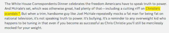
Bell hopes to be able to provide such context at any point in a story, no matter if it is text or multimedia. Toward that end, for text, Vox staffers are currently testing out the functionality of yellow highlights, which takes readers to the appropriate card in the appropriate stack for more detail with just a click. For example, Klein’s piece about size discrimination in the US–told through the example of Chris Christie being lampooned for his weight–highlights the phrase “Christie’s scandals” and leads specifically to a card on Bridgegate.
Other ways sites have experimented with this type of feature include the bio and slideshows that appear on the side of the story each time a character is introduced in The New York Times interactive Snow Fall, or by way of a sidebar of context about country history the way the BBC provides next to most articles like this one.
If well-designed, this combination of literacy-oriented architecture and curation could help to inform those general readers who want to be able to share what they learn from the news not just on social media, but in good-old conversations. “There are people who know a great deal about Ukraine but everyone around them is talking about Sterling,” Bell says. “So how can they access that information about Sterling that will help them be informed?”
Funding for this coverage is provided by the Robert R. McCormick Foundation.
Has America ever needed a media defender more than now? Help us by joining CJR today.