Sign up for the daily CJR newsletter.
To walk through San Francisco is to examine the area’s lurid, sometimes brutal mid-nineteenth-century origins. Each street has a story. Guerrero Street is named for Francisco Guerrero, a landowner and politician killed by a slingshot-wielding horseback assassin in 1851. Charles H. Gough, a local milkman, served on the committee that named many of the streets in 1855; in a bit of minor civic corruption, he named a major thoroughfare after himself and other streets after his sister, Octavia, and a friend, Steiner.
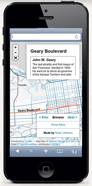
Noah Veltman, a San Francisco-based coder and designer, wanted to create an application to exhume this history. He envisioned an interactive map that would tell the stories behind each street name. And because each tale is so intimately tied to geography, he wanted explorers to be able to access his map on-the-go through their mobile devices. These days, says Veltman, “designing anything of substance involves thinking about mobile.” And that means grappling with new constraints and challenges.
Modern newsrooms have the same problem, caught at the intersection of two powerful trends: the exploding volume of information and the rapid shift to mobile computing. As a result, newsrooms that have invested in data visualization now need to design not just for the 27-inch monitor but also for screens with a small fraction of the surface area.
The digital storage company EMC estimates that we created 2,800 exabytes of data in 2012 (to put that in perspective: one exabyte, roughly equivalent to a billion gigabytes, can store 36,000 years worth of HD video. With 2,800 exabytes, you’re looking at 100,800,000 years). Visualizations make it easier to sift through and make sense of all those bits, but putting those visualizations on mobile devices comes with added challenges.
Nearly half of American adults own a smartphone and 31 percent have a tablet, according to Pew Research Center. More than a third of those people check the news daily on their devices; NPR reported that fully half its traffic on election night last year came from mobile users. That shift in reader behavior is mirrored by a parallel shift in revenues, with mobile ad revenues up 80 percent in 2012, to $2.6 billion, while the overall digital market grew 17 percent, according to Pew.
Veltman is currently working at the BBC as a Knight-Mozilla Fellow, whose digitally savvy participants are embedded in newsrooms around the world. He found that creating clickable streets on the digital version of his San Francisco map interface was a major challenge. “It was already borderline unreasonable to expect people to successfully click on them with a mouse,” he says. “It was impossible to expect it with a fingertip.” His solution was to utilize a lot of complex math to record the location of a user’s touch, and then guess at the closest clickable point. “Basically, it estimates in a very convoluted way what street you meant to click,” he says. The effort was worth it: The Atlantic‘s Emily Badger called the app “delightful,” writing: “we’d love to see something like this in any number of other cities.”
The complexity of Veltman’s approach shouldn’t dismay graphics teams struggling to keep up with changing technology.
“I think most news organizations are getting ahead of themselves when it comes to mobile dataviz,” says David Yanofsky, a designer and coder at Quartz. While the digital cognoscenti fawn over complex, cutting-edge projects, “there still isn’t a good archetype” for the basics, he says. “I have yet to see a well-designed interactive line chart made for mobile. Once the simple stuff gets figured out, the more complex stuff will have a better foundation to build off of.”
Amanda Cox, a vaunted interactive designer at The New York Times, says designing for multiple screens is an enormous challenge. “Simple adapting tends to lead to stuff that’s mediocre in at least one space,” she says. Interactive newsrooms need to update their style manuals, and decide on rules for when and where mobile-specific actions, like sliding and dragging and shaking, are appropriate, and what elements, like keys or toggle buttons or zoomable displays, are necessary in each graphic they produce.
Mobile designers must also become as integral a part of the editorial process as desktop designers have become, helping editors and reporters figure out the best–and most realistic–treatment for their stories. At the same time, they must acknowledge that not every news story lends itself to an infographic, and not every infographic will work on a smaller screen. Quartz tries to make every graphic mobile-friendly, but “sometimes we decide that the specific thing we’re making is inherently not mobile-friendly,” says Yanofsky. Mobile devices are, after all, still more limited in terms of processing power. And while they’ll get faster, there will always be a new form factor (Google Glass, anyone?) that introduces new limitations.
Once they figure out the basics, newsrooms can start looking for clever ways around those limitations, just as Veltman did when he came up with an algorithmic way to guess a user’s intention. Still, the emphasis must remain on the story and the information, not on programming tricks.
“Designers need to embrace their lack of control in a device-diverse world,” says Veltman. “Yes, painting when you don’t know the size of the canvas is hard, but when you worry less about the paint and more about what the painting is trying to say, it starts to make more sense.”
Has America ever needed a media defender more than now? Help us by joining CJR today.


