Sign up for the daily CJR newsletter.
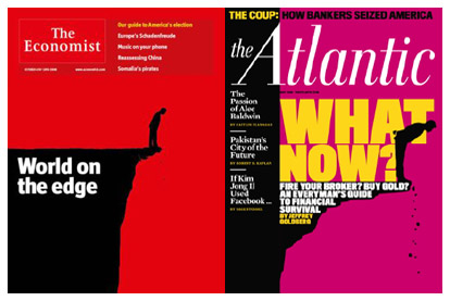
I think half the news sites I read have lately been running a highly irritating ad for The Economist, which covers the entire screen when you click on a link. I usually skip the thing as fast as I can, but before I managed to do so the other day, this image—showing a cover from the magazine’s issue for the week of Oct. 4, 2008—caught my eye:

It looked awfully familiar… perhaps because a few us in the CJR office had just been looking at some recent covers of The Atlantic. Here’s the May 2009 cover of that magazine:

A remarkable resemblance, right? Here they are side by side:
So how did this bit of design doppelgangery happen? I asked Atlantic art director Jason Treat, who replied via e-mail:
I actually hadn’t seen the Economist cover when we designed this, so I wasn’t even aware that they had arrived at the same design solution. It was a difficult piece to illustrate: Jeffrey Goldberg wrestling with what to do with his decimated savings now that the financial world had been turned upside down, after those that he thought were financial experts had let him down. It seemed that he was staring into the financial abyss, and we wanted a cover that reflected that sense of devastation and apprehension. It’s a great visual metaphor, I only wish I had seen the Economist cover first.
In a follow-up exchange, Treat said that if he had seen The Economist’s image earlier, The Atlantic likely would have retained the concept, but “would have revised it to distance it aesthetically.” He also specified that he hadn’t been aware of the similarity until being contacted by CJR. That’s not surprising—a bit of Google searching and a check with some folks in the design world suggests the resemblance hasn’t been previously noted. (Penny Garrett, head of graphics for The Economist, is out of the office this week and could not be reached for comment.)
As for what, if anything, it means, Steven Heller, an expert in the history of graphic design, notes that the similarity may be “embarrassing,” but “the off-the-cliff idea is one of those ‘universal’ notions.” (For an example of a real rip-off flagged by Heller, see here.) With any luck, the world—and the economy—will continue moving back from the ledge, and the design pros won’t need to call on this notion again anytime soon.
Has America ever needed a media defender more than now? Help us by joining CJR today.