Sign up for the daily CJR newsletter.
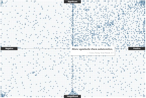
Much like New York magazine’s “Approval Matrix,” which plots pop culture happenings on matrices of “highbrow” to “low” and “brilliant” to “despicable,” a new interactive graph on The New York Times website invites readers to plot their reactions to two questions: How much of a turning point in the war on terror will Bin Laden’s death represent? (significant to insignificant), and What is your emotional response? (positive to negative).
The format is useful for commenters because they can easily click a square and answer two questions at once, and it’s useful for the casual reader, who can measure the feelings of the crowd at a glance. When you first visit the page, you can click on any square to see others’ comments or to plot your own—or, you can just watch for a few minutes, as I did, as random comments slowly float up and fade out from the mosaic.
It’s a lot more convenient than scrolling through the hundreds of comments NYT articles online usually attract; at the same time, setting these questions apart from the rest of the site in this way also serves to give them a weight that feels appropriate.
Of course, the “war on terror” eludes tidy answers; our complex feelings about morality, fear, justice and safety can’t fit on a graph. But when put together like this, collectively, somehow this works.
Below is a screenshot: go here to see it in action.
Has America ever needed a media defender more than now? Help us by joining CJR today.