
Sign up for the daily CJR newsletter.
During the summer of 2014, as the Black Lives Matter movement flared amid a spate of questionable police killings, the little known hashtag #every28hours began appearing with increasing frequency on social media. The hashtag is shorthand for the statistic, drawn from a 2013 report by the black activist group Malcolm X Grassroots Movement, that an African American is killed by police every 28 hours.
It’s a horrifying number, if true, and that summer, it certainly seemed like it could be. In August, several weeks after Michael Brown’s death at the hands of a white cop in Ferguson, Mo., the statistic was cited on CNN, erroneously as it turned out. Conservative radio host Larry Elder and Morehouse College professor and activist Marc Lamont Hill* were debating the issue of police violence against African Americans when Elder asked, “How often does it happen that an unarmed black is shot by police?”
“Every 28 hours,” Hill responded. “Every 28 hours, Larry.”
Within days, Politifact debunked Hill’s answer. The Malcolm X report had counted 313 “extrajudicial killings” of African-Americans in 2012, but did not say that all the victims were unarmed. It also defined “extrajudicial killings” to include not just people killed by police officers, but also those slain by security guards or vigilantes like George Zimmerman.
Without data, we can’t have an intelligent conversation.”
In fairness to Hill, the question he was asked is hard to answer, largely because the FBI database that tracks fatal police encounters is known to be critically flawed. In the absence of such vital data, newsrooms have begun compiling their own databases on a national and local level and sharing them with the public. “Without data, we can’t have an intelligent conversation” about policing, says David Klinger, a criminology professor at the University of Missouri-St. Louis and a former cop.
The journalists are filling an important need, but a definitive count of law enforcement killings remains elusive. Quantifying them can be a messy, subjective process that requires editorial judgment, not just number crunching.
The two largest newsroom efforts are from The Washington Post and The Guardian US, both of which are compiling national databases of people killed by police. While comparable, the projects differ in several key ways. The Guardian’s The Counted, which launched in June, tracks every fatal encounter with law enforcement since January 1, 2015, while the Post’s database includes only police shootings. In addition to basic demographic details, the Post tracks whether the person killed showed signs of mental illness, while The Guardian tracks the outcomes of investigations into the killings. The two news outlets define “armed” and “unarmed” differently, a non-trivial matter, since the presence of an “unarmed” victim is often interpreted to mean the killing was unjustified.
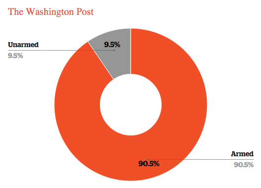
The vast majority of people shot by police are armed, based on data from The Washington Post through October 12, 2015.
The Post and Guardian both rely on crowdsourced tips and news reports as their primary sources, then verify them using public documents, interviews with police and family members, and other standard reporting techniques. The process is similar to that used to compile Fatal Encounters, an independent website that collects police killing data going back to 2000.
The creator of Fatal Encounters, D. Brian Burghart, is the editor of the alt-weekly Reno News & Review; he launched the site in 2014 after he discovered a lack of reliable data. “I’m not a data expert by any stretch of the imagination,” says Burghart, whose data has been used by The New York Times, among others. “The idea was that if we created it and kept it as neutral as possible, then large media outlets can use it for whatever they wanted.” Burghart is currently crowdfunding for a related project, called Encuentros Mortales, that will track deaths of immigrants, which are often reported in Mexican media but not in the US. Both projects are updated and maintained by Burghart and a team of “mostly underpaid volunteers.”
Among the newsroom efforts to count police killings, there is tremendous variety in what journalists choose to collect, share, and publish, although most data sets capture several basic factors: age, gender, race or ethnicity, and whether the victim was armed. Even the definitions of widely used terms like “police killing” or “officer-involved shooting” are not uniform, and that dictates which incidents get included in the count, which is often the first things readers see.
On The Guardian, a bright yellow ticker at the top lists the death tally (879 as of October 1) under the title “people killed by police this year.” The last digit on the ticker is stuck halfway between the current and subsequent number, a bit of visual editorializing that suggests the next killing is inevitable. The Post’s headline reads “X people shot dead by police this year.” (Its count was at 745 on October 1.)
Nick Selby, a detective and the CEO of StreetCred Software, a data analytics company for law enforcement, says the overall tally is not a useful data point, since it lumps all kills together, without a meaningful way to distinguish between justified, unjustified, and controversial incidents.
The @Guardian‘s The Counted says Jermaine Benjamin was killed by police; ME says Benjamin died of OD of Flakka https://t.co/4b2HFRk1FG
— Nick Selby (@nselby) August 26, 2015
He also argues that The Guardian’s count is disingenuous, because it includes cases like that of James Bush, who reportedly was killed in a “tragic accident” with a police vehicle, and cases where suspects died post-booking. The Guardian also includes deaths in custody. In one such case, Selby tweeted: “The @Guardian’s The Counted says Jermaine Benjamin was killed by police; ME says Benjamin died of OD of Flakka.” The Guardian does not mention the cause of death in its summary of the incident, but the news report the paper cites begins, “A family believes excessive force led to the death of their loved one, but the sheriff of Indian River County said his deputies did everything they could to save his life.”
Kimberly Kindy, the government accountability reporter at the Post and involved in this project, says the paper chose to track shootings because it’s a more rigorous category. “This is a world that’s gettable,” says Kindy, as opposed to deaths in custody, or vehicular deaths, where the officer’s role can be harder to pin down. “You just do not want to do definitive analysis about what’s wrong with policing unless you know you have the world of incidents in front of you.”
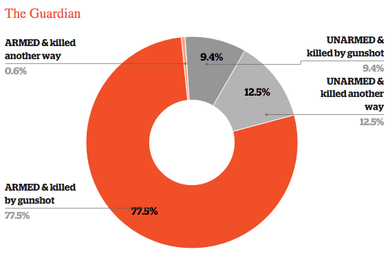
99% of people killed by police who are armed are killed by gunfire vs. 42% of people who are unarmed, according to The Guardian’s data through October 12, 2015.
Another concern is how journalists define “unarmed,” which can get murky in any but the most straightforward cases. Was the weapon accessible? Was the alleged perpetrator reaching for it? Is a baseball bat, a broom, or a piece of rebar, a deadly weapon?
Selby says that journalists dealing with such data need to be upfront about their methodology and show how they reached their conclusions. “That’s what journalists would expect from a scientific study,” he says. StreetCred’s own data on police killings is accompanied by a detailed key that explains each column.
These considerations are important for all newsrooms, but especially for the Post and The Guardian–not just because of their size and influence, but also because their databases are built for readers to explore on their own, without the context of an accompanying narrative. Both provide various filters and graphics to dive into the data, and each instance in The Guardian’s count is accompanied by a pop-up card that provides an image of the victim, a brief summary of the incident, and links to news reports.
The interactive format is engrossing: flipping filters on and off, comparing states, and reading the individual incidents gives direct access to the breadth of information available. “The database is one of the most-read pieces The Guardian US has done,” says Jon Swaine, one of the team members on the project.
I can’t do anything about it if readers don’t read the stories, if all they’re going to do is look at a graphic.”
However, it can be difficult to provide deep context in an interactive database. The Post’s Kindy says the context is available in the wealth of reported stories the Post has done on policing. “I can’t do anything about it if readers don’t read the stories, if all they’re going to do is look at a graphic.” But Thomas Wilburn, a news developer at the Seattle Times who worked on a recent story on police killings, says that with so much information available, journalists must be selective about what they show. “You’re maybe not going to offer people as much freedom,” Wilburn says, “but it will give people a stronger throughline editorially.”
The journalists who spoke to CJR agreed that the government should track police killings. Endeavors by The Guardian, the Post, and on the local level in Atlanta, Los Angeles, New York City, Washington state, Utah, and many other places were created for a general readership, not as a basis for policymaking or academic research. And they’re works in progress. Swaine, at The Guardian, says he and his colleagues are constantly reevaluating, and trying to balance context with clarity. “There’s so much within this issue to tell. We hope we can tell some of it, the most important bits of it, and we’ll keep trying to add more information.”
The FBI’s Uniform Crime Reporting Program, which collects standardized crime data from the country’s nearly 18,000 police departments, tracks “justifiable homicides” by police. But the data is known to be problematic, since it’s voluntary for police departments to report, and very few do. According to the UCR, there were 444 justifiable homicides in 2014. Fatal Encounters counted nearly triple that number. A Wall Street Journal investigation last year collected data from 105 police departments, then compared its count to the FBI’s and found that the bureau’s tally was missing several hundred deaths.
In October, FBI Director James Comey called the dearth of accurate data “embarrassing and ridiculous,” The Washington Post reported. “It’s unacceptable that the Washington Post and the Guardian newspaper from the UK are becoming the lead source of information about violent encounters between police and civilians,” Comey said.
Several federal efforts over the last year have sought to correct this problem. Last December, Congress passed the Death in Custody Reporting Act, which would provide funding for states to track both arrest-related deaths and deaths in custody. In May, the Obama administration launched the Police Data Initiative, and in September, Comey released a statement saying that the bureau would expand the data it collects on police use of force, but reporting will remain voluntary. On October 1, the NYPD announced that it would begin tracking every instance of use of force by the department.
The hashtag #every28hours persists. Each time a black person is killed by police under questionable circumstances–Freddie Gray, Walter Scott, Christian Brown–it spikes briefly on Twitter, along with the new victim’s name. And the number may not be far off. The Guardian counted 217 black deaths at the hands of police through September 2015, or one every 29.8 hours. The Washington Post counted 190 black deaths by police gunfire, or one every 34.1 hours.
But then, numbers only tell you so much.
*An earlier version of this story identified Professor Hill as Eric Lamont Hill.
Has America ever needed a media defender more than now? Help us by joining CJR today.