
Sign up for the daily CJR newsletter.
This post by James Pethokoukis, who recently hopped over to AEI from Reuters, shows how to combine the worst tendencies of Slate (contrarian shtick), Business Insider (misleading, hyped headlines), and think tanks (paid-for spin), and puts it in internet-friendly listicle format:
5 reasons why income inequality is a myth — and Occupy Wall Street is wrong
This, at least the first part of it, is false in a you’ve-got-to-be-kidding-me kind of way, which is the whole point. That kind of headline draws you to read the post, which proceeds to give seemingly sound (but ultimately misleading) evidence for why inequality isn’t growing in order to plants seeds of doubt about whether that whole inequality thing is really a problem.
You’re probably not going to take the time to poke holes in it, so I will. A deeper look at this post shows that the body is nearly as flawed as the headline.
First, remember that income inequality is an obvious fact—a glaring one, actually:
The poorest 20 percent of households made an average $11,034 last year, $179 less than they did in 1979. The median income rose to $49,445 last year from $46,074 in 1979, while the top 20 percent made an average $169,633, or $48,536 more than in 1979.
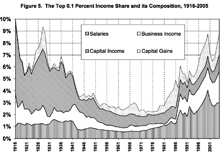
But the real blowout hasn’t been between the 80th and 99th percentiles. It’s been in the top 1 percent and top 0.1 percent, which is why that “We Are the 99 percent” slogan has struck such a chord. The poorest member of the top 1 percent made $347,000 in 2007 (the latest year I can find), more than double the $165,049 they made in 1979.
Pethokoukis gets it totally wrong in his first point, reporting on the conclusions of a working paper by Robert Gordon which he sums up as “In other words, income gains were shared fairly equally” between 1979 and 2007. You be the judge:
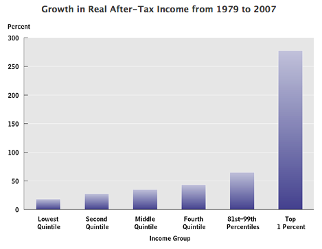
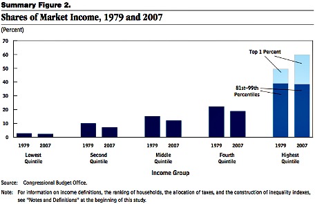
That’s CBO data, as is this:
But don’t take it from me or from the well respected, nonpartisan CBO. Take it from Pethokoukis’s source himself. Gordon:
The evidence is incontrovertible that American income inequality has increased in the United States since the 1970s.
That’s the very first sentence of Gordon’s paper, which Pethokoukis somehow overlooked. In debunking the inequality of the top 1 percent and everyone else, he also forgets to mention this Gordon quote:
Because of the very different behavior of the top 1 percent and the bottom 99 percent, this paper treats as two separate topics the causes of changes of inequality at the very top and among the remaining 99 percent of the population.
That’s from page one. Here’s more:
We have seen that the timing and interpretation of increases in top incomes at the top 1.0 and 0.1 percent levels is very different than that in the bottom 99 percent. Much of the within‐group increase in inequality in the bottom 99 percent occurred before 1993, whereas between 1993 and 2000 there continued to be an increase in the income share of the top one percent, and a continuing shift toward the top 0.1 and 0.01 percent groups within the top one percent segment.
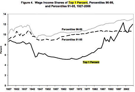
And maybe a couple of charts from Gordon’s paper will help:
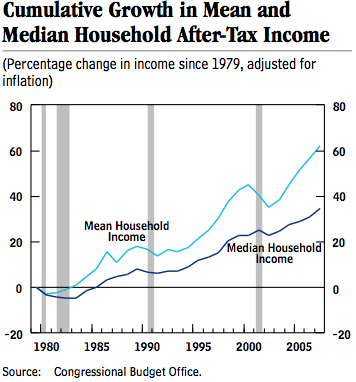
Pethokoukis’s second bullet point quotes Federal Reserve Board of Minneapolis papers by Terry Fitzgerald to say that adjusting for things like declining household sizes, median household income rose 44 percent to 62 percent between 1976 and 2006 and that median hourly wages rose roughly 30 percent (when including non-cash benefits like health care). But Fitzgerald also points out that per capita personal income rose by 80 percent during the same era. What accounts for the difference between median and mean pay? Fitzgerald:
The remaining difference between the 44 percent to 62 percent increase in median household incomes and the 80 percent increase in BEA personal income per person appears to be largely attributable to an increase in income inequality.
That’s Fitzgerald from his 2008 paper. Pethokoukis misses that quote too.
In other words, median pay is lower than the mean (per capita is an average) because those at the very top are earning so much more than the median than those at the bottom are earning less than the median. Or as the CBO puts it:
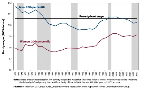
Let’s remember that that cash hourly wages have stagnated or gone down for folks at the bottom (women earn more than they did, but men earn less). Here’s a chart from the liberal Economic Policy Institute showing real hourly earnings for men and women at the 20th percentile of income:
The third study Pethokoukis cites claims that rich people have suffered much worse inflation than poor people. In other words, the price of a yacht and a Park Avenue townhouse has gone up far faster than the price of Sam’s Choice Dr Thunder and Dollar General-brand diapers, and that means that inequality is actually unchanged.
Small comfort for generic Dr Pepper-guzzling babies and everyone else. More importantly, the study doesn’t look at the top 1 percent.
Here’s Pethokoukis’s fourth point:
A 2010 study by the University of Chicago’s Bruce Meyer and Notre Dame’s James Sullivan notes that official income inequality statistics indicate a sharp rise in inequality over the past four decades: “The ratio of the 90th to the 10th percentile of income, for example, grew by 23 percent between 1970 and 2008.” But Meyer and Sullivan point out that income statistics miss a lot, such as the value of government programs and the impact of taxes. The latter, especially, is a biggie. The researchers find that “accounting for taxes considerably reduces the rise in income inequality” over the past 45 years. In addition, “consumption inequality is less pronounced than income inequality.”
So let’s consider the value of government programs and the impact of taxes. Here’s the CBO on market income plus transfers minus federal taxes (it’s important to note that the CBO adjusted household income measures by size of the household):
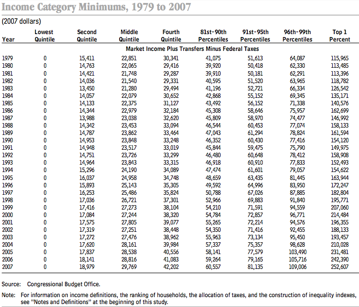
By this measure, income for the poorest member of the top 1 percent has gone up 118 percent (the CBO doesn’t break out these numbers, but the top 0.1 percent would have gone up several times that) while that of the poorest member of the middle quintile has risen 30 percent.
Pethokoukis’s fifth and final point isn’t quantitative at all. It’s the standard “the poors have air conditioning now” right-wing talking point.
Set all the numbers aside for a moment. If you’ve lived through the past four decades, does it really seem like America is no better off today?…
No doubt the past few years have been terrible. But the past few decades have been pretty good—for everybody.
See above.
UPDATE: Follow-up post here.
Has America ever needed a media defender more than now? Help us by joining CJR today.


