Sign up for the daily CJR newsletter.
Election Day is an occasion for high drama on the Internet: data coming in all day and night, polls, pundits, analysis, voting booth mishap stories, Twitterers typing away until the dreaded “over capacity” whale appears. It’s also the perfect occasion for news sites to stretch their legs and experiment with new interactive tools and graphics.
As Simon Rogers of The Guardian’s Datablog said last week in reference to the WikiLeaks data visualizations, “Just because something can move, does it need to?” It is possible to overdo it with this stuff. (Thanks to CJR’s Liz Cox Barrett for reminding us of CNN’s “hologram” interviews from ’08, something we were trying to forget.) And yet, on Election Day, it seems as though everything is allowed. Here’s a rundown of the best of those experiments on news websites.
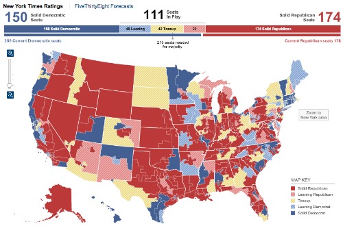
The New York Times maps win again for thoroughness and ease of navigation. When looking at the House, Senate, and gubernatorial maps, readers can click back and forth between Times ratings and FiveThirtyEight forecasts. Hover over a state for the basic election information, or click on a state for a fuller analysis of the race and that state’s demographic information. The FiveThirtyEight blog itself will surely be a go-to for politicos watching at home tonight, and the Times also provides a helpful rundown of what races to watch as each one closes, hour by hour. (The Atlantic’s Marc Ambinder points to another useful map by TheElectoralMap.com showing poll-closing times by state.)
On the other hand, the Times’s “Twitter Traffic” graphic, which maps the candidates’ frequency of tweets, falls into the “just because you can…” category. It’s sort of gimmicky, and interesting to glance at for about a second, but doesn’t really convey that much information.
The Washington Post is using Twitter to its advantage all day with the first-ever hashtag promotion by a news organization, reports Steve Myers on Poynter. When a Twitter user searches for “#election,” they are taken to a page that has a Post tweet at the top. From that perch, @washingtonpost will direct readers to WashingtonPost.com coverage all day and night, coverage that includes interactive maps, charts of campaign spending, and a map specifically tracking Palin-endorsed Tea Party candidates. Myers writes that the Post’s use of Twitter will help them to “rise above the din of election-related conversation and draw more traffic to its website.”
Twitter’s blog post from yesterday lays out all the ways it hopes people will use the technology for tracking trends and updates. The Los Angeles Times is also embracing Twitter today with a custom deck on its homepage, displaying a “curated” feed from Times editors and reporters. Other than that, the Times website is fairly text-analysis-heavy and does not (yet, at least) make much use of maps or other interactives. One interesting graphic illustrating three potential scenarios in the House and Senate is buried pretty far within the site and took some clicking around to find.
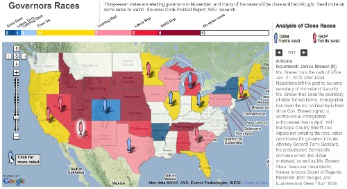
The Wall Street Journal has a bunch of interactive projects on display today, thankfully all in front of the paywall. The most entertaining, time-suckiest feature, of course, is the WSJ page that collects attack ads from across the country and invites readers to vote on which ones are most effective. Quirkiest is “The Capitol’s Age Pyramid: A Graying Congress,” a graphic illustrating how old the 111st Congress is. The most informative graphic, though, is a trio of simple color-coded maps, predicting where the House, Senate, and gubernatorial contests will go tonight. It’s very easy for these kinds of predictor maps to get cluttered and complicated, but these keep it nice and clean:
PBS NewsHour is also jumping headfirst into the 2000s (I kid, I kid) by streaming its famous Lehrer-Shields-Brooks analysis trifecta online tonight. A series of video live chats on PBS MediaShift started at 1 p.m. eastern, between host Mark Glaser and “an all-star lineup of new media experts, comedians, and social media gurus” that should be entertaining, judging by whom he’s got lined up.
The Sunlight Foundation is teaming up with PBS as well, and starting at 7 p.m. eastern, will complement the video stream with “dynamic transparency data widgets and social media coverage and expert analysis” specifically focusing on campaign spending. We’re not quite sure what that is going to look like, but the Foundation recently won a Knight-Batten Award for this platform technology, so it sounds promising.
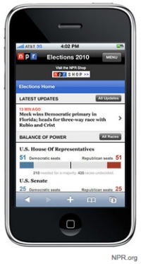
NPR is putting its award-winning mobile app technology to use tonight. Starting at 6 p.m. eastern, NPR will feed its “Balance of Power” graphics and updates from NPR.org to participating mobile devices (mockup below). It’s also using the #ivoted tag on Twitter to track listeners’ stories about their experiences at the polls. Speaking of which, TBD is using Ushahidi crowd-mapping technology to map any voting problems that readers in D.C. might encounter.
Finally, a new-ish fad in election coverage is to try to predict the outcomes of races—or at least the mood of the voters—by tracking Facebook status updates, Tweets, and web searches. CBS.com, for instance, used Google Insights for Search to show trends in web searches for political parties and individual candidates (though it’s unclear how “interest” in parties or people translates to votes for same). If you like voodoo zeitgeisty predictions and colorful graphs, check out Slate’s Lean/Lock prediction game on Facebook and The Daily Beast’s “Election Oracle”.
Or, of course, you could go back over to Nytimes.com and watch as the “What One Word Describes Your Current State of Mind?” graphic toggles back and forth (Hopeful, Anxious, Hopeful, Anxious) all night long.
Has America ever needed a media defender more than now? Help us by joining CJR today.