It’s been a big year for Homicide Watch. Last summer’s Kickstarter campaign succeeded admirably, raising $47,450. The website went from an almost-fatal hiatus to hiring its first staff members, who could continue to cover murders in DC while the founders, Laura and Chris Amico, are at Harvard for the year. Homicide Watch also announced a partnership in Chicago with the Sun-Times.
The Chicago expansion is a big deal for several reasons. It provides much-needed revenue, helps the Amicos build out their platform, and will perforce provide a serious proving ground, as Chicago sees far more murders annually than DC (though at a slightly lower per-capita rate).
But the Chicago expansion is most culturally significant for what it says about newspaper culture. Chicago is famously a newspaper town, home of “If your mother says she loves you, check it out,” and The Front Page, as well as the recent near-death experiences of its two major dailies. Newspapers have covered murder in a particular way for as long as there’s been a crime desk. And Homicide Watch doesn’t do it that way.
Homicide Watch’s greatest contribution to crime reporting is a “just the facts” service that is part AP reporting style and part database feed, whose basic premise is that if someone is murdered in your city, it’s a story. If you want to see how radical this idea is, and how much race affects reporting, take a look at Homicide Watch’s hometown.
Last fall, The Washington Post published an interactive map of every murder in DC between 2000 and 2011. The paper never acknowledged the existence of Homicide Watch in the piece, but the use of a database to track local murders in that famously murderous town is hard to read as anything but the sincerest form of flattery.
The Post version, though, isn’t a carbon copy of Homicide Watch. Below is the default view of each page:
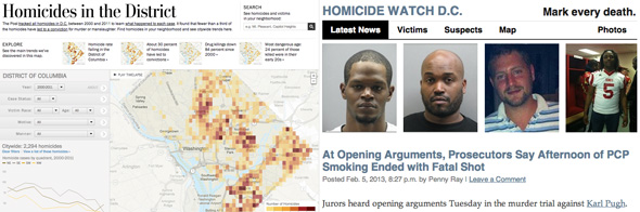
The Post‘s default view is a map. Homicide Watch’s default view is a face. The Post‘s view is aggregate and historical; Homicide Watch’s is personal and recent. The Post focuses on murders, Homicide Watch on victims. The Post gives you all the murders; you have to zoom in for the details. Homicide Watch starts with the most recent events; you have to zoom out for the bigger picture. The most recent murder the Post puts on its map was in December of 2011. As I write this, the most recent murder Homicide Watch put on its map was last night–Howard Venable Jr., stabbed to death at Fuller and 16th NW.
The Post‘s map is about neighborhoods and patterns. (When I showed the Post‘s map to my journalism students and asked whom they thought the ideal audience was, they said, “Realtors.”) Homicide Watch’s map is about people and events. The Post‘s map tells you things like, “Stay the hell away from Anacostia.” HW tells you that Venable was 68 years old, and gives you a tip line for the cops, if you have any idea who killed him.
Not to put too fine a point on it, The Washington Post has produced a white-people map of murder, a map that assumes you couldn’t possibly know the victim. Homicide Watch has produced a brown-people map–a map that assumes you might, a map for a city where brown people are 30 times more likely to be murdered than white people.
As we live through the data-driven transformation of journalism, we should never assume that information is impersonal or unbiased, or unaffected by editorial decisions, both big and little. (In an inexplicable design choice, the Post decided “brown = bad” on its map.) The Amicos haven’t just shown us how to do better reporting for civically vital issues, at lower cost, and greater benefit. They’ve shown us that even reporting the facts has to be thought of as a political act. They’ve shown us how the choices of journalists and editors continue to matter, even in an age of big data and real-time feeds. For all the neutral style and straight-ahead presentation, the Amicos’ greatest gift, as people inventing a new model of journalism, turns out to be their sense of humanity.
Clay Shirky has a joint appointment at New York University, as a Distinguished Writer in Residence at the Arthur L. Carter Journalism Institute and as an assistant arts professor in the Interactive Telecommunications Program. He blogs at shirky.com/weblog.