Sign up for the daily CJR newsletter.
The heat wave that swept the Pacific Northwest and Western Canada in late June was an extraordinary disaster. A mass of high-pressure air over the region trapped heat there, creating a “heat dome”—a term that recurred in news coverage. In Oregon, power cables melted; in Washington, roads buckled. Record-breaking temperatures in Lytton, British Columbia, and nearby First Nations communities, were followed by a devastating wildfire.
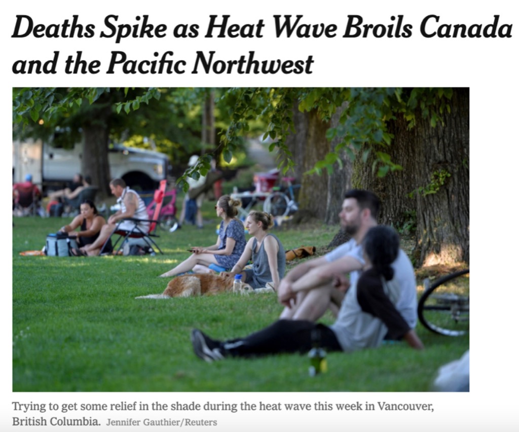
The sustained temperatures in Washington have since been called “the state’s deadliest weather-related disaster.” According to the Centers for Disease Control and Prevention, 800 heat-related deaths occurred across the Pacific Northwest and British Columbia between June 25 and 30. An additional 2,800 people across Oregon, Washington, Idaho, and Alaska ended up in an emergency room due to heat-related illness.
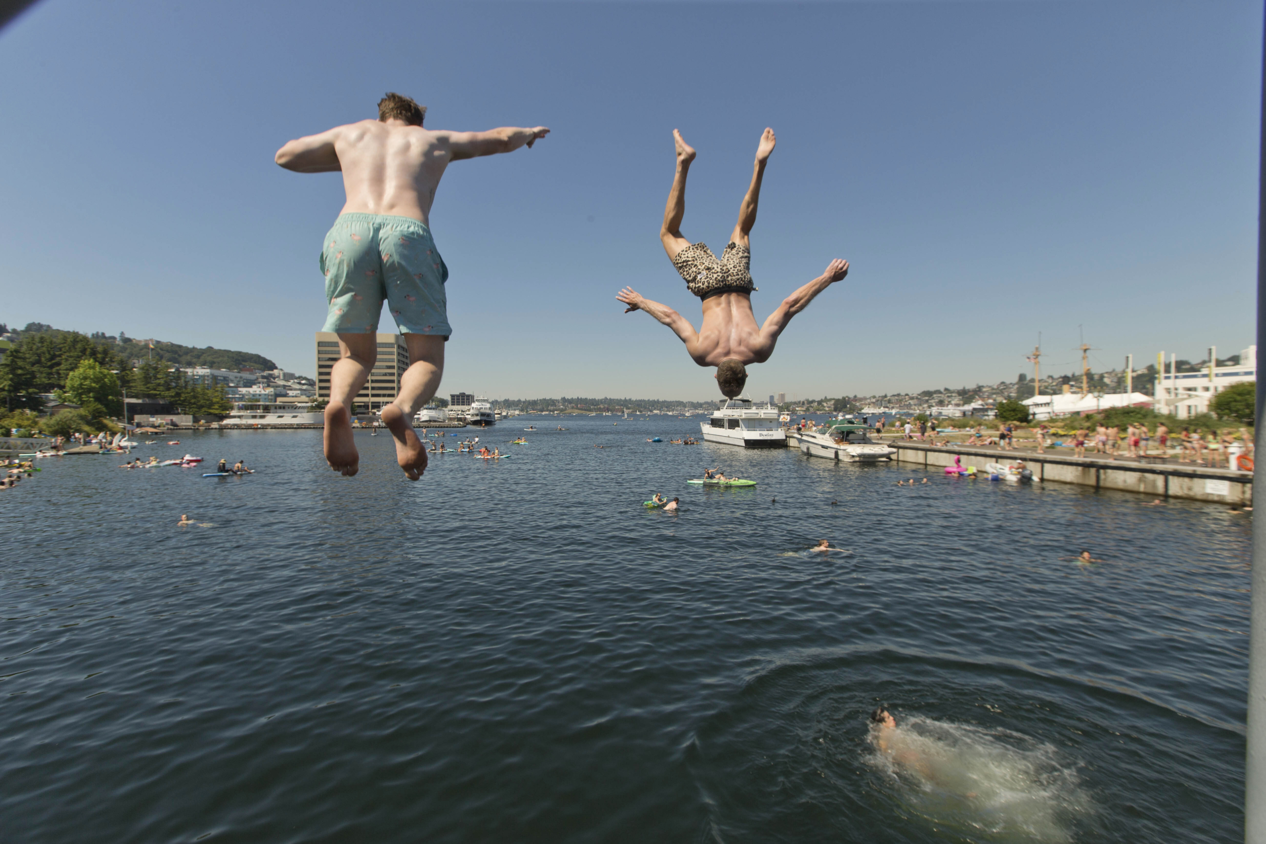
The devastating heat—more harbinger than anomaly—exposed weaknesses in the media’s representation of deadly temperatures as well as their connection to climate change. The images that led news stories widely minimized the event. Many photos made it look like a run-of-the-mill heat wave; some were so banal as to conjure stock photography. Photo slideshows confused the issue with a juxtaposition of the ordinary and extraordinary.
Headlines about widespread fatalities were accompanied by images suggestive of a typical hot summer day. The New York Times paired one severe headline with an image more evocative of a picnic:
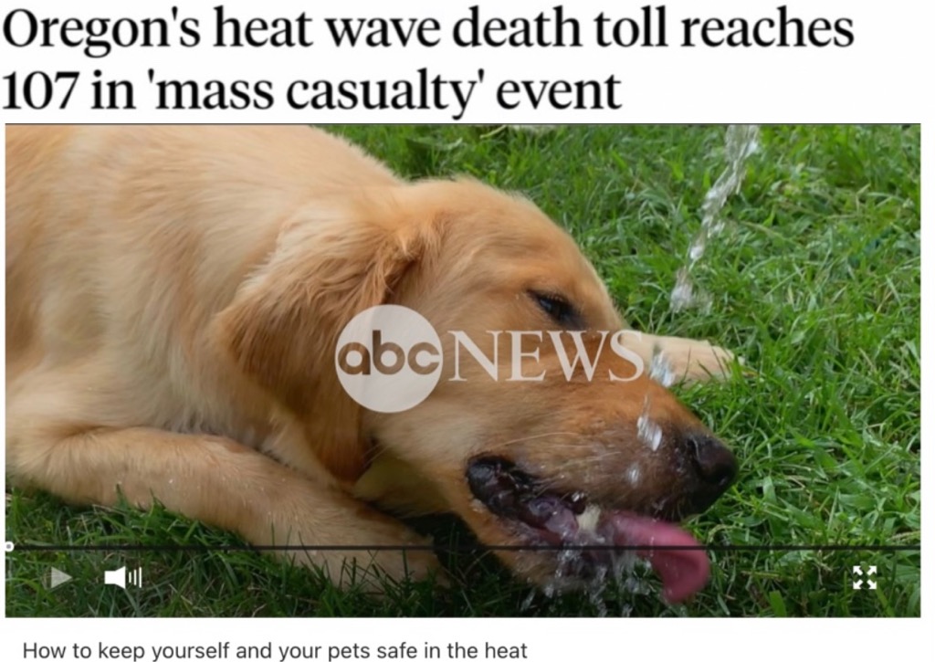
An ABC News report about the emergency leads with a still of a golden retriever lapping water. Although the subsequent video provides some guidance for coping with the heat, the endearing image hardly reflects a “mass casualty” event:
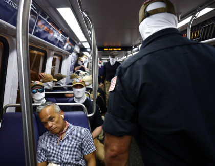
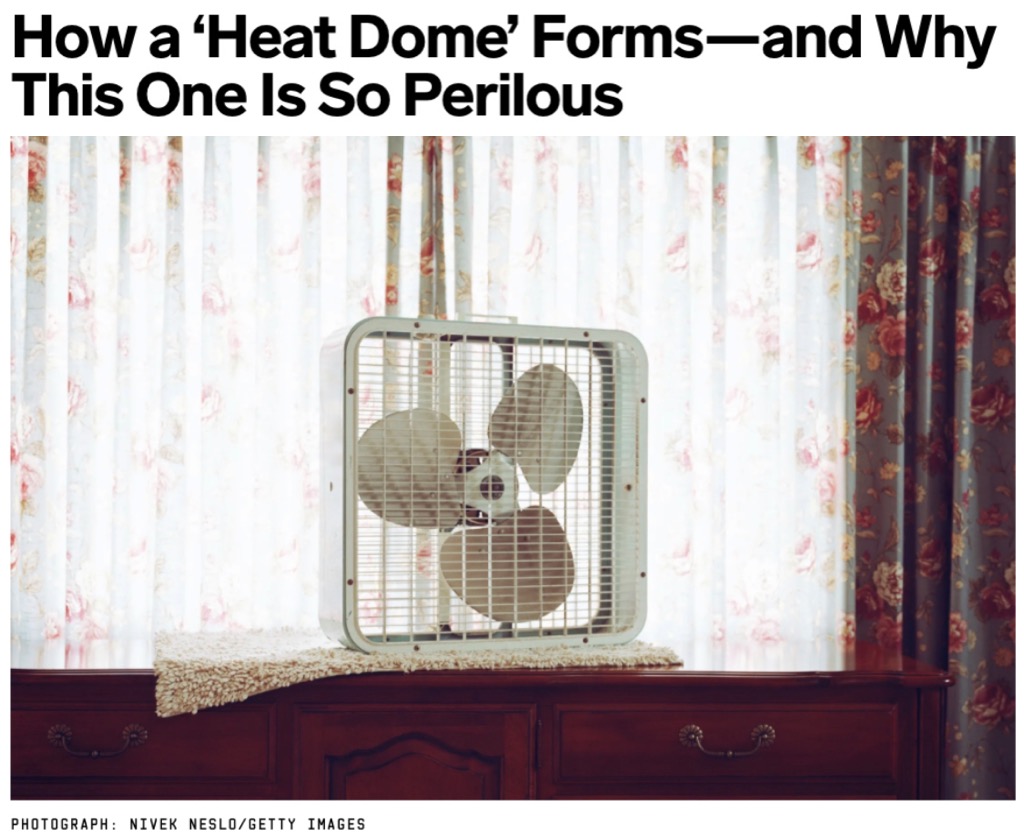
Other images diluted the fatal event with banal, stereotypical identifiers, as in this Wired backgrounder:
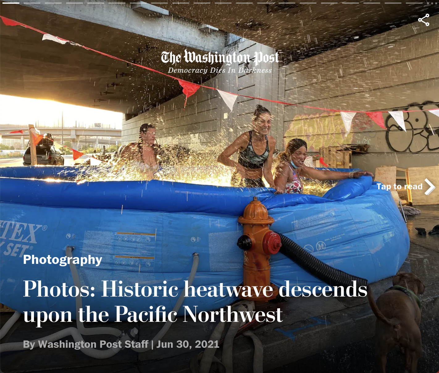
A photo feature in the Washington Post led with an image, taken by a stringer for Reuters, of people frolicking in a swimming pool beneath a freeway underpass:
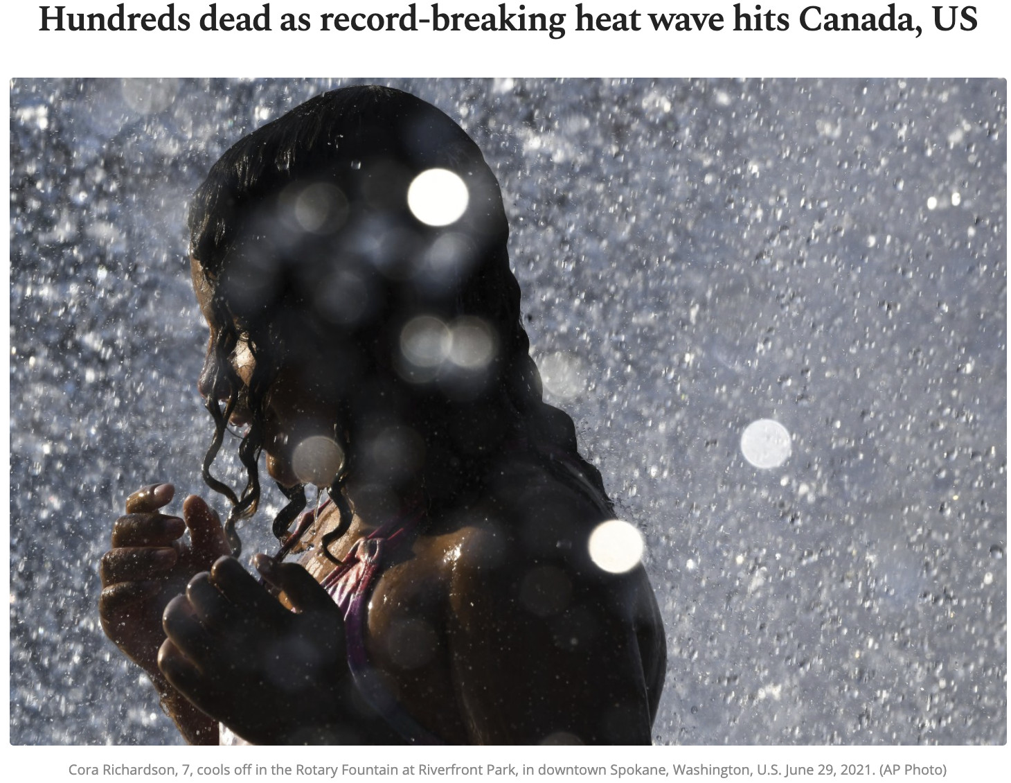
Daily Sabah, a Turkish newspaper, offered more death and water play in its coverage:
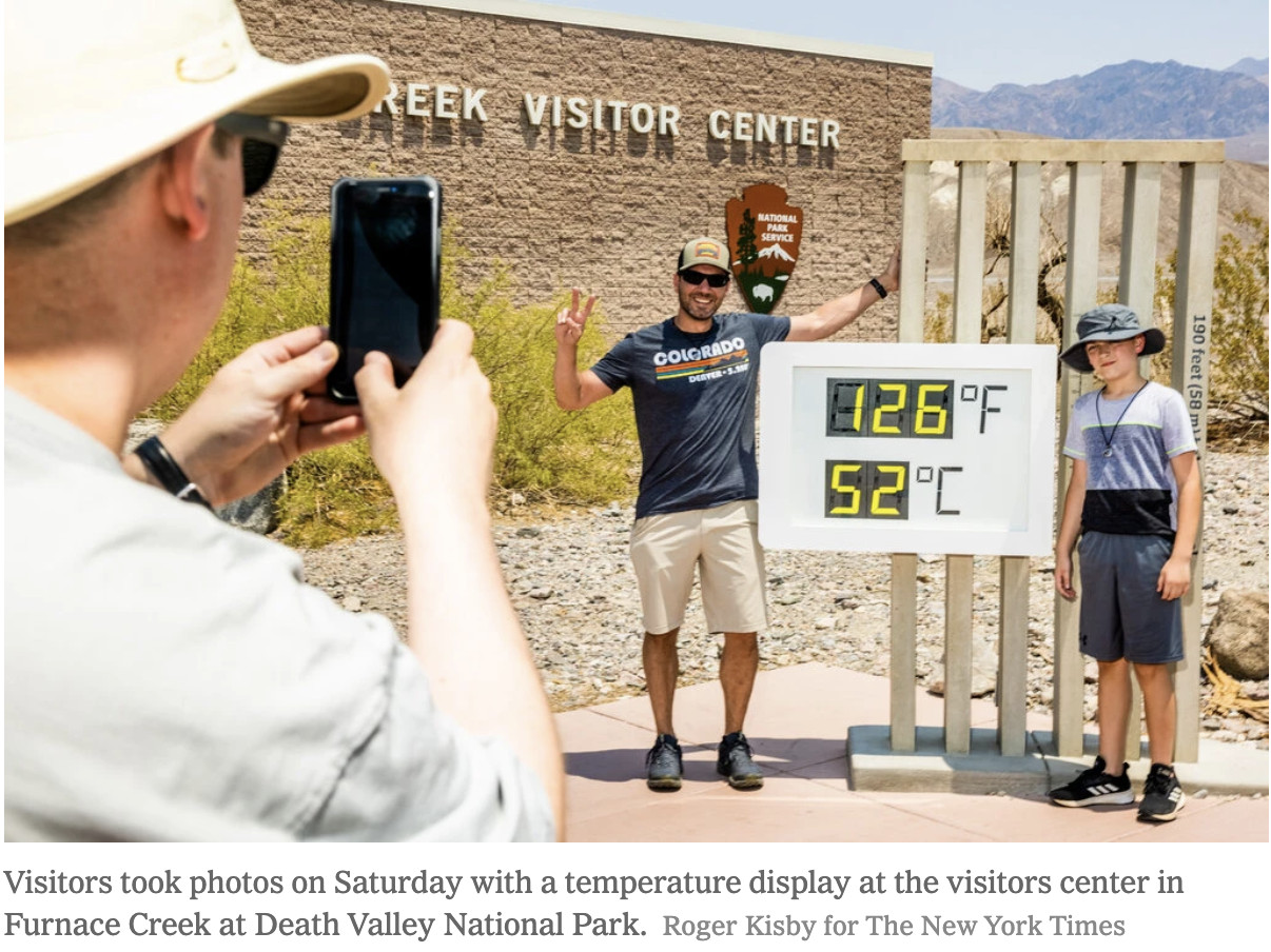
In many cases, the crisis was reduced to spectacle. Outlets published innumerable images of “heat tourists” flocking to Death Valley, California. This shot, from the New York Times, shows tourists gawking at the public temperature reading and posing for photos and selfies at the Furnace Creek display:
The temperature displays alone were a staple of the crisis coverage, and—as the below image, from TIME, shows—often ran close to headlines about deaths:
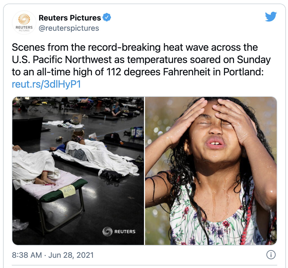
A prominent slideshow from Reuters, published on June 29, featured 21 images; of those, two featured temperature signs, four depicted water recreation, and five showed bags of ice or people holding water bottles. Only a handful—of people in clear duress, or seeking emergency shelter—were indicative of a true crisis. Four (including one shown below, left) were taken at a cooling station set up at the Oregon Convention Center:
Scenes from the center were certainly concerning, as you can also see in this shot from Getty Images:
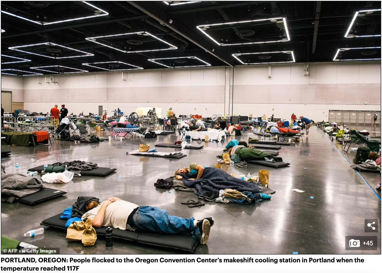
At the same time, this single location featured disproportionately in coverage of a crisis that gripped communities across the Northwestern US and Western Canada. Its frequency in visual coverage spoke to a greater paucity of imagery of sheltering, debilitation, or triage.
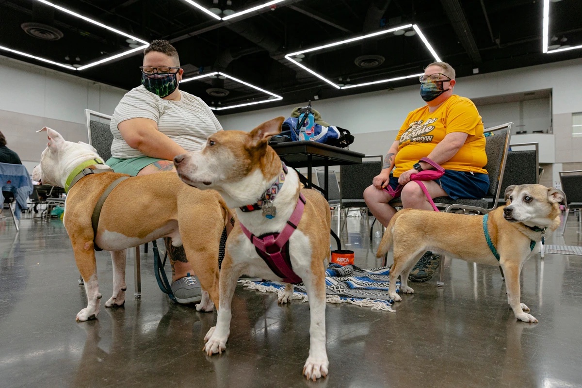
Photos from the cooling center also varied widely in tone, sometimes blurring the line between crisis and inconvenience. Although images conveying more urgency illuminated many media stories, others —for instance, the example below, from Willamette Week—opted to publish the lighter ones:
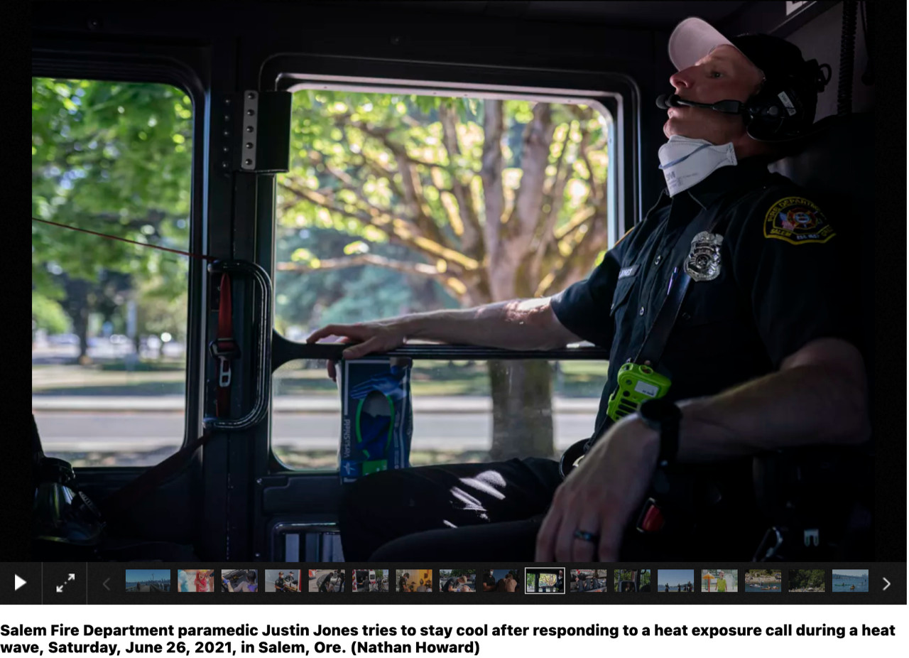
If many images unintentionally downplayed the severity of the crisis, some photographers—especially local staff photographers and freelancers—engaged the crisis with work that rose to the occasion. Some of the most effective and widely-distributed imagery was created by Portland freelancer Nathan Howard, whose photos were published by outlets such as the Spokesman-Review in Spokane, Washington. This shot, for instance, demonstrated how even first responders weren’t physically immune to the oppressive conditions:
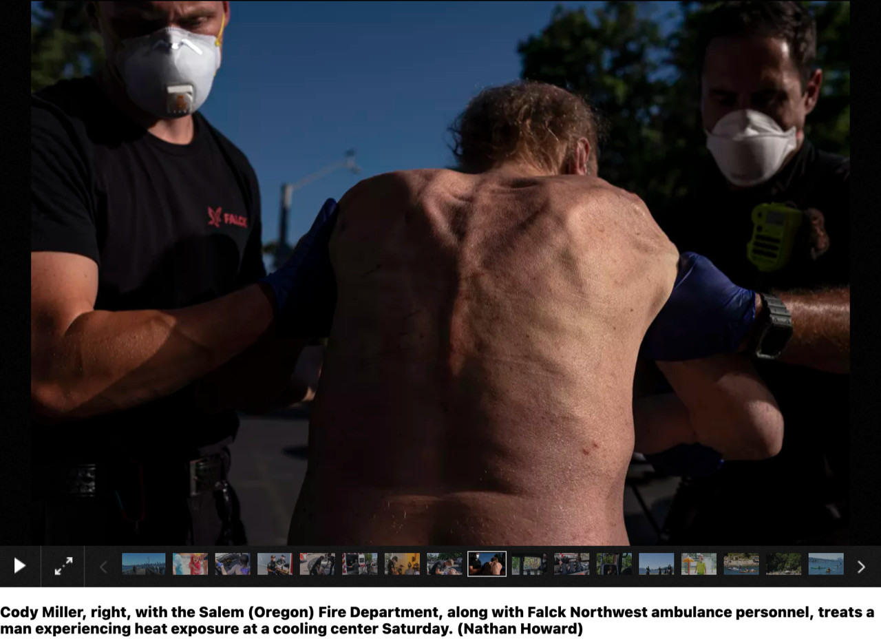
Another emphasized the particular vulnerability of homeless people and agricultural workers:
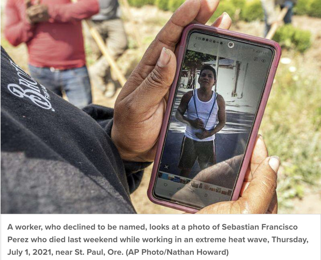
Howard spent time documenting farmworkers toiling in Oregon under the heat dome, as well as the vigil of Sebastian Francisco Perez, a worker, who died from the heat. Howard photographed images of Perez that were printed on signs calling for justice and “no más muertes”—no more deaths—and shown on phones; they are among the rare published photos of the week’s approximately 800 fatalities:
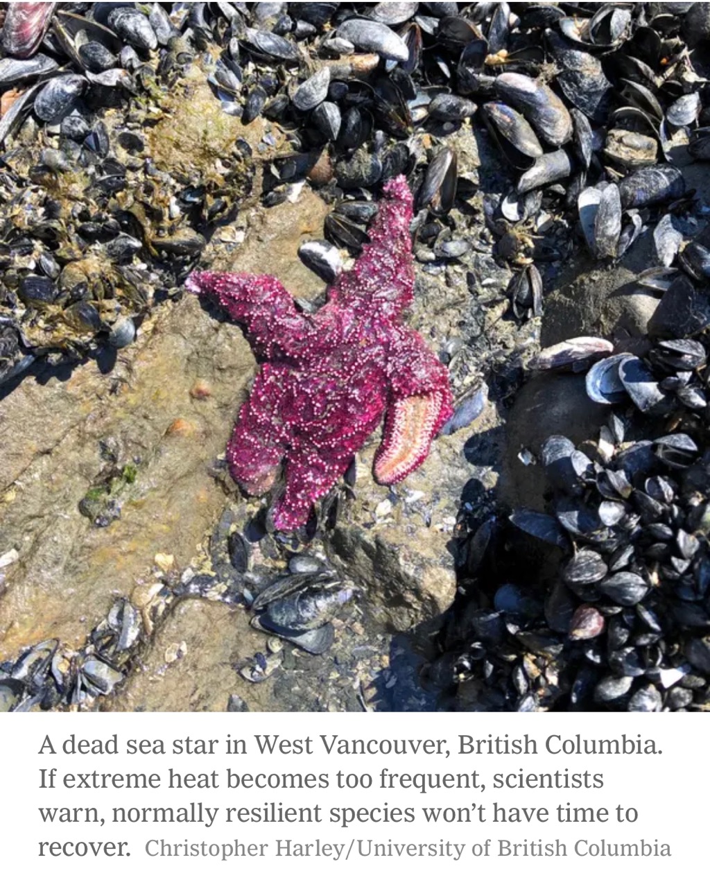
The challenges of visualizing the heat emergency were not confined to images of humans. The toll on sea life was practically incomprehensible. A photo of a starfish, however, is commendable for its use of anthropomorphism: its alluring pink, pebbled form suggests a defeated body with a broken arm—an image of a non-human climate casualty that delivers unusual impact:
Heat waves in America kill more people than any other severe weather. And that’s in an average year. The heat dome at the end of June and subsequent events must serve as a visual wake-up call. News consumers deserve imagery that is every bit as urgent in its content and tone as the phenomenal crisis threatening the planet.
Has America ever needed a media defender more than now? Help us by joining CJR today.