Sign up for the daily CJR newsletter.
What’s going on with these redesigns?
There seems to be a movement afoot to declutter news websites’ home pages. Problem is, it makes them harder to read and, thus, harder to navigate.
I noticed it first several weeks ago with Bloomberg.com’s redesign, which I really dislike. The most visible change is the black and orange that dominated the site in a nod to its cash-cow terminals. It’s now white. Not a fan, but whatever. The bigger problem is the home page, which on my laptop looks like this:

If I click over to Bloomberg to see what’s up, I get three stories “above the fold.” Before the redesign, I got at least eight or ten. Now you have to scroll down to see them. And you have to do a lot of scrolling because Bloomberg has jumbofied these headlines and subheds.
Bloomberg’s most-recent design just gave you its often quirky headlines. It now gives you jumbo headlines and quite a bit of the lede, which is pretty pointless since it’s mostly redundant.
Stocks Soar, Euro Rallies on China’s Europe Comments
Stocks surged and the euro snapped a three-day decline against the dollar as China said it remains a long-term investor in Europe…
And:
Obama Defends Spill Response, Says Drilling Risks Will Rise
President Barack Obama defended his administration’s response to the BP Plc oil spill and said Americans one day must decide how much risk they will tolerate to keep drilling for fossil fuels.
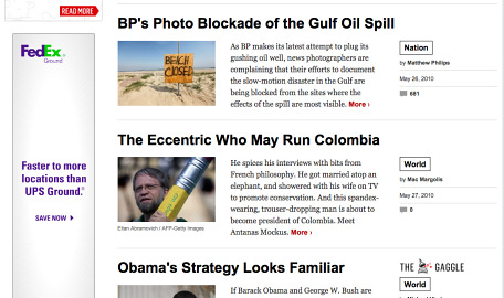
Newsweek just unveiled its redesigned site and it’s even worse. It’s got one big story above the fold, and that’s it. Oh, there are actually three more stories linked up top, but I didn’t even notice them the first couple of times I visited the site:

Scroll down and you’re lucky to get three headlines on your screen at once. Seriously, Newsweek’s site now looks more like the Reader’s Digest Large-Print Edition 2.0 than anything else. These headlines are huuuge, Tiny E!
Who’s really going to be scrolling down that much? Think I’m just being cranky? Go read Jakob Nielsen, who’s the expert on this stuff:
Web users spend 80% of their time looking at information above the page fold. Although users do scroll, they allocate only 20% of their attention below the fold…
Finally, it’s not just big media doing this. The startup Bay Citizen also goes with this simplified layout. It gives two stories above the fold on my screen:

Again, I’m far from a design expert. But this stuff seems intuitive. Don’t you want to give readers more to read on the page they’re actually going to read?
I’ll be the first to acknowledge that I’m an extreme consumer by profession (as well as nature). I want a lot of information easily accessible right away. It’s frustrating when you make it harder to find. It sure isn’t going to make me want to read more of your stuff.
The amazing thing about Bloomberg.com is that its iPad app is awesome. Probably the best news app I’ve seen. Why can’t it emulate that on the Web?
Has America ever needed a media defender more than now? Help us by joining CJR today.