Sign up for the daily CJR newsletter.
My colleague Joel Meares has written a lot lately about various news sites’ makeovers for the midterm election season, from Yahoo’s “hyper visual, hyper-interactive” new site “Ask America” to PBS NewsHour’s snazzy redesign, an attempt to attract new and younger readers to their political coverage.
But sometimes readers aren’t in the mood for measured analysis, and they just want to see the numbers, yes? Google’s political map partners with Cook, Rothenberg, CQ-Roll Call and RealClearPolitics to put everyone’s numbers in the same place, on a map that’s easy to navigate.
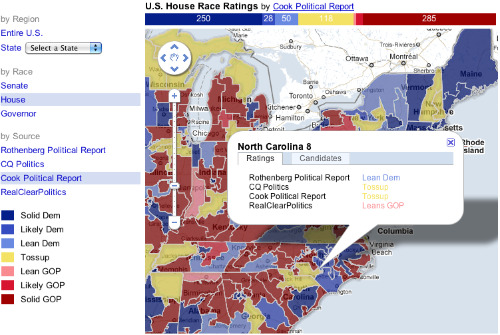
Google’s tool isn’t an alternative to political reporting or analysis, of course, and polls aren’t everything, but this can be an easy way for news sites to make political trends visual. Best of all, it’s free.
Calling all short-staffed news organizations: if you can’t afford to have your own online graphics team, free to steal this code and embed it in your site. C’mon, Google owes you; help them atone for their sins.
Has America ever needed a media defender more than now? Help us by joining CJR today.